
KYLE JENKINS: CELARE PAINTINGS
Kyle Jenkins
10.05.23 - 17.06.23

KYLE JENKINS / CELARE paintings
The monochrome was first created in the late 19th Century by Paul Bilhaud and his work Combat de Nègres pendant la nuit ("Battle of negroes during the night") 1882, however historically its establishment as a painting strategy is in early 20th century Modernism with Kasimir Malevich’s ‘Black Square’ 1915. This marked a point of departure in painting that has been readdressed by numerous artists, movements, and groups since 1950s, such as European abstraction, Swiss Concrete, and New York Neo-Geo. Historically a monochrome can suggest the removal not the application of paint because there is no identifiable representational image in the work. This is incorrect because these forms of work are not reductive as they aren’t about taking something away, it is about maximising and focusing on what’s there.
For myself, what the monochrome (and my work) investigates are active tropes associated with the very act of painting in both historical and contemporary contexts. Instead of figuration and recognisable images (representing objects/scenes/feelings in art), this work is about non-figurative propositions that engage with history, the marketplace, and the way in which a painting is received in the early 21st century. The word Celare(the title of these paintings) means to colour, to cover, conceal, destroy, and hide. This series of misshapen monochrome works deal with issues of originality (appropriation), authorship, presentation, display, and the act ‘of painting’ where the actual picture in the painting is the painting itself. Additionally, by creating a monochrome, one is engaging with the history of such painting but also the problems every person is dealing with when making a painting, that of the problems of colour, shape, composition, weight, tonal value, scale, flatness, the frame of support. Instead of adding and adding, these aesthetic issues are just all collapsed into one colour, one surface, one composition, one construction, as one painting, that is about questioning what painting is, and could be. The monochrome works are about encoding each painting with the very nature of what painting is re: production, perception, reception, and interpretation. In this way what you bring to the work is what you get from the work because the paintings aren’t about creating illusion based within the technological or representational screen but is about looking back at the viewer offering a sense of reconciled finality through colour relationships and formal limitations.
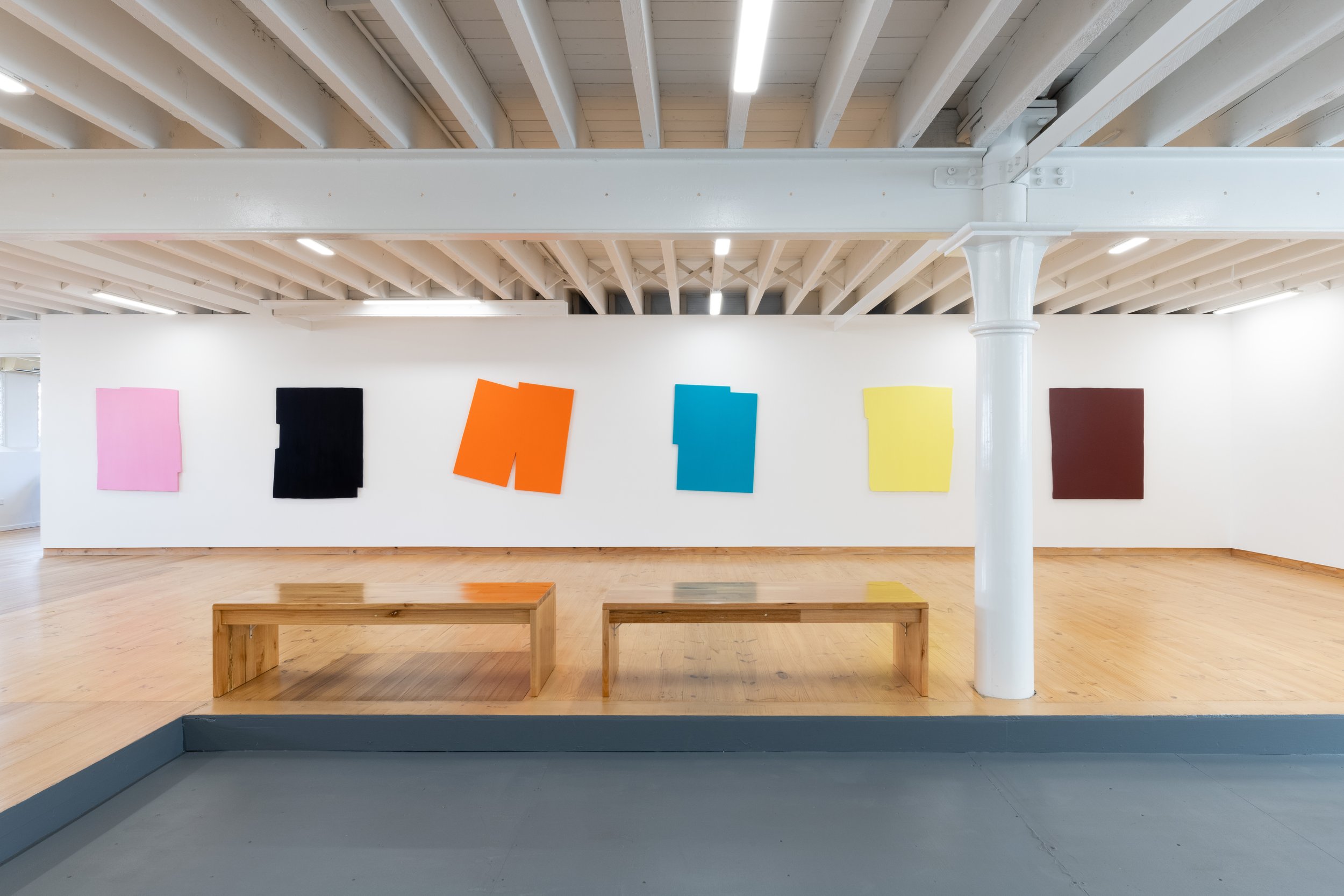
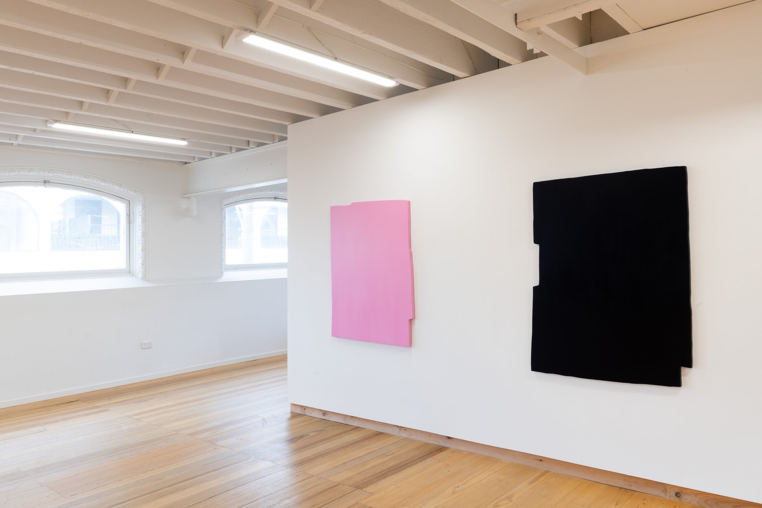
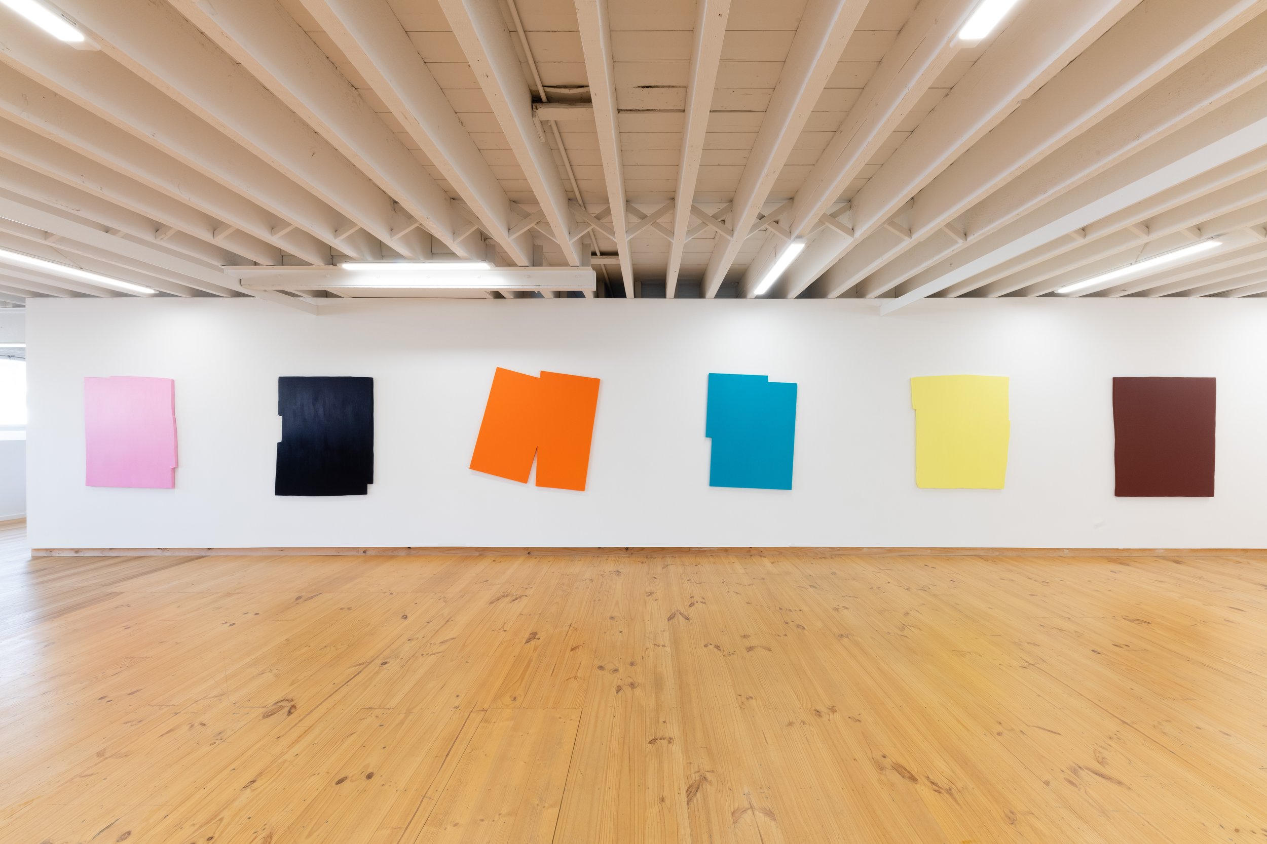
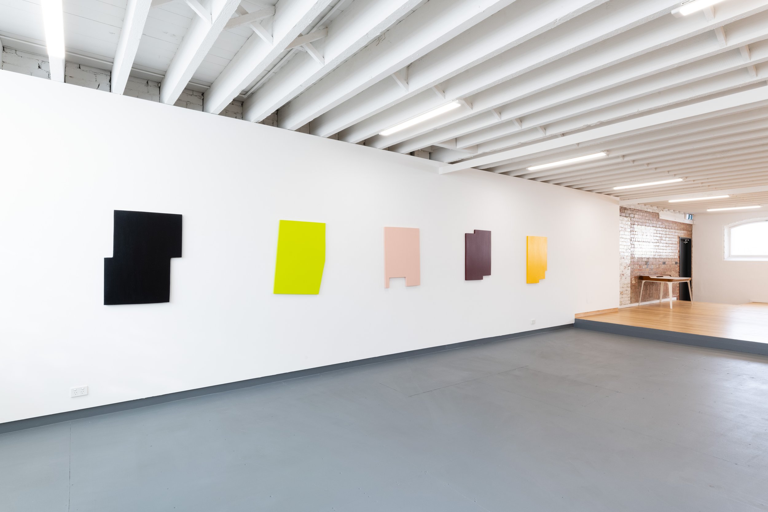
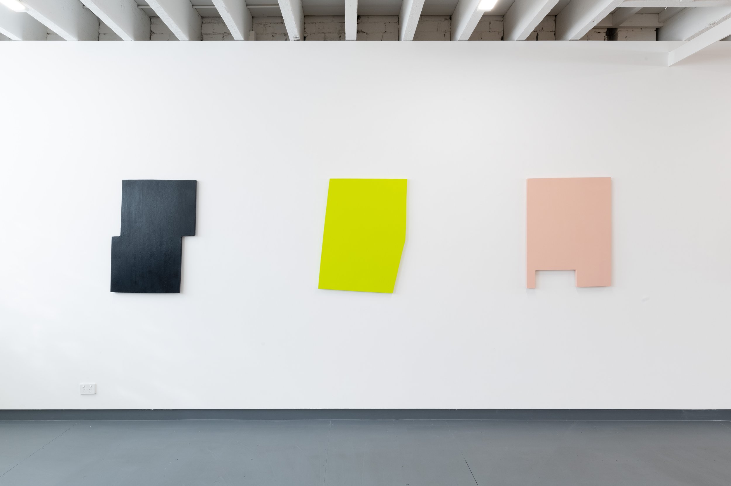
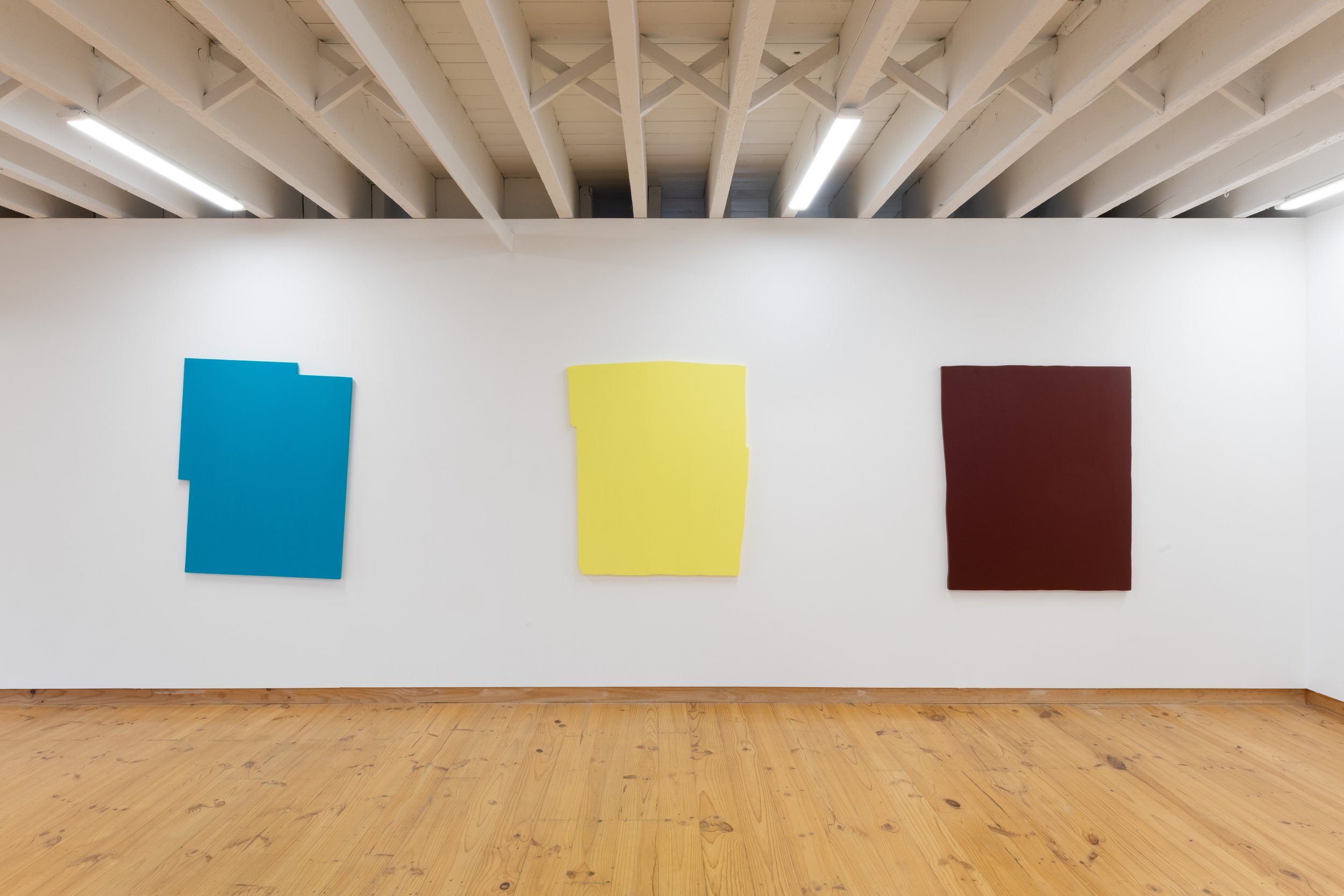
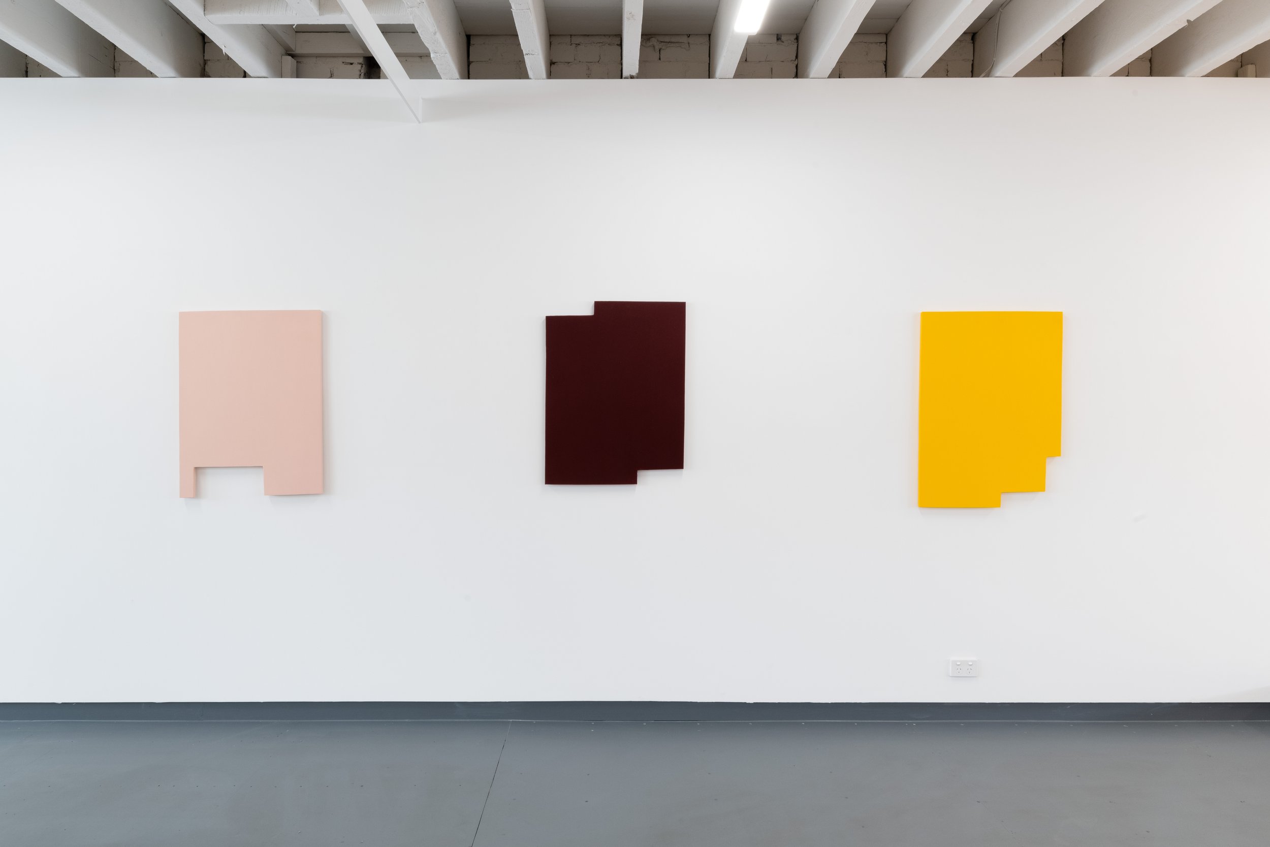
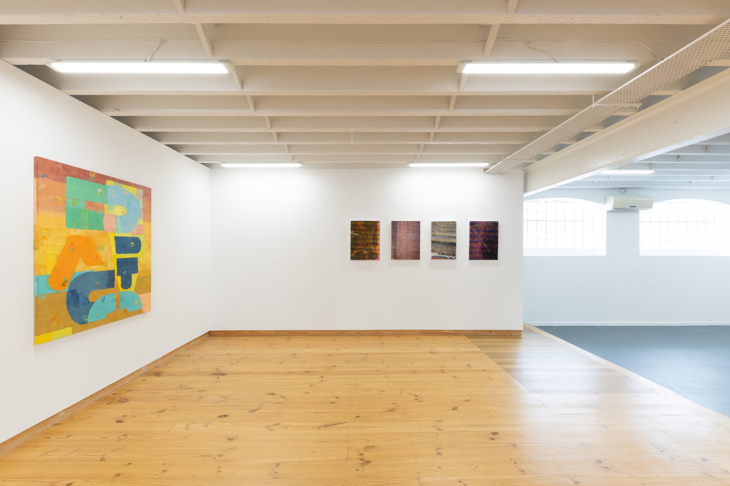
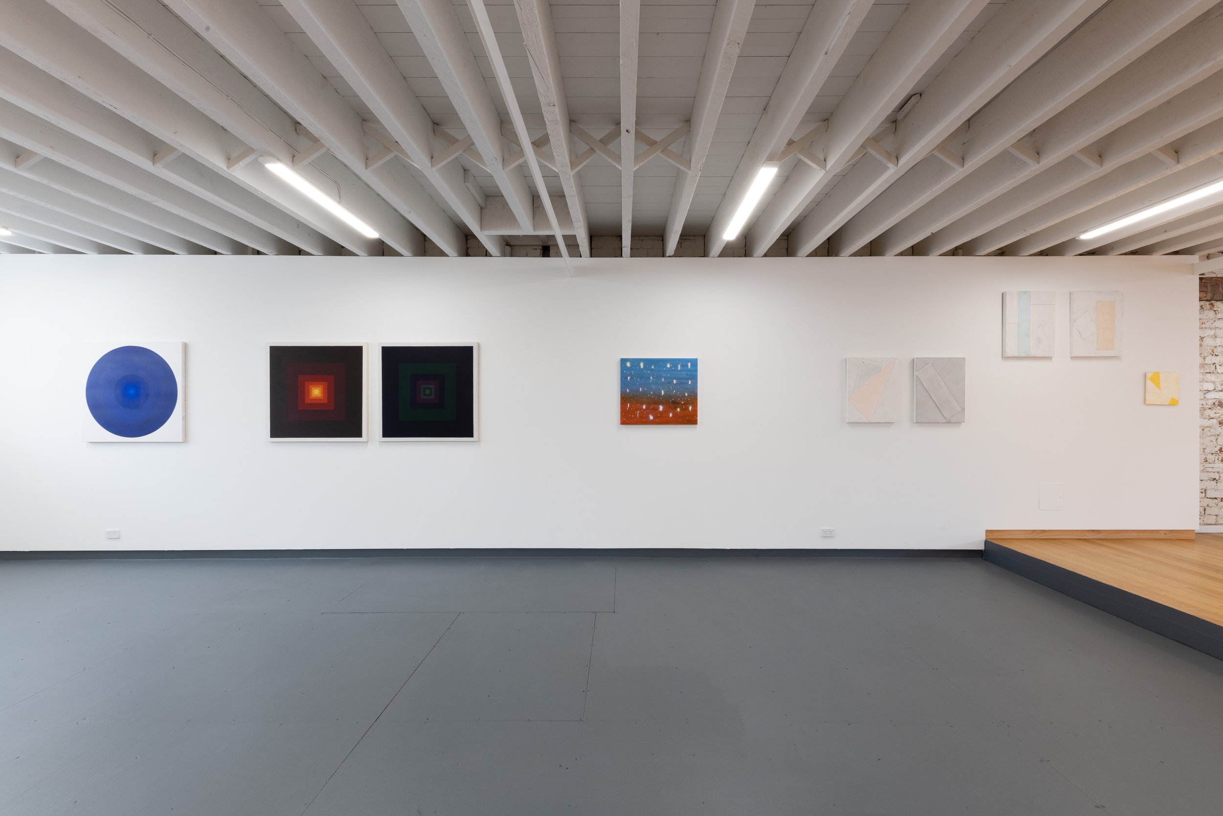
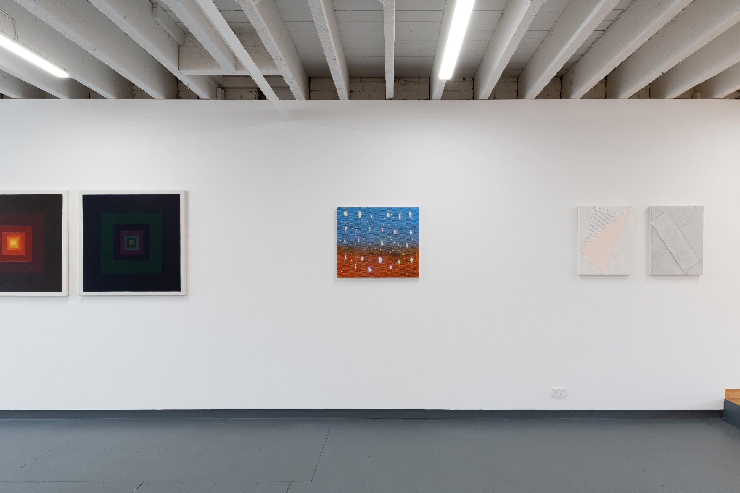
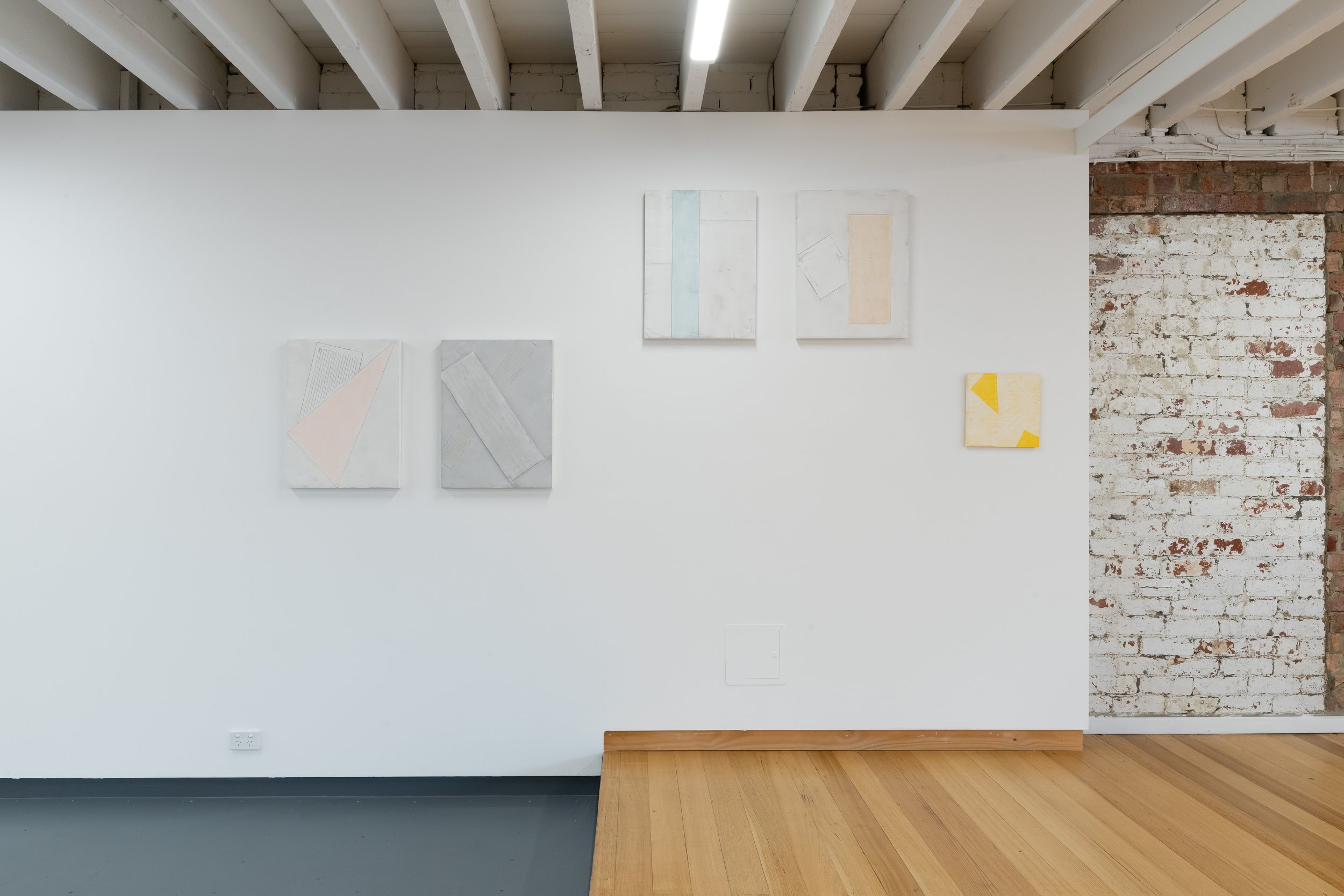
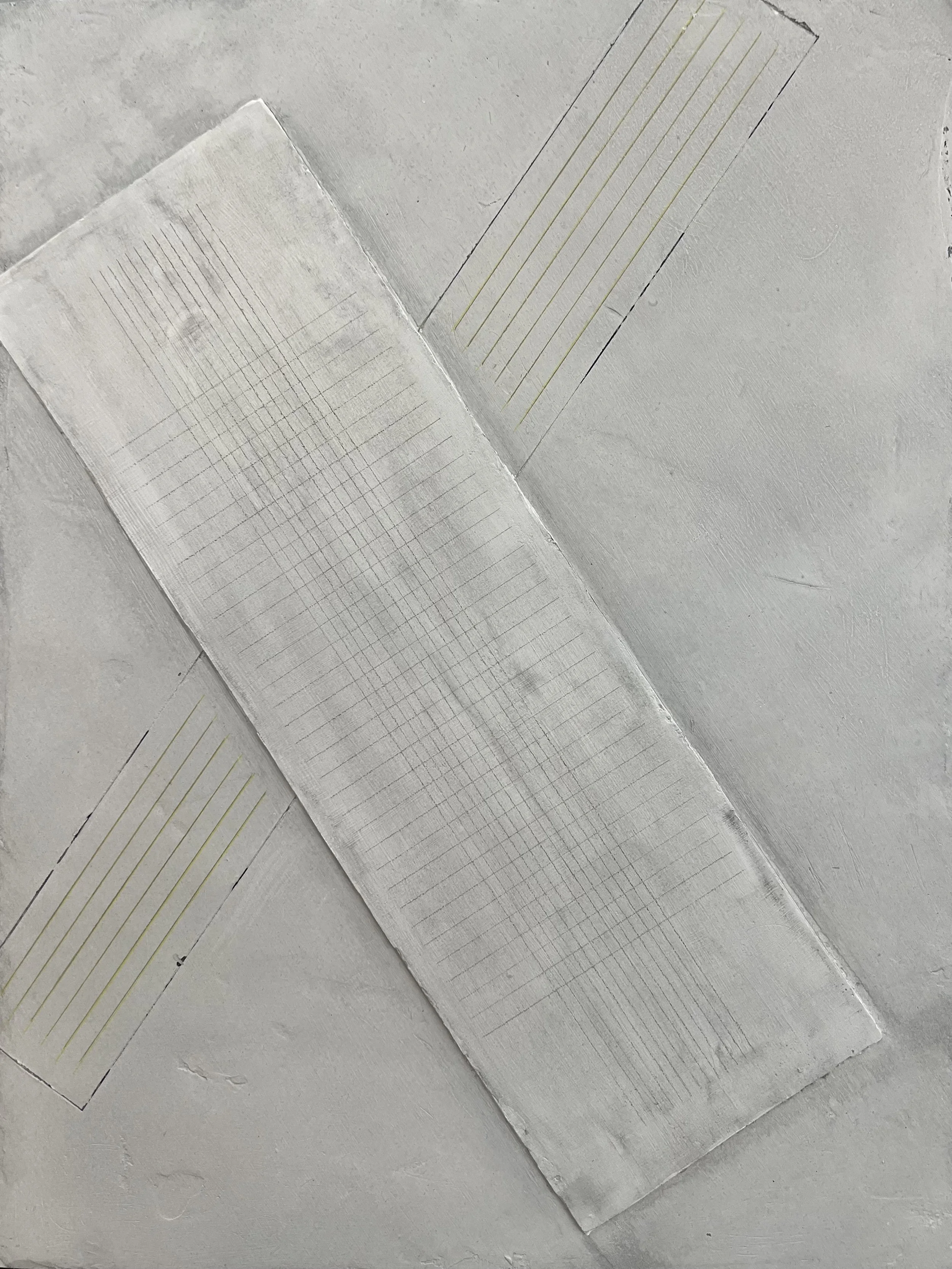
The CELARE monochromatic paintings are about engaging with the tradition that the reading of a painting is all about its surface; as such, this series of shaped-based canvases can seem to mimic architectural motifs, but also exist in a space between painting and object, creating a tension that asks, “is it a painting, is it an object or ultimately what is it as an artwork?” One of the ways this is done is by creating paintings where the edges are imperfect, with a hand-made DIY aesthetic. The sides of the canvas are painted so the work acts as a surface of intention indicating that the function is tied to its tradition, but the artwork also becomes a painting ‘as’ object. In these works, the main conceptual premise is how far can you push the creation of a painting, or the traditional notion of a painting, before it dissolves into being read as an object, architecture, design, or nothing at all. Ultimately these paintings confront the traditions of painting into a tensity between art and non-art, existing within authorship, the monochrome, painting ‘as’ object, architectural motif and the everyday.
The works are constructed through a process where wood is hand cut, not measured or ruled up, allowing the intuitive construction and slight wobble in the form’s edge to be left as a sign of construction. The wood panels (that have canvas stretched over them) are associated with topology, a subdivision of geometry, which deals with characteristics of geometric figures that are preserved despite certain deformations. These occur in the frame’s edge, not its field. The tension between this creates a form of construction that appears miss-constructed where the un-level, un-square, warped edges are the structural parameters of the painting but are also falling out of the paintings frontal field over the edges through its application of paint. In these paintings, the edge becomes an act of divergence where small changes in the edge of the frame (the traditional notion of what a painting frame is, its geometry and structure as a square or rectangle) is challenged and these works are as much about what is outside the frame as within.
The series of misshaped panels challenge the notion that the reading of a painting is all about its surface; as such, by juxtaposing one paintings scale to the next creates a multi-reading within the paintings collectively, where the viewer can read each painting potentially as a coloured void and/or object in relation to the wall that it’s located against, considering the work in relation to the architecture that the work exists within; or considering the tonal weight of the colour/s used singularly and collectively. The relationship of the shape of the painting to the wall and the room creates synergetic notions of space where the physicality of it, the paintings shaped space (as both surface field and as object) and the remainder of the exhibition space, combines as transitional units. In this sense the shaped paintings are not autonomous units, instead, they are composed of the painted-shaped frame placed on the wall together with its negative, the space sitting outside its edge. Within this there is a relationship between frame construction, tonal presence and space, and the parallel relationship of painting, space, and viewer. The paintings are not just about responding metaphysically to the works in terms of colour, line, and scale, but are also about the angle at which the viewer is standing to the work, their position within the space and the positions of the other works within this same space.
Artist Statement, 2023
WHAT YOU SEE IS YOU
When an artist is asked what kind of paintings, they ‘make’, it is in the response where initial interpretation is key to providing visual answers. For the landscape, figurative, abstract or portrait artist, there is an instantaneous visual connection; whether the genre is agreeable to the viewer or not, an understood association is instantly established. For the monochrome painter, however, the answer can easily be misinterpreted as a kind of conceptualised notion of potential possibilities; a suggested idea of other, resulting in a sense of disconnect or possible unknown. For Kyle Jenkins, the answer is in the question, and the question is exactly what he’s challenging and bringing to the fore in this series of artworks.
For artists embarking on producing monochrome paintings, they’re aware it can never, not acknowledge its own history. Jenkins’ practice is engaged with collapsing historical and physical attributes of painting, such as shape, colour, composition, tone, and flatness into the one constructed object, to question the possibilities of what painting can be today. There are considered applications such as tonal value and crafted edges, that reflect his intended aesthetic and conceptual intentions, as well as an acknowledgement of artists before him, who investigated ideas including appropriation and authorship in relationship to the monochrome. What is timely though, about this exhibition and group of highly constructed monochrome paintings, is that Jenkins has intentionally made them to be viewed and engaged with by an audience in the third decade of the 21st century. Through their painterly application and physical presence, these CELARE paintings bring new ideas of authorship, absence, and appropriation, historically associated with monochrome painting, and confront notions of identity, simply by being painted in an era where our sense of self is challenged by a visual culture that’s saturated by an influx of digital imagery.
This digital culture provides information to be visually downloaded or subsumed via various mediums and devices that are rapidly distributed and automatically communicated, either as images, text, and or sound. In particular, when viewing images via digital technology, the screen appears to flatten potential edges and objects, at once offering up a seamless illusion whilst simultaneously preventing us from focusing on any one thing. This creates a strategy of withdrawal from ‘experiencing’ the full essence of the subject or image, in turn, limiting our perspectives of being in the world.
The speed at which we consume visual information via a screen, where one image from one time and place is collapsed on top of the next, combined with reduced details (materiality) of how an artwork’s physicality (such as brush marks, colour, tonal variations etc.), offers up delusions of photo-real impressions, creating false truths and disorientated understandings of reality. For monochrome painting, and the viewing of it through a screen, blocks of monochromatic fields appear to negate any suggestion of historical or conceptual narrative, reducing any DIY aesthetic qualities. When viewed in the gallery or physical space, monochrome paintings reveal their material details of construction. Additionally, the viewer is drawn into the work on a more intimate level, inviting them in to take a closer look, experiencing the artists ideas / paintings more personally. It is here that a level of presence in the works is negated by digital technology and a redirecting of the viewer’s focus away from the physicality of a painting’s construction, occurs. Any focus on painterly issues such as materiality, perception, production, and interpretation, are reduced, and when this occurs, so too are ideas and notions of the self.
In Jenkins’ CELARE works he uses the practice of painting to problem-solve associated issues related to colour, surface, and construction; a way of wearing his heart on his sleeve (so to speak), revealing potential struggles or organisational issues related to the manufacturing of the paintings. Issues such as colour placement, or dealings with edges and irregular forms, emphasising negative spaces between the works, considering the architecture, and exaggerating the picture planes flatness, are all ways for him to discover potential realities that look at the nature of painting and how far it can be pushed, or minimised, to reconstruct it. Jenkins questions ‘what is painting and how do we experience it’, through this interrogation, and as such an element of empathy is ignited in the viewer, and so too are new notions of truths and authorship.
All these painterly issues, both physical and conceptual, are so closely entwined with the genre of monochrome painting and are essential to being seen and experienced first-hand. Jenkins knows that potentially, most of the audience for these paintings will be viewing the work through a screen. He makes no apologies for this, and through his unwavering investigation, dares the audience to do the work too. They need to get in front of the paintings, and by doing so see beyond any false, digital seamless imperfections, into new perspectives and truths. These monochrome paintings mirror Jenkin’s authentic self, through their constructed nature and irregular physicality combined with intentional and considered details, they could be interpreted as self-portraiture, exposing his search for truth, that simultaneously offers room for his viewer to do the same, to bring us all back to really seeing and experiencing ourselves, through the work. It is in this way, the CELARE paintings act as a group of paintings that are collaborative in nature, whereby they offer ways for the audience to connect back with the physicality of themselves, the world around them, and each other.
Tarn McLean
Dr Tarn McLean is an artist, designer, and Doctor of Philosophy (Visual Art) and founded the Australian accessories and textile company Ocre Designs in 2008.
ARTWORKS:


enquire.
the colour & the shape
10.08.2022 – 03.09.2022
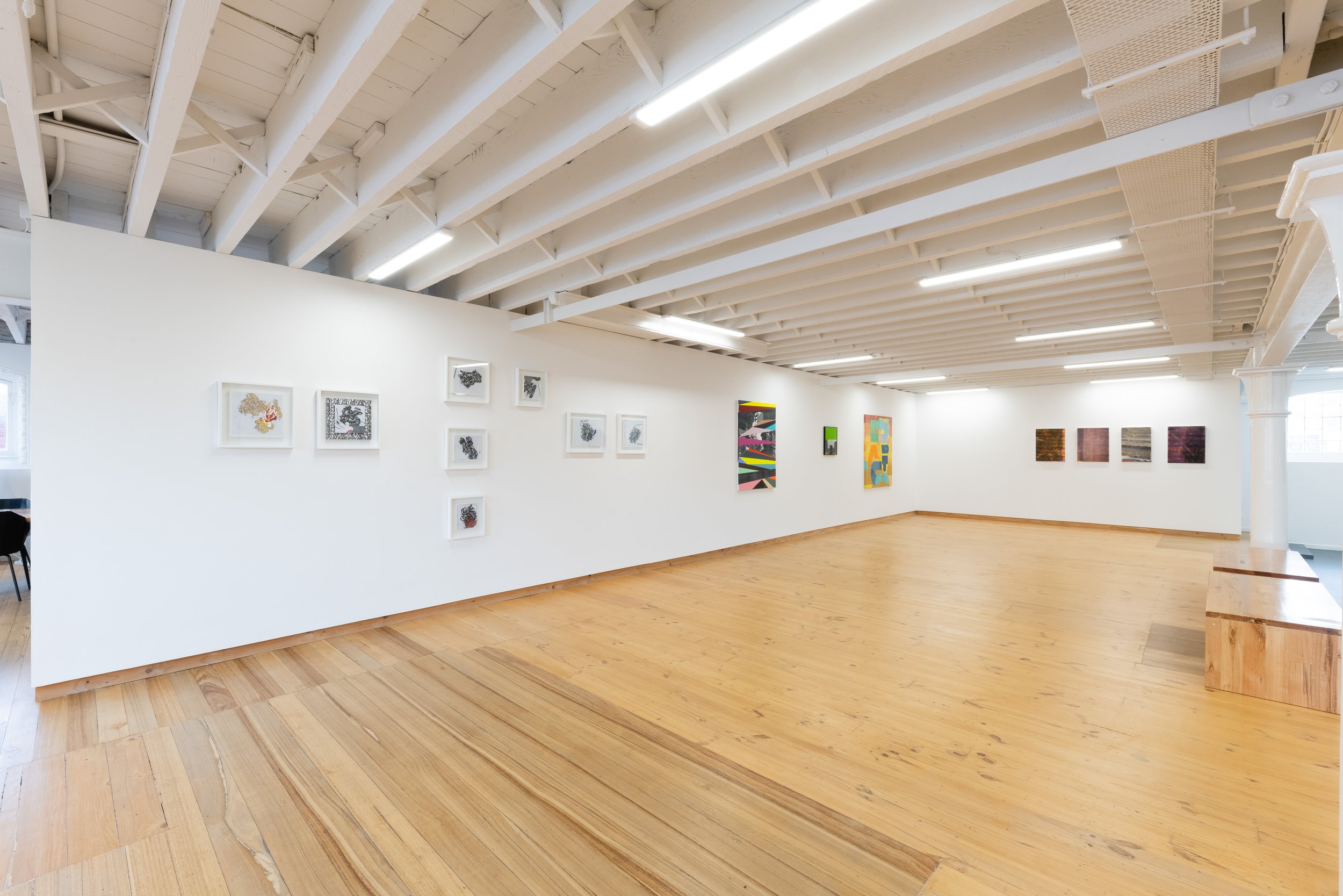
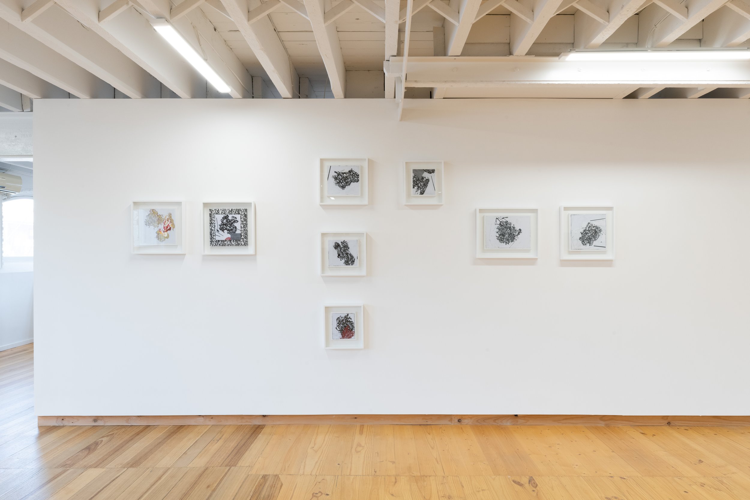
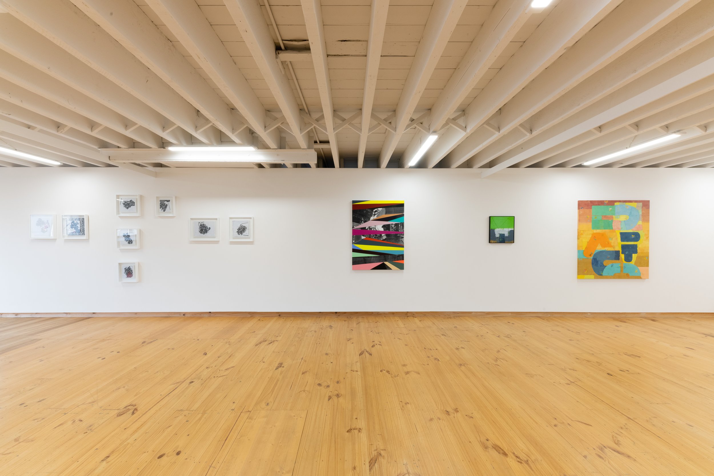
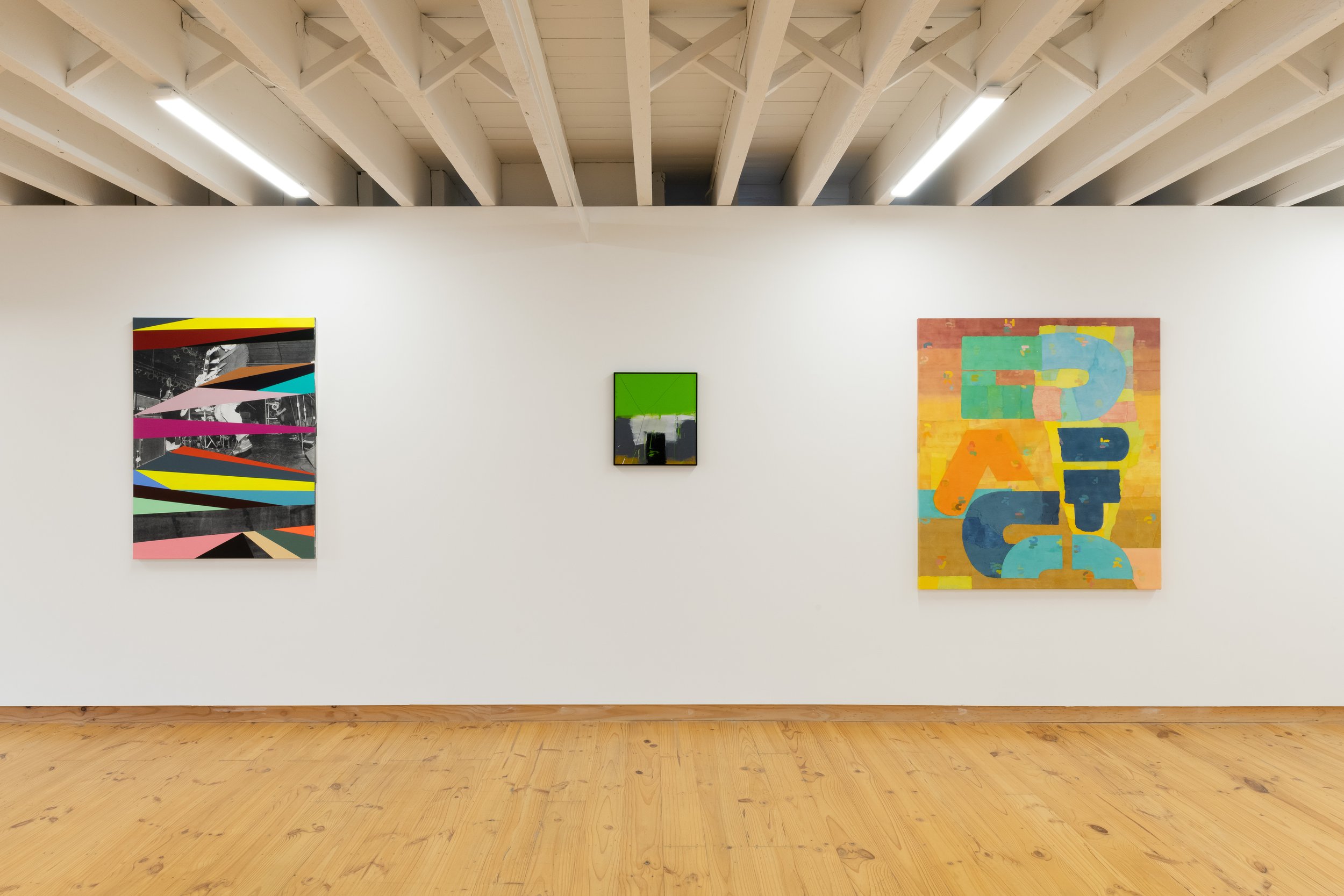
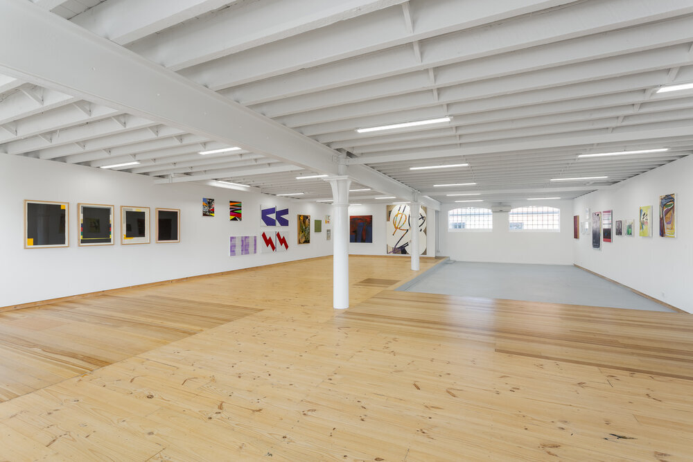
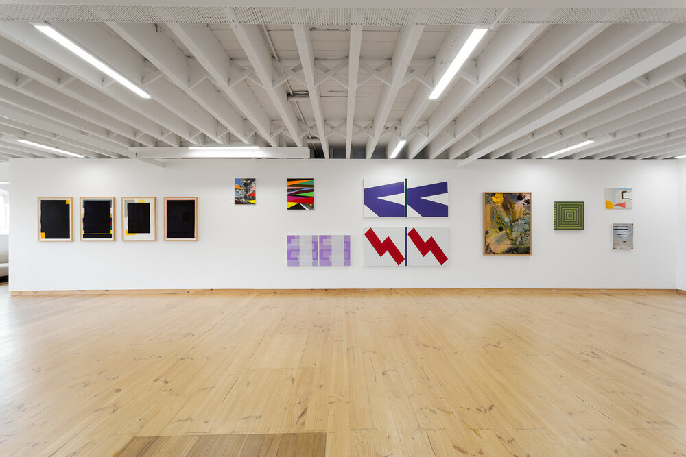
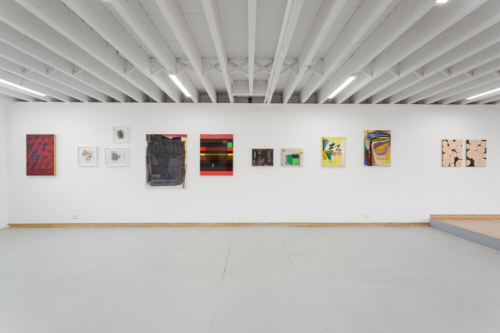
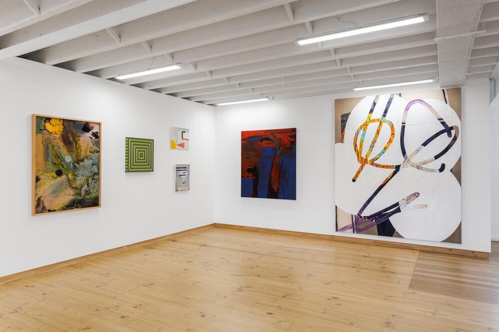
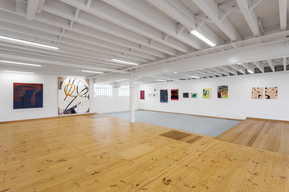
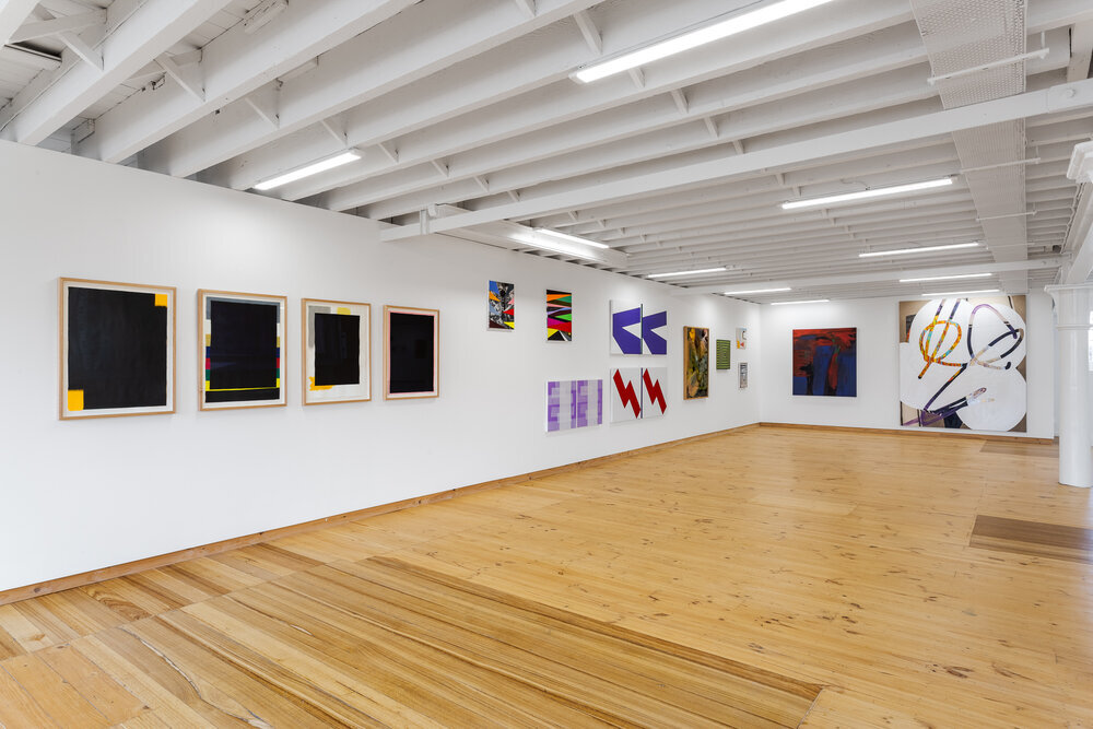
Installation images, The Colour & The Shape. Blockprojects, 2021. Photography: Simon Strong
Blockprojects is please to present The Colour & The Shape, a group exhibition exploring the visual language between shape, form, colour and line in abstraction.
ARTISTS:
Steven Asquith, James Clayden, David Freney-Mills, Jason Haufe, Kyle Jenkins, Paul Newcombe, Tom Vincent, David Wallage.
SELECTED ARTWORKS:


HOW SOON IS NOW
12.08.20 - 12.09.20
Installation images, How Soon is Now. Blockprojects, 2020.
Blockprojects is proud to present, HOW SOON IS NOW,
an exhibition featuring fifteen contemporary artists who explore the mystery of abstraction.
ARTISTS:
Darren Munce
Julia Powles
Eduardo Santos
David Thomas
Tom Vincent
David Wallage
Peter Westwood
Neil Keith Baker
Merric Brettle
James Clayden
Dandan Dai
Robert Doble
Marc Freeman
Kyle Jenkins
Jason Haufe