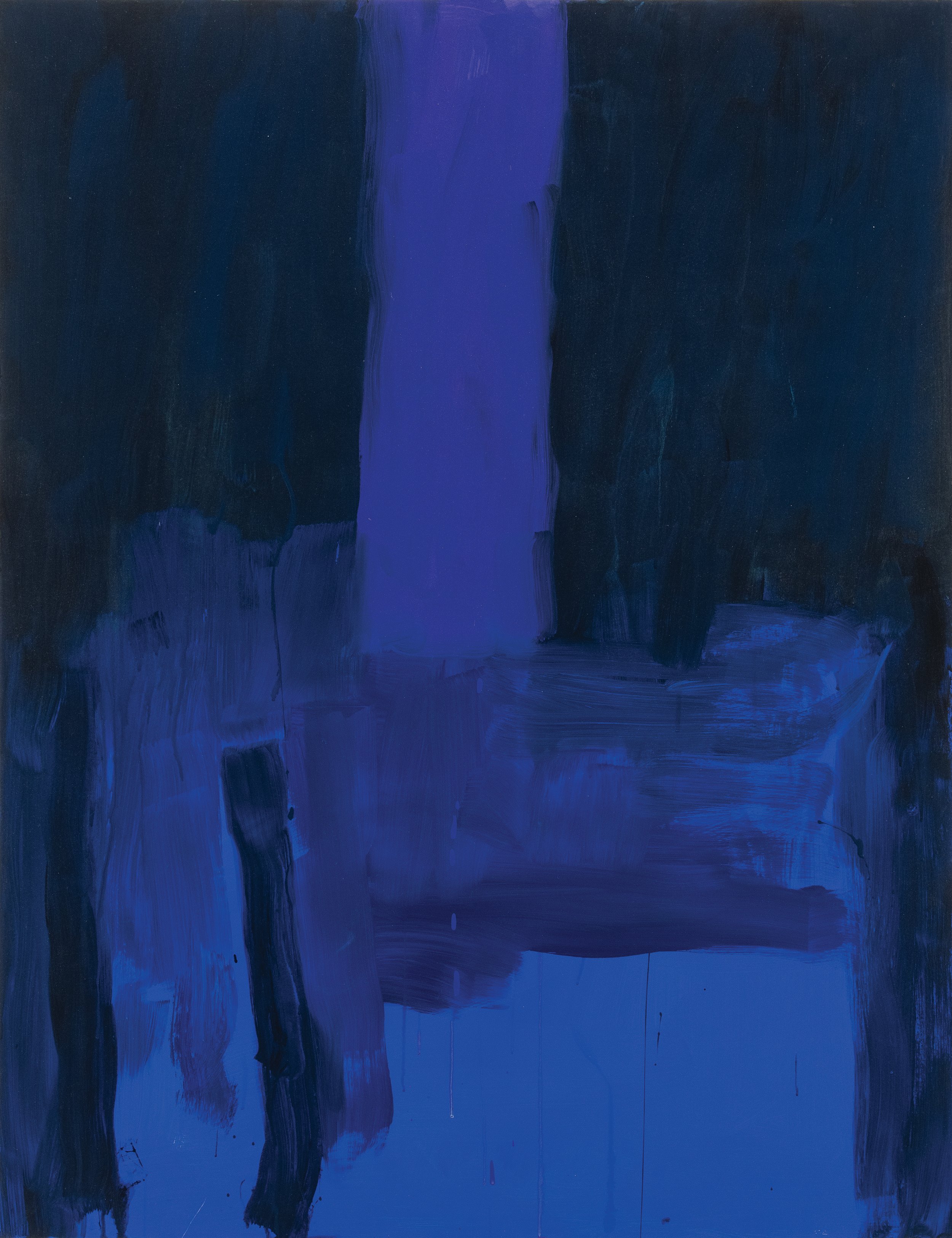
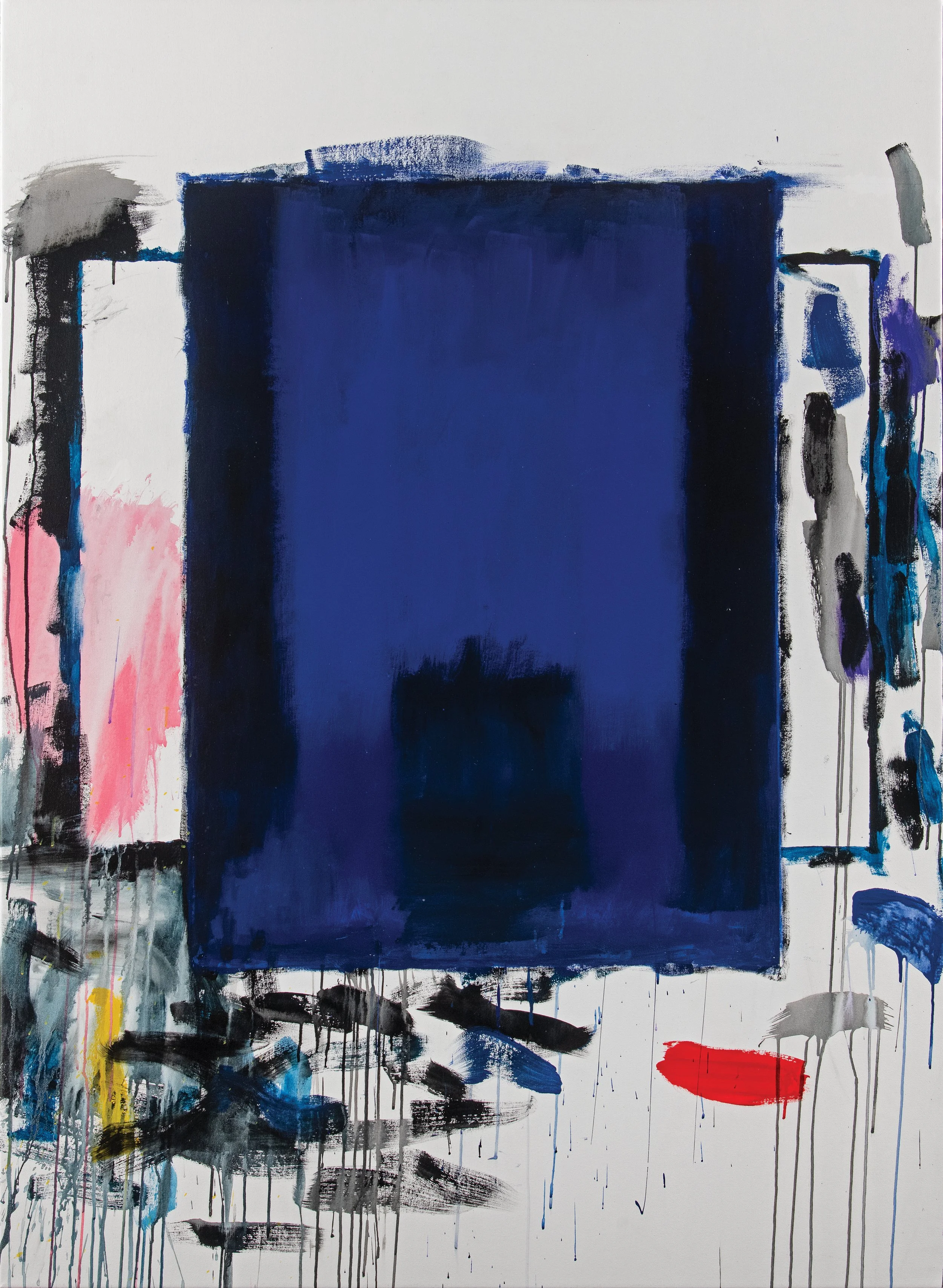
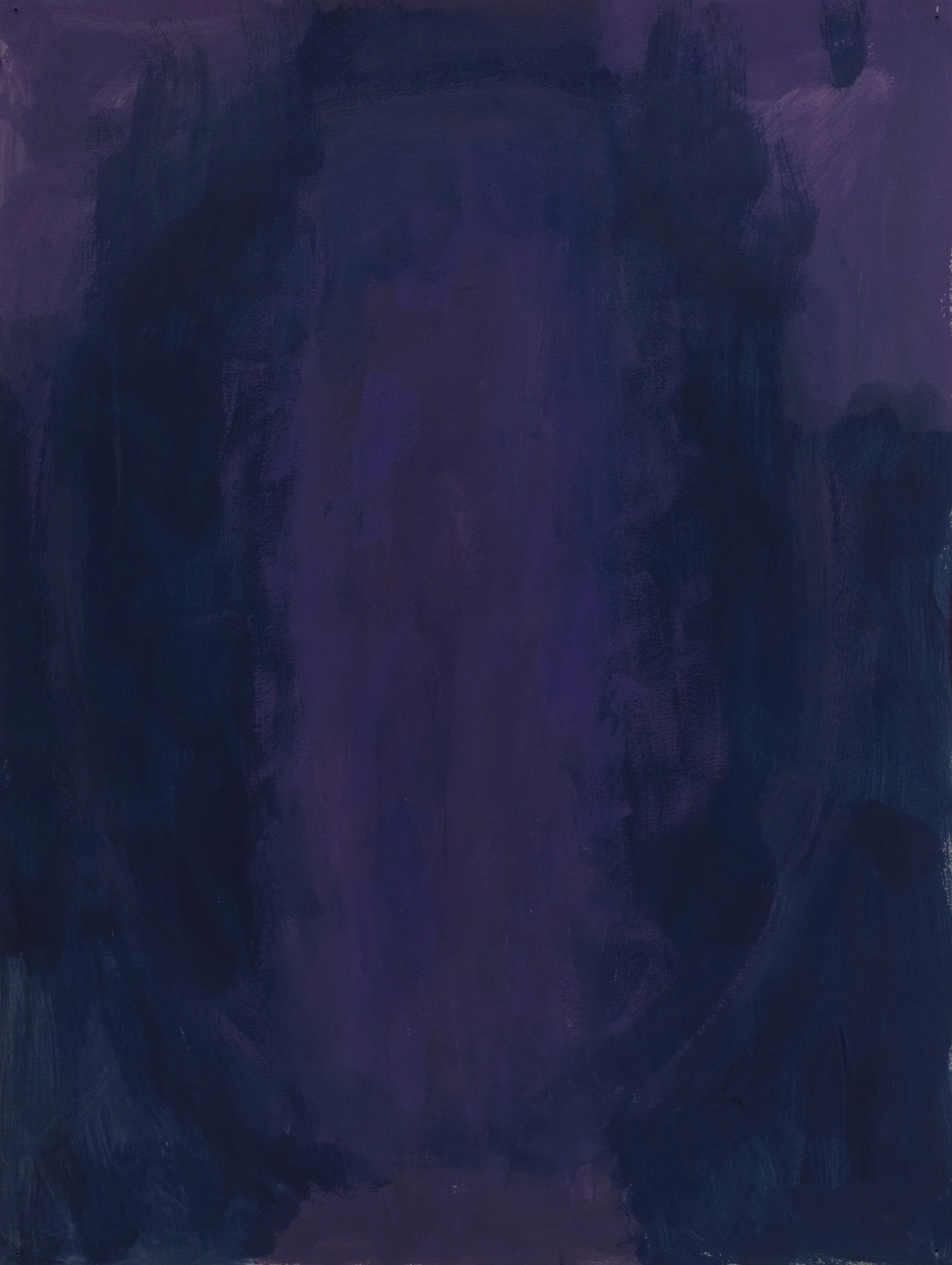
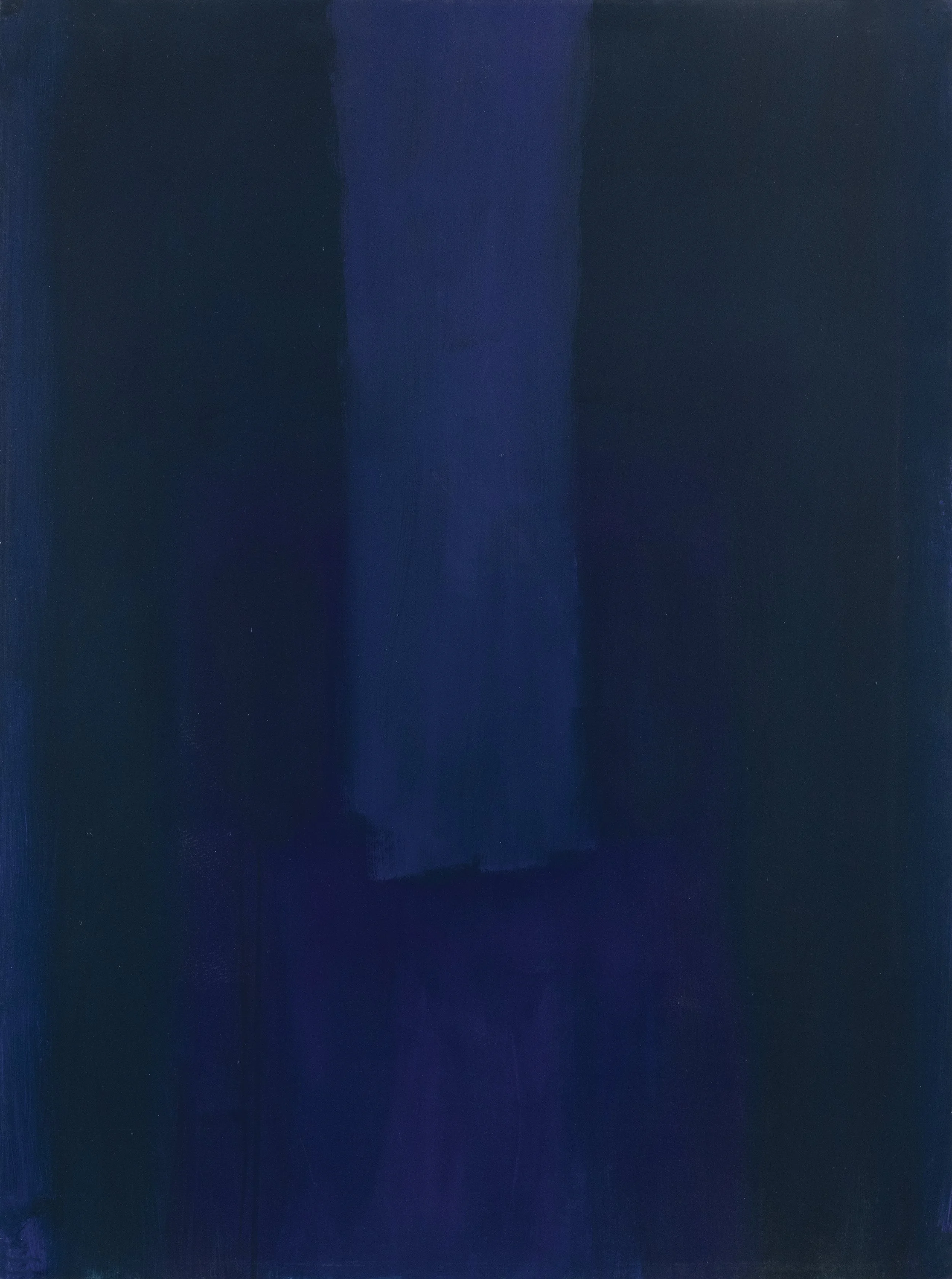
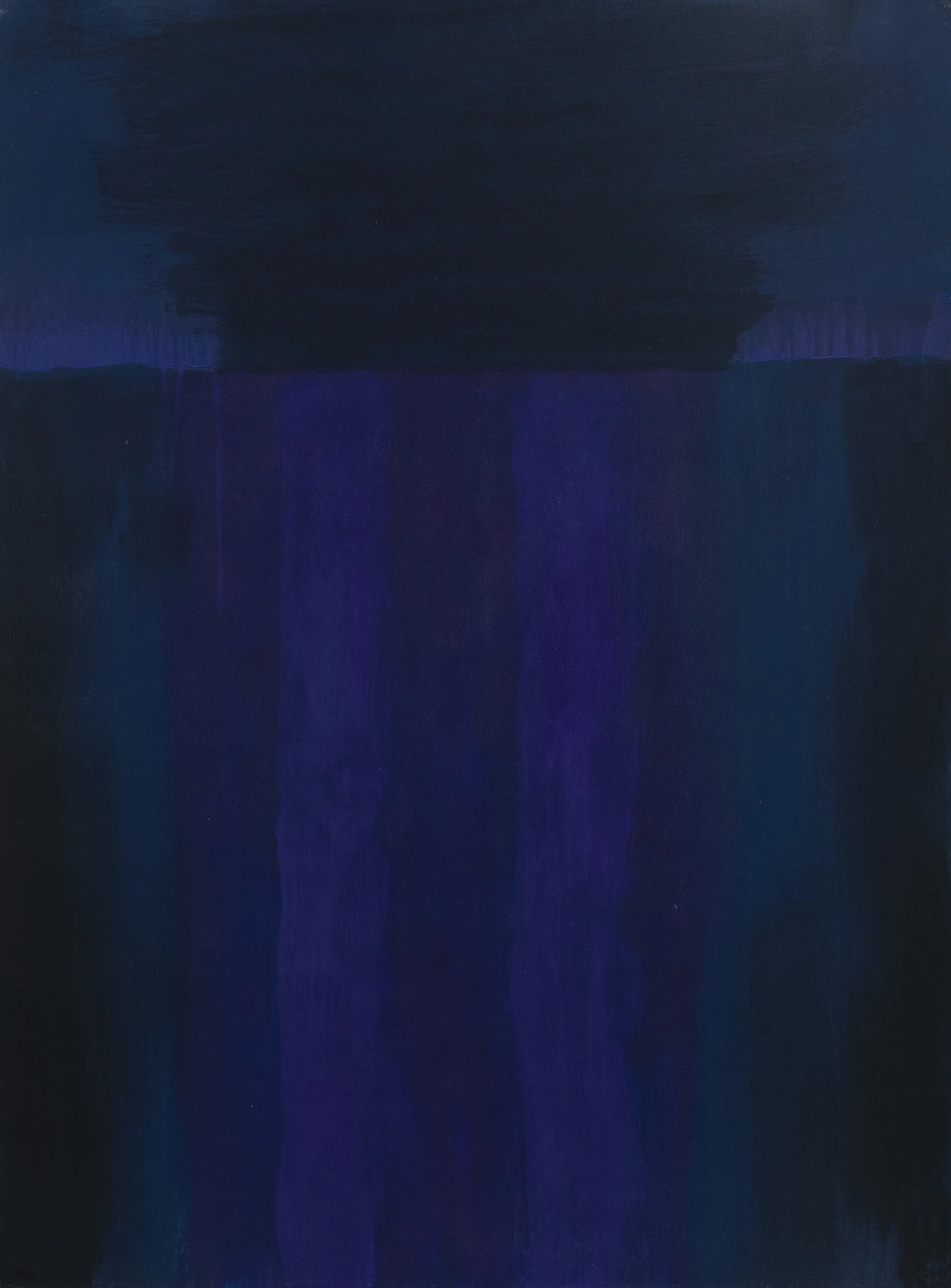
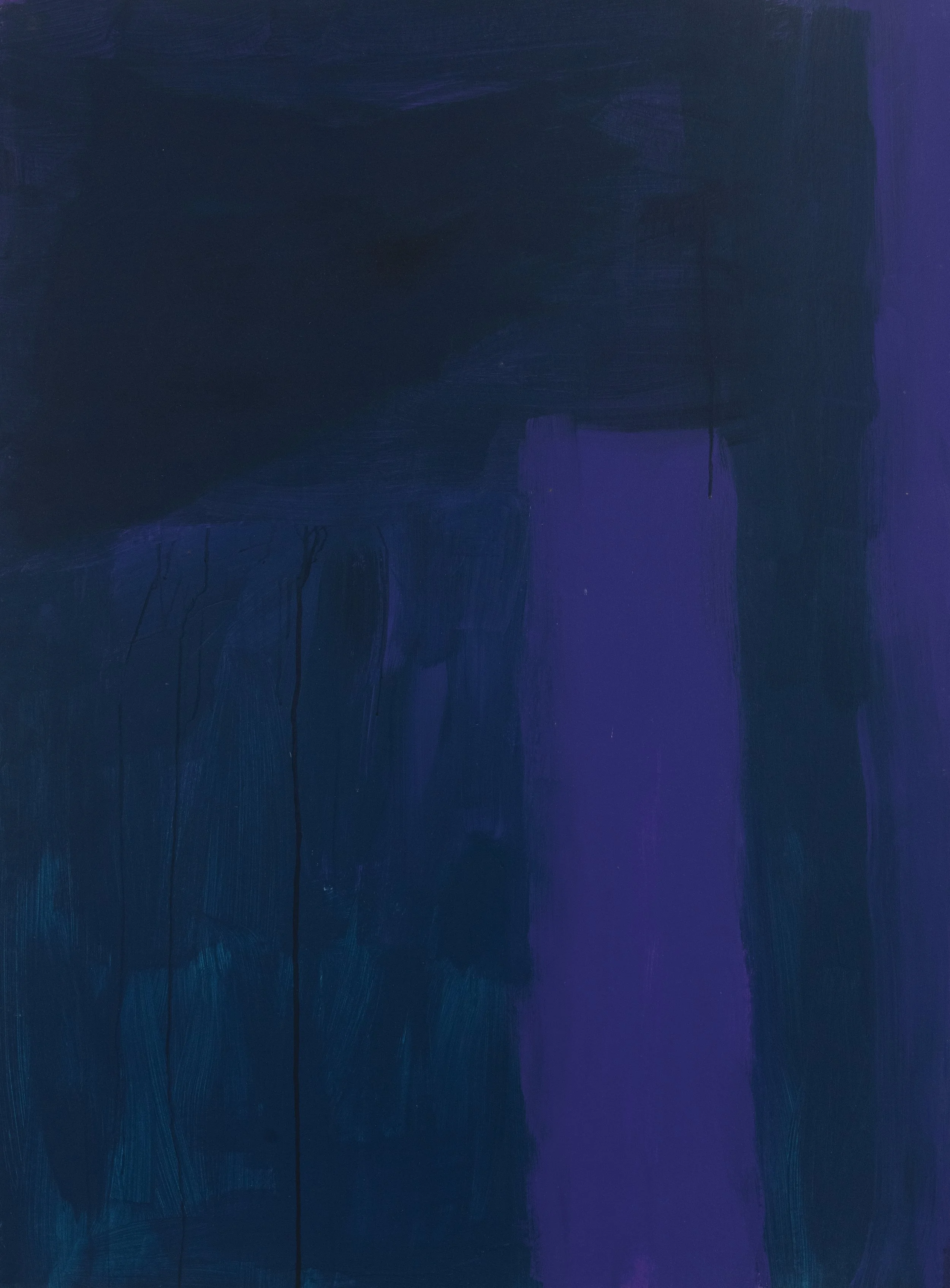
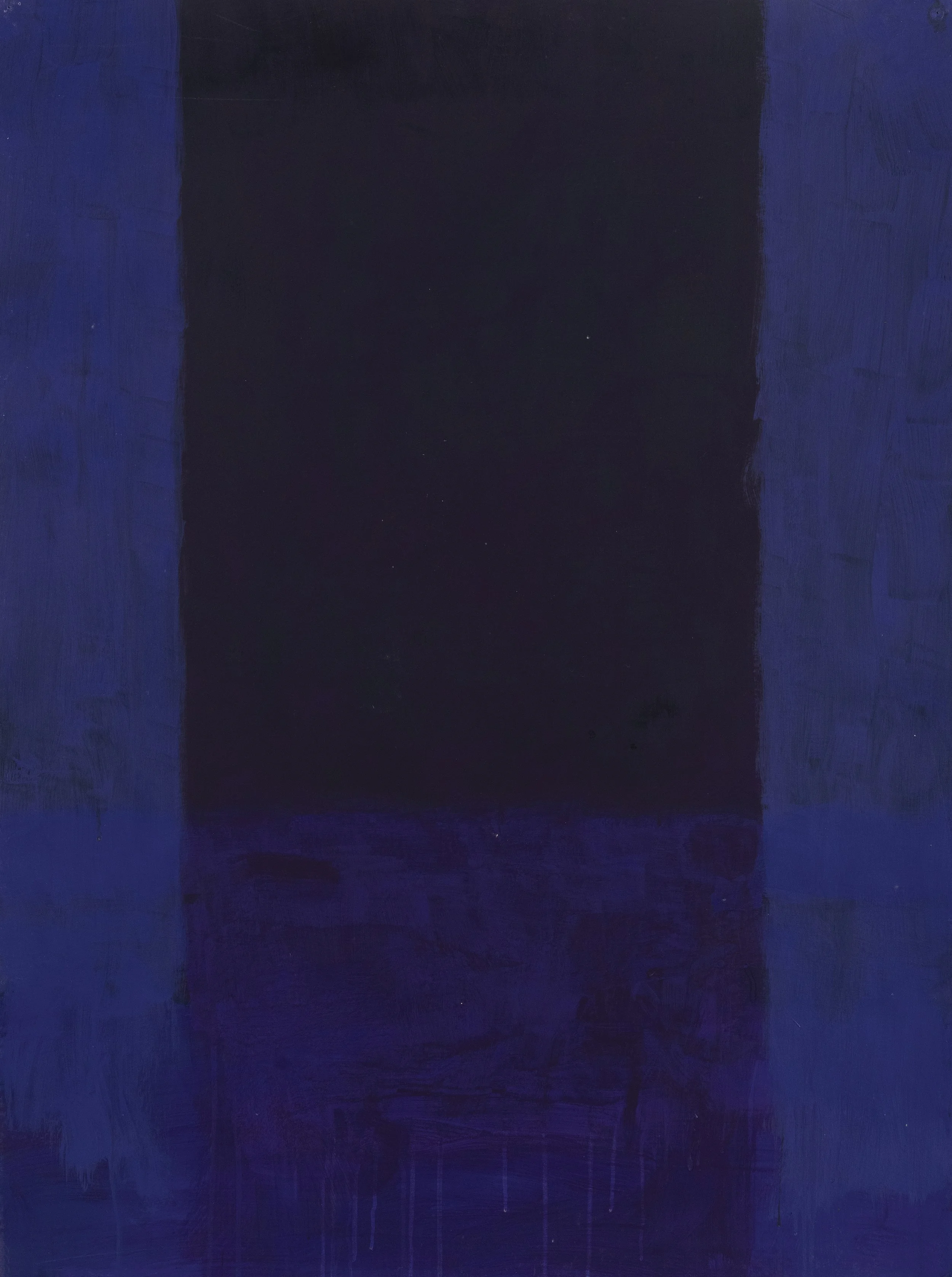
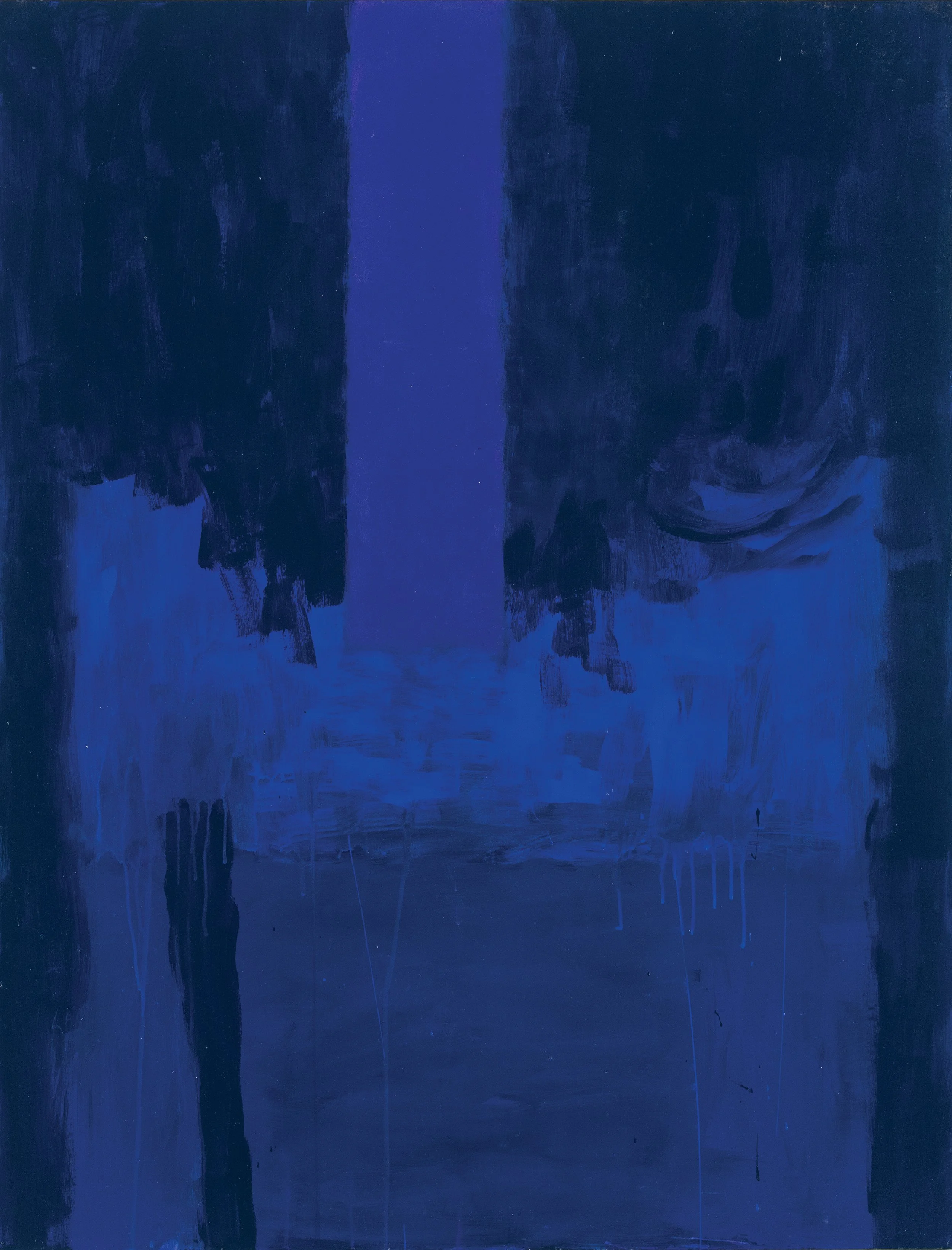
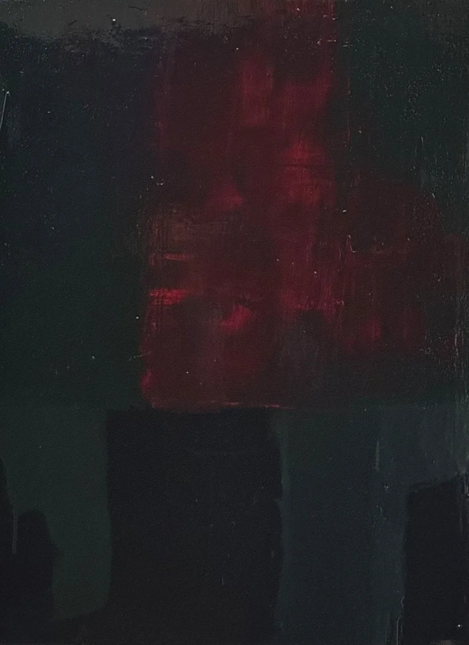
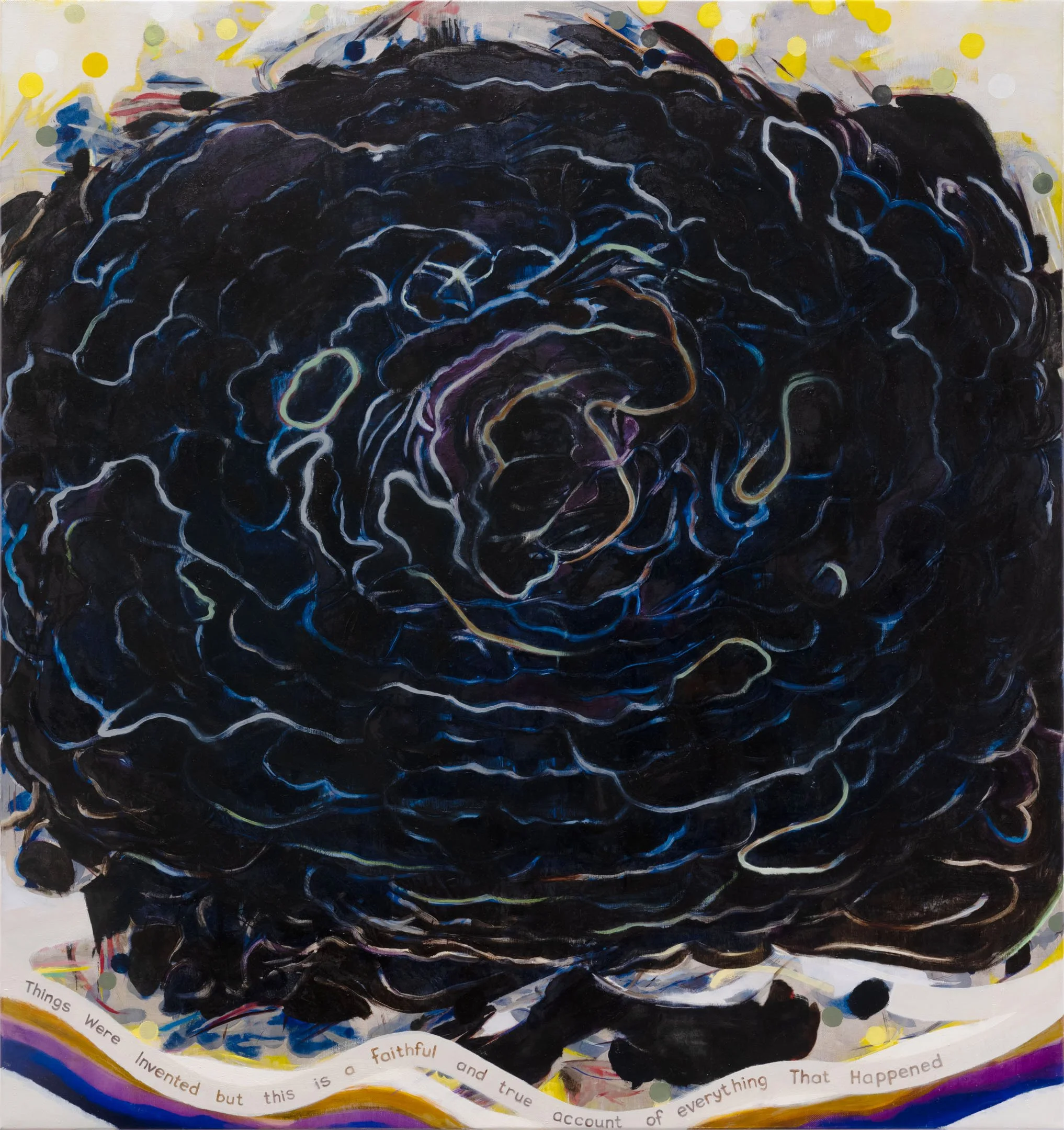
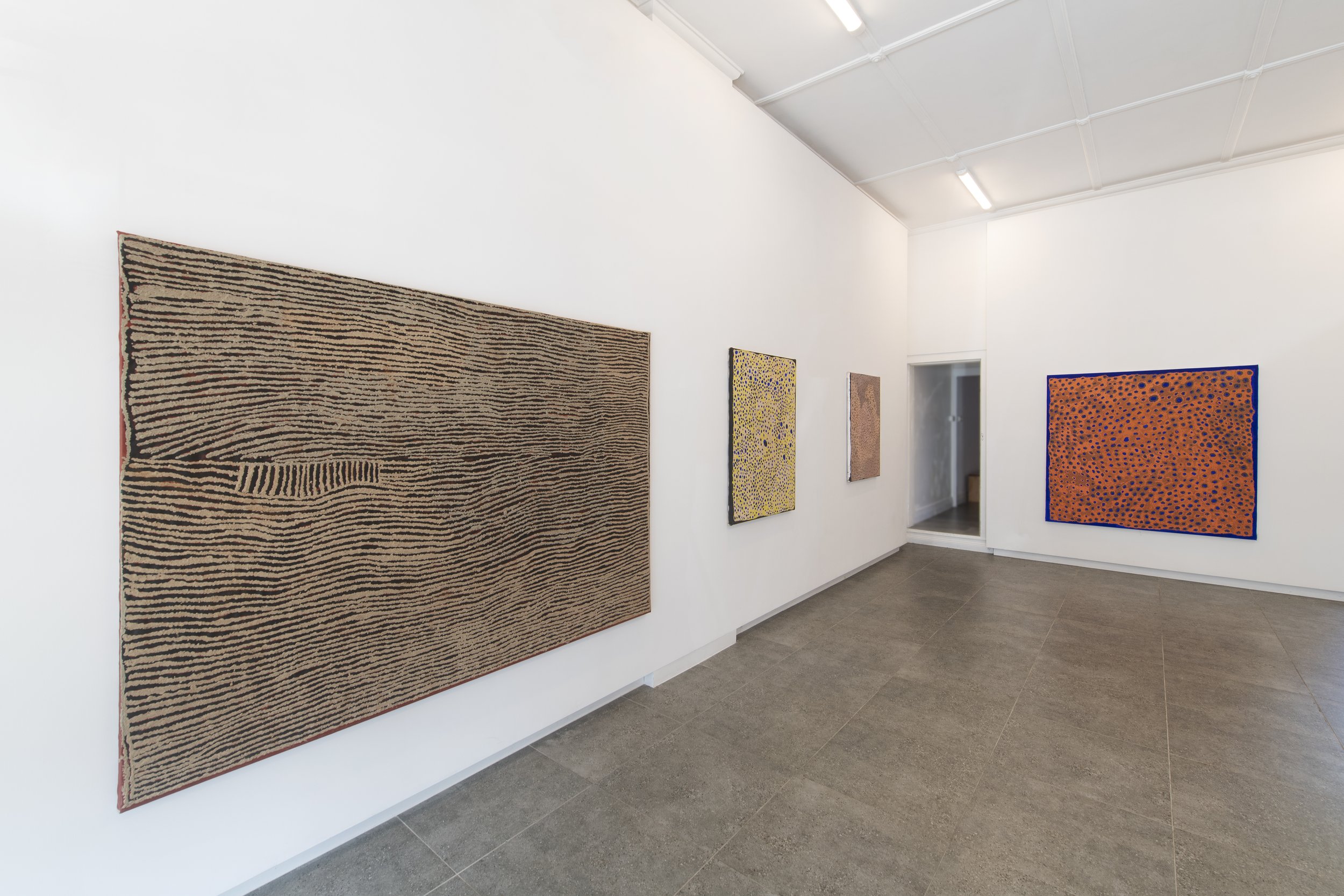
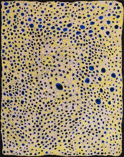
james Clayden: breath paintings
JAMES CLAYDEN BREATH PAINTINGS
JAMES CLAYDEN
04.03.26 - 02.04.26
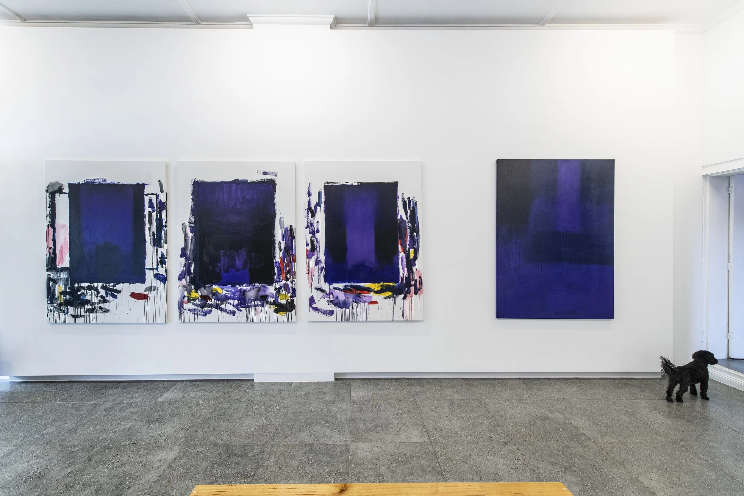
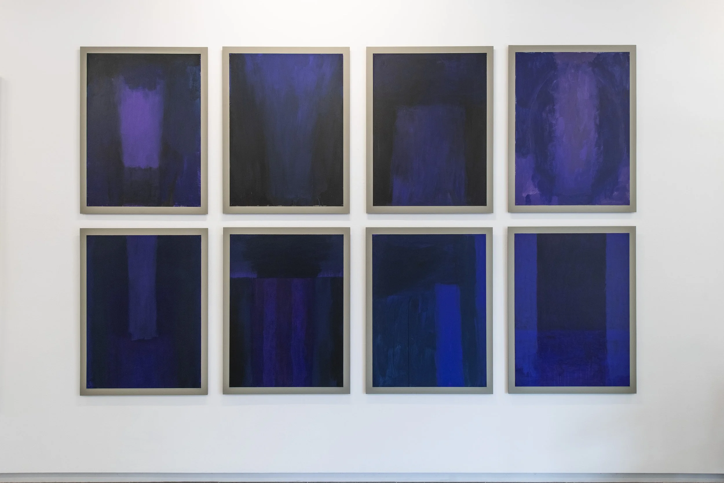
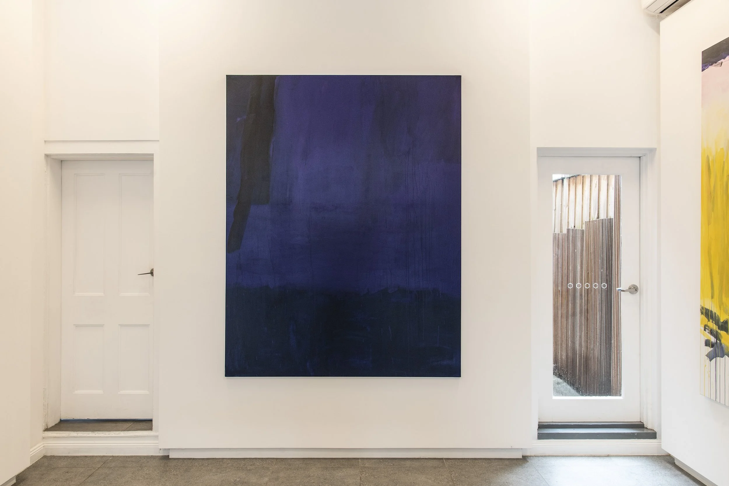
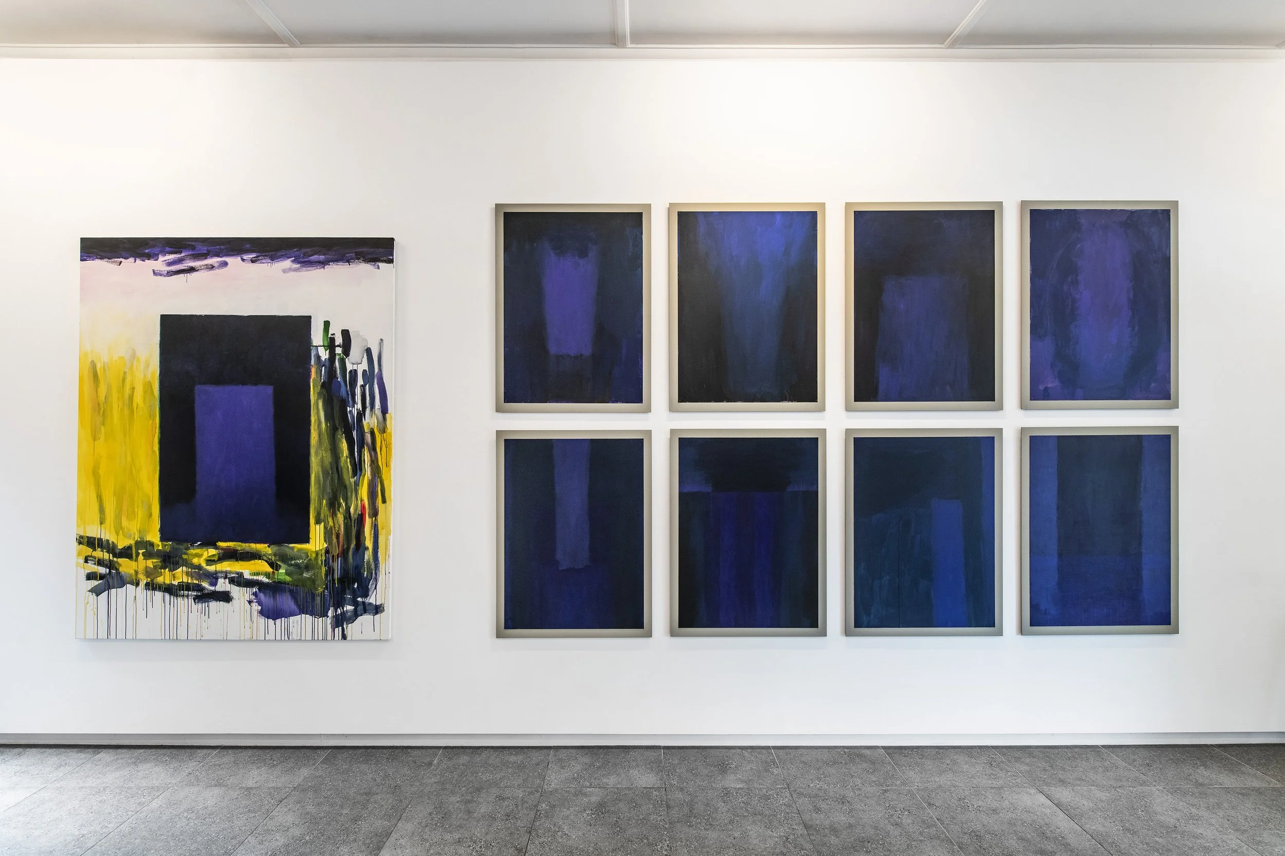
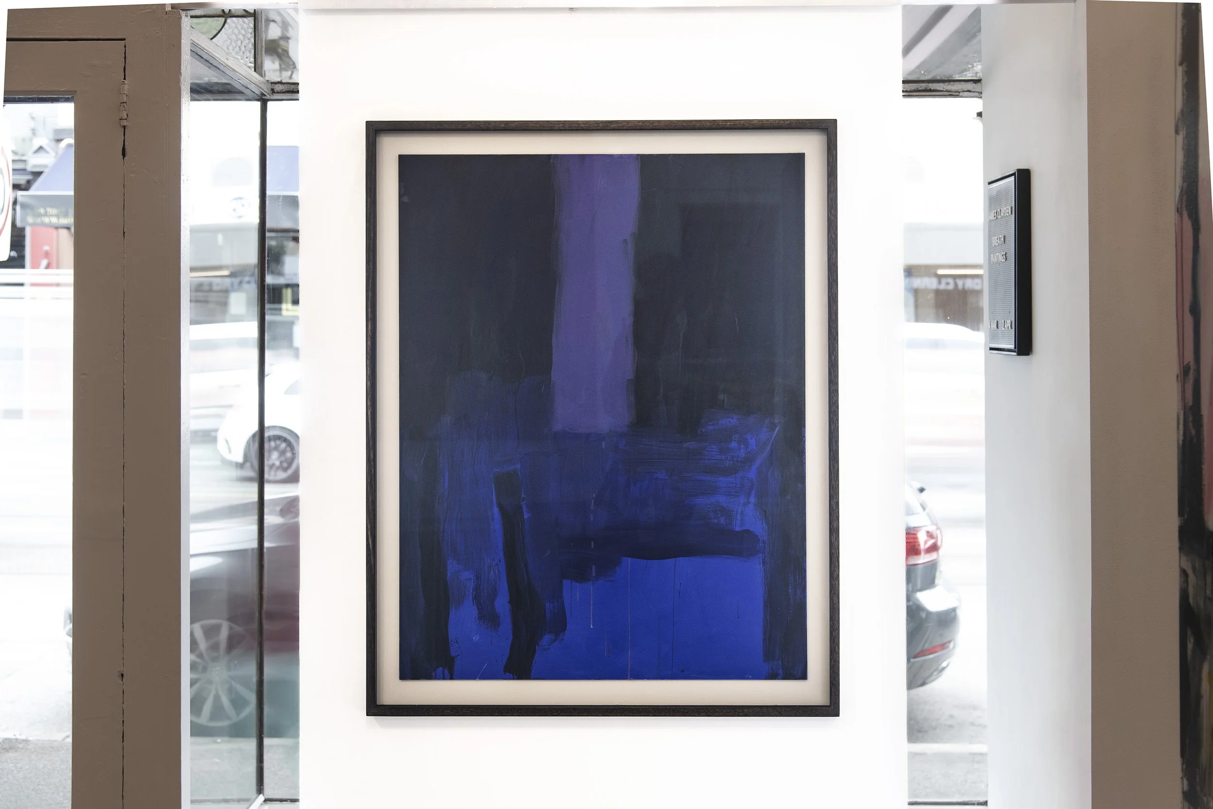
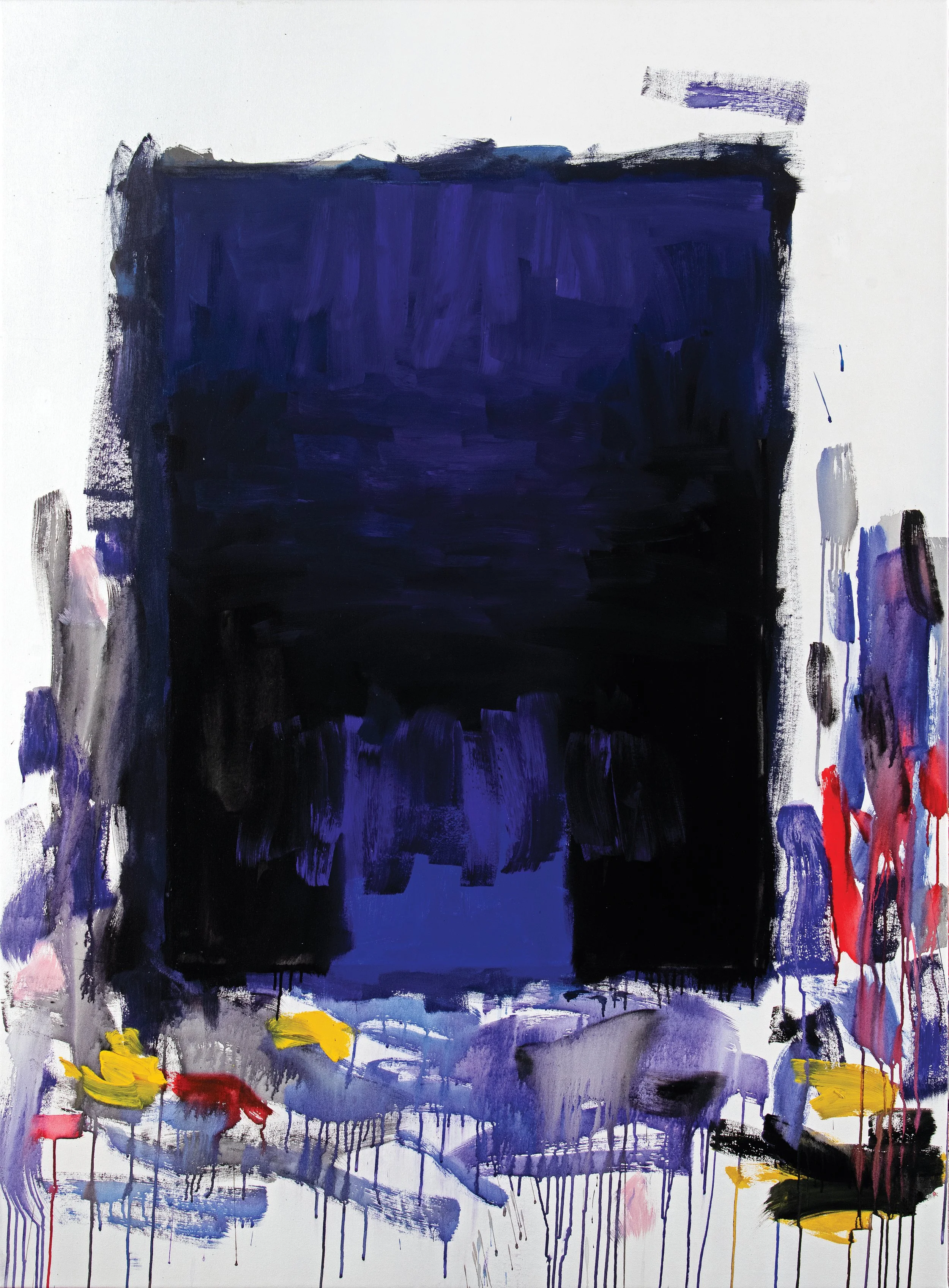
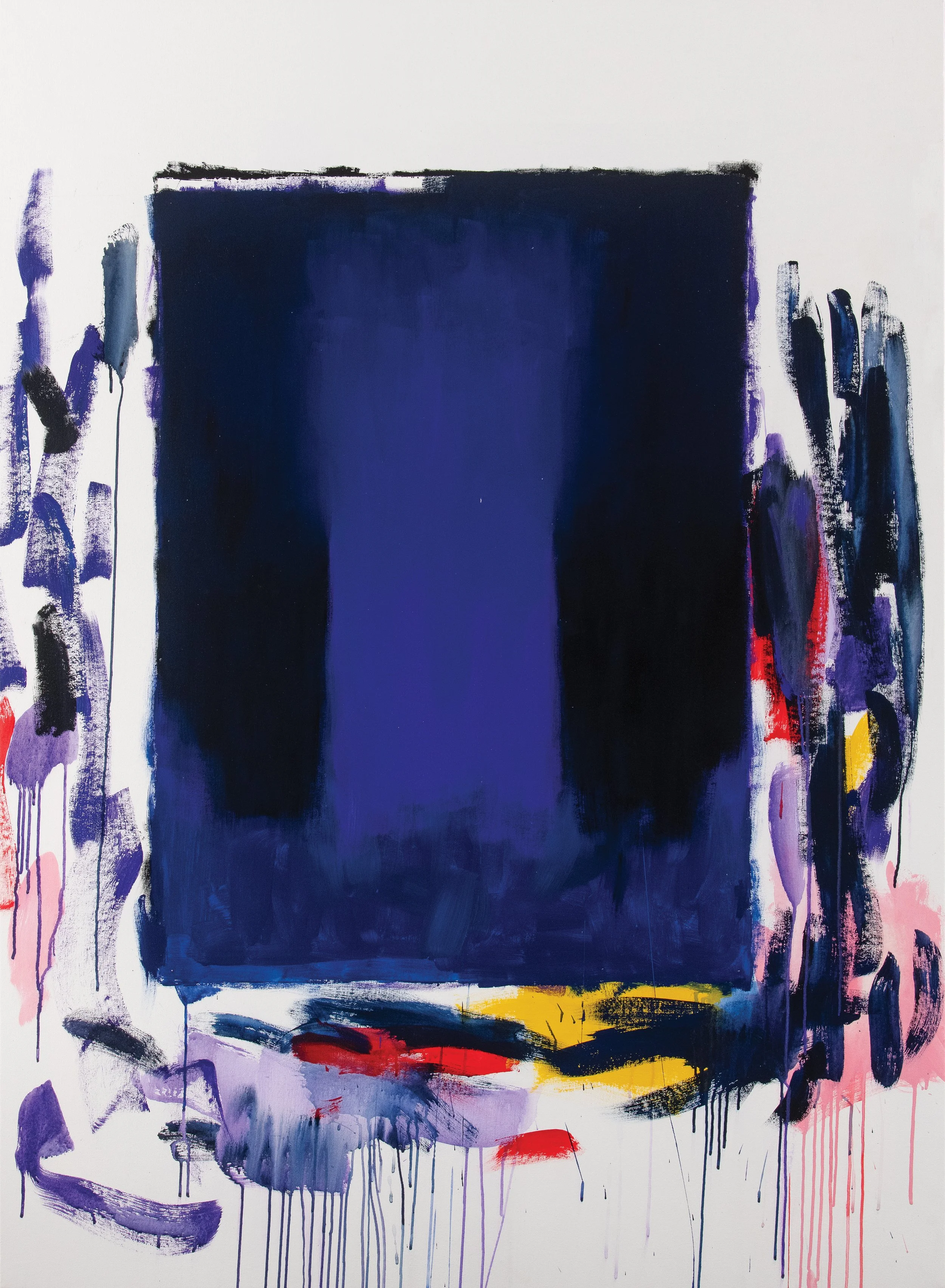
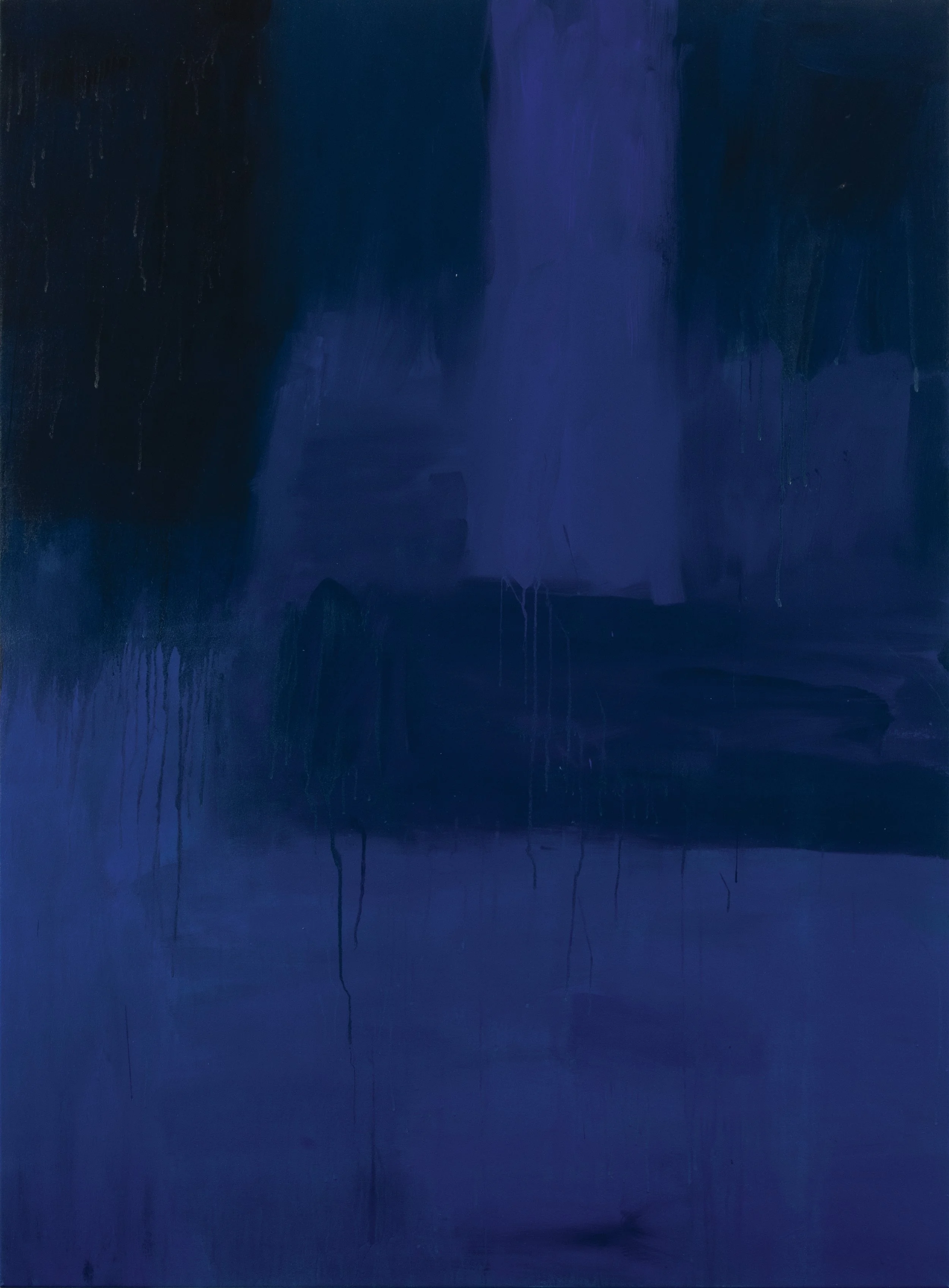
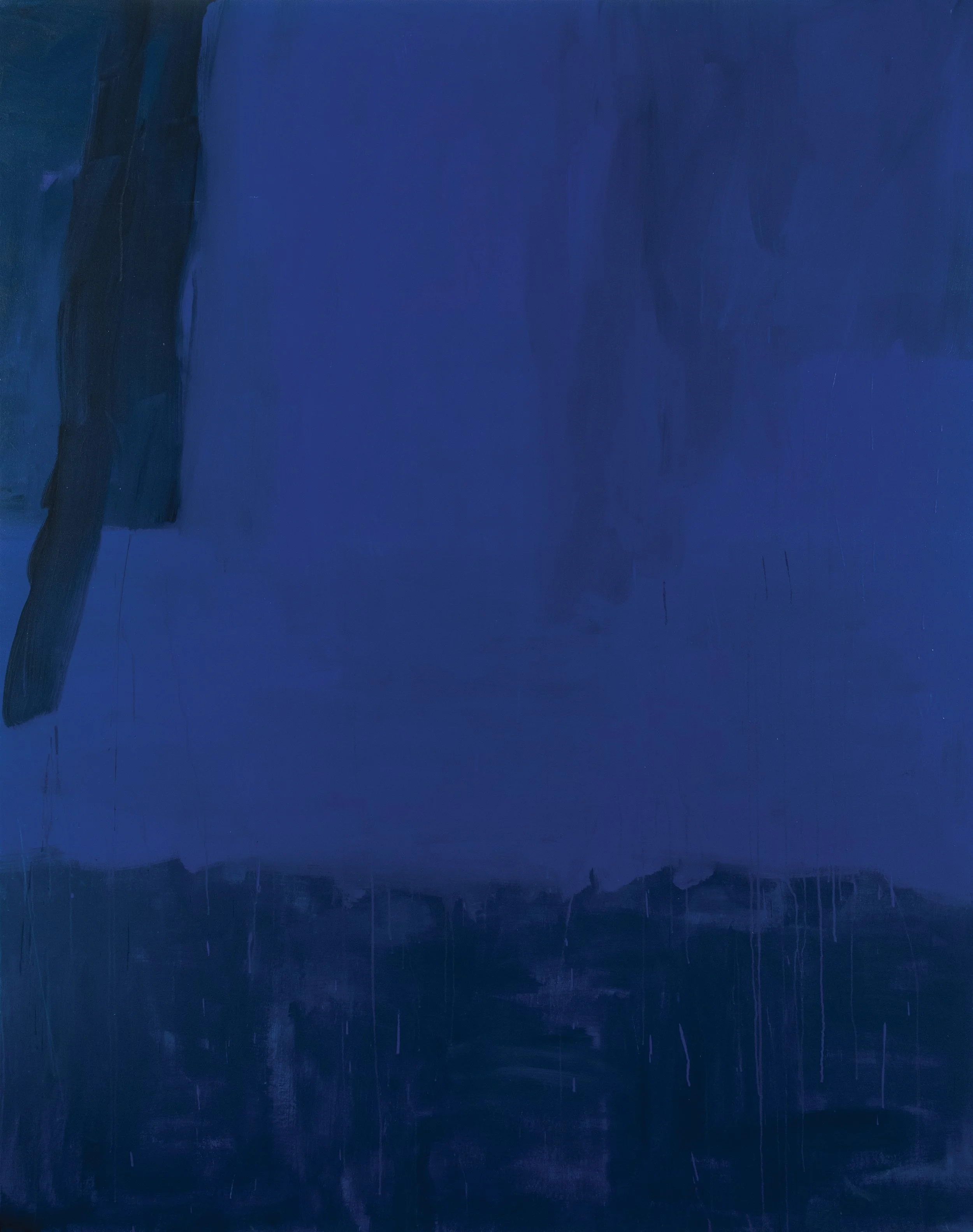
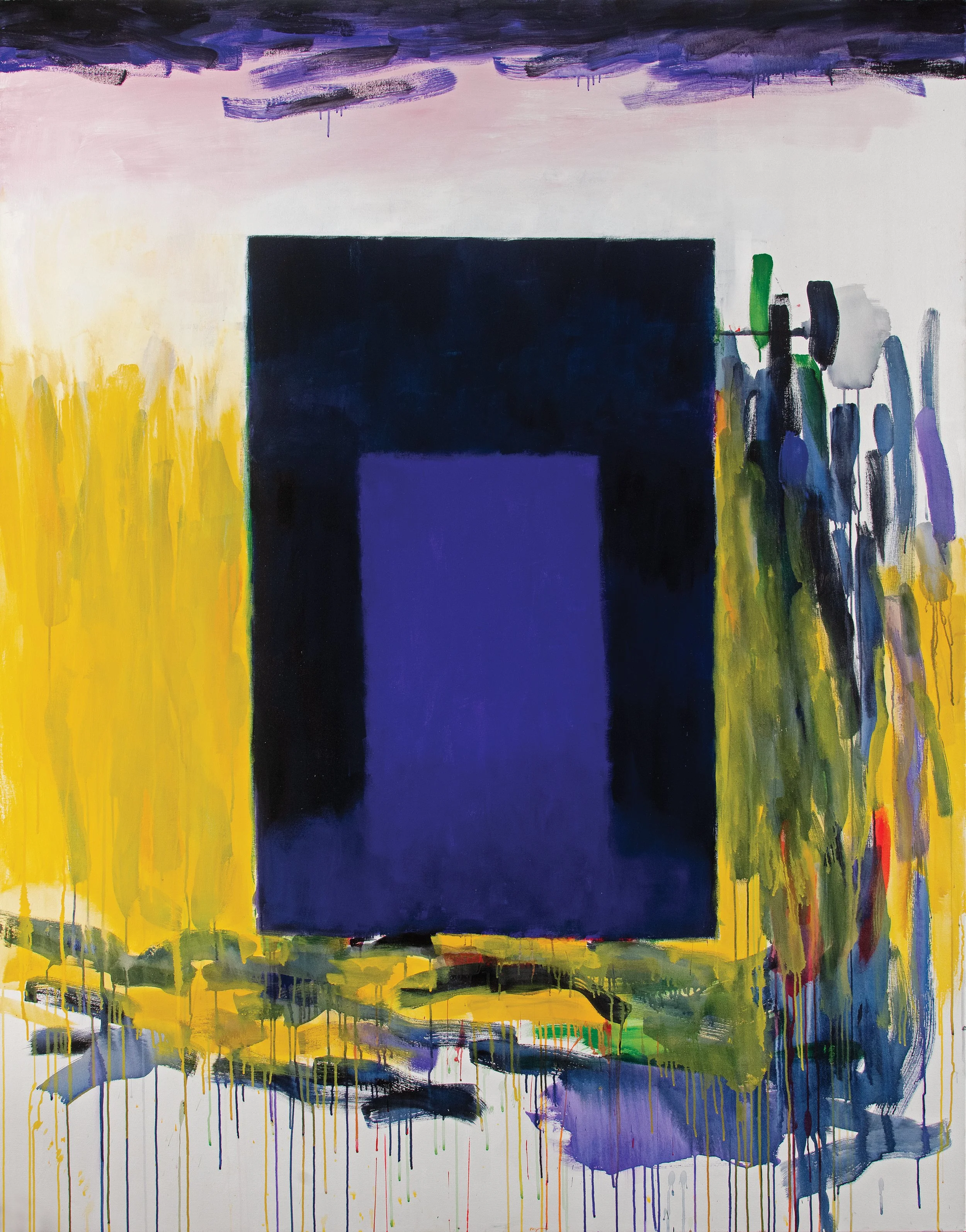
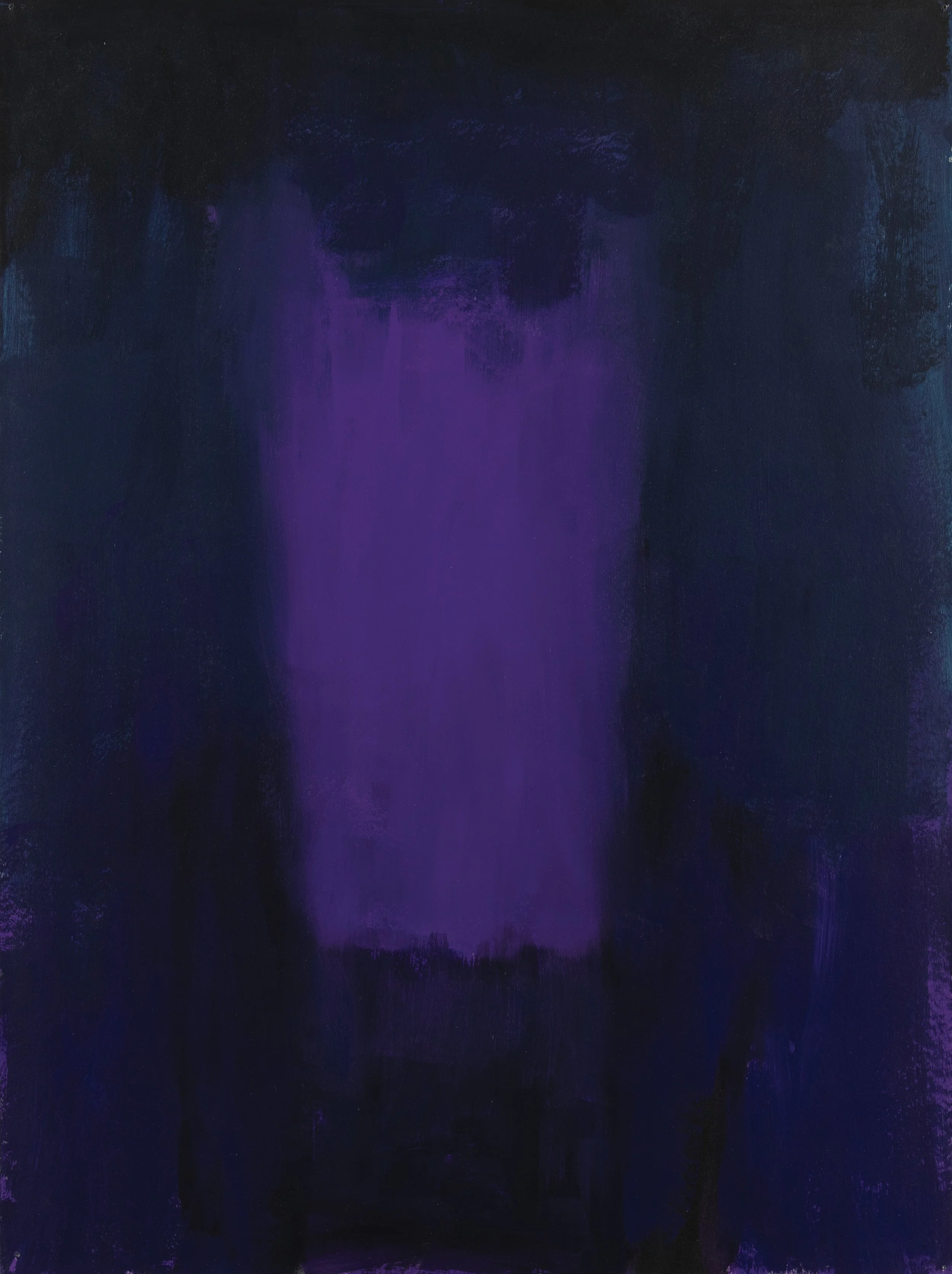
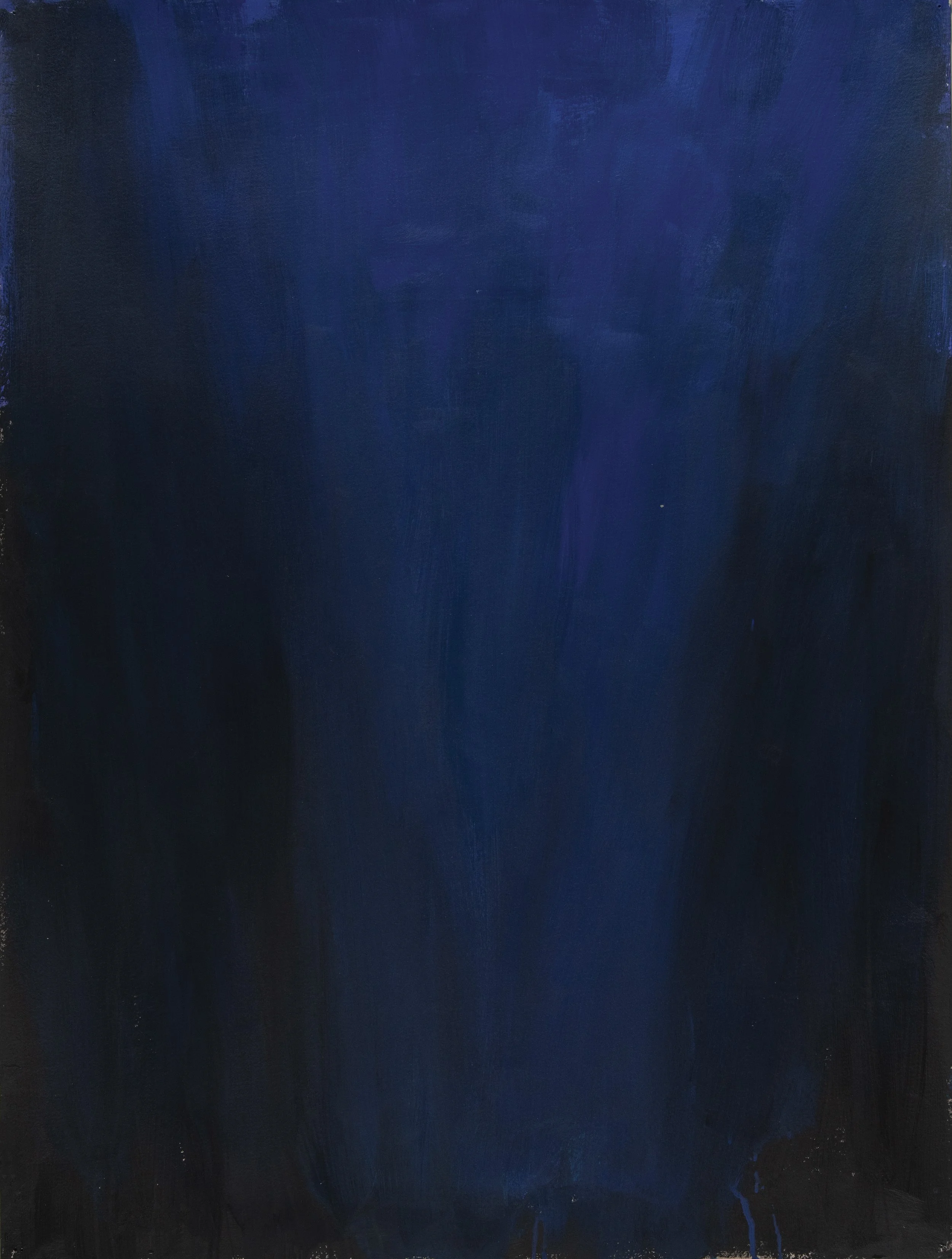
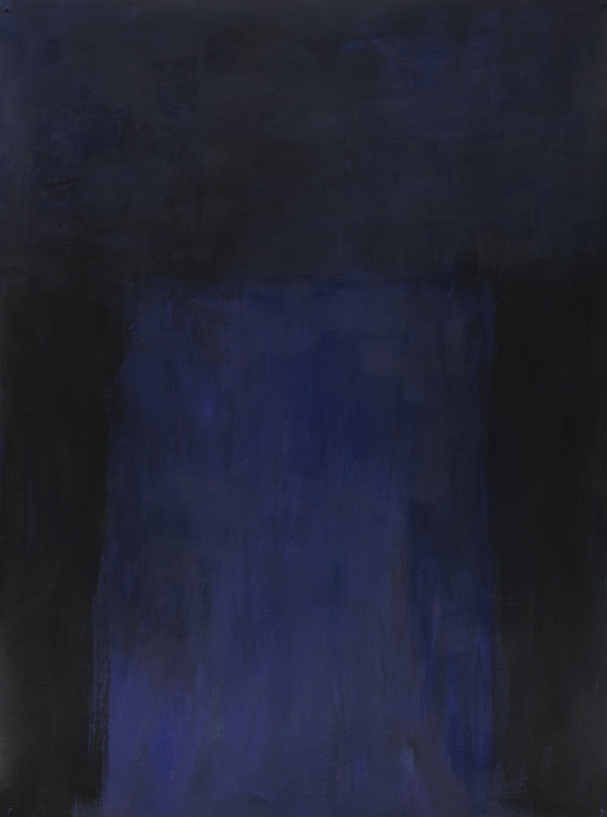
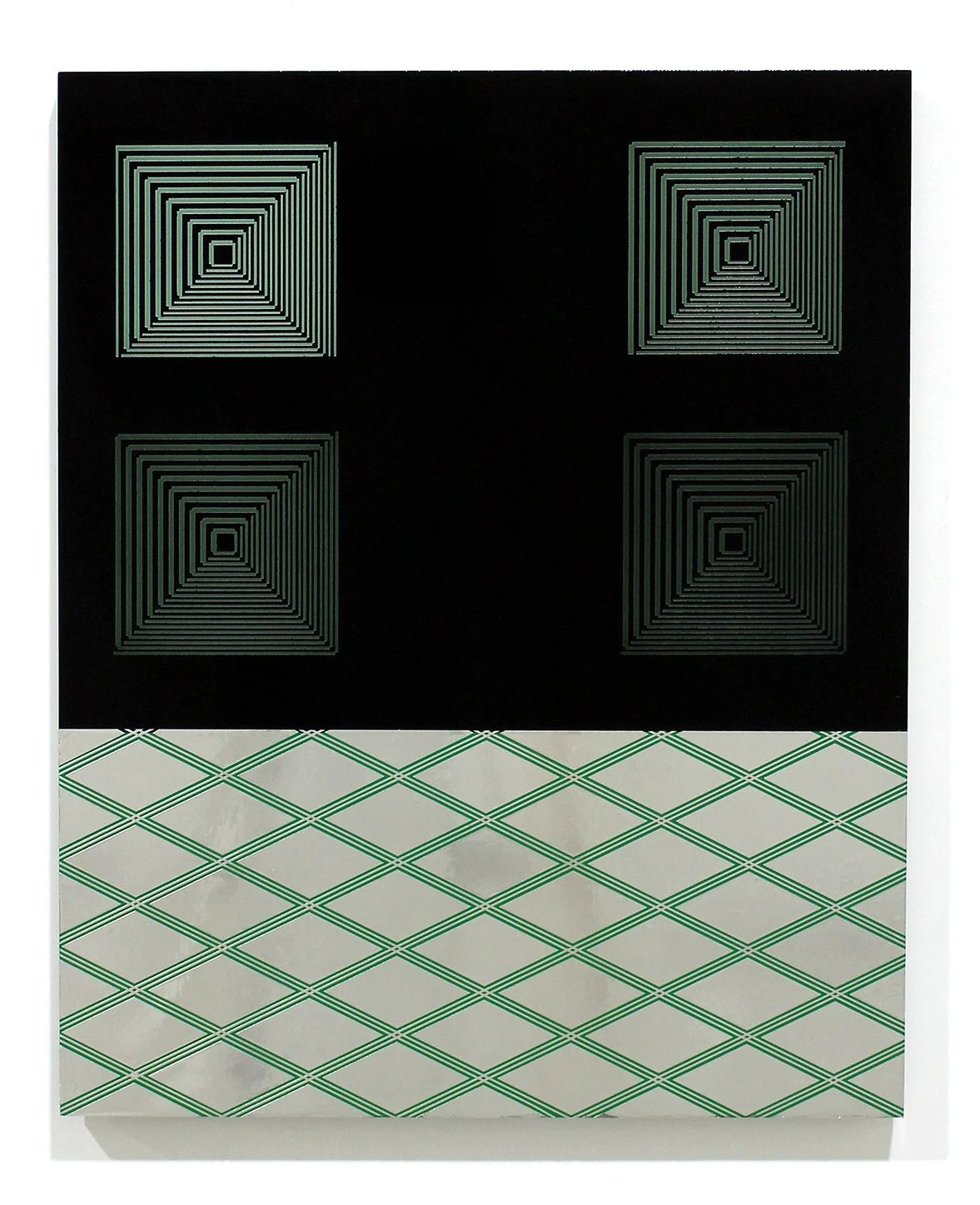
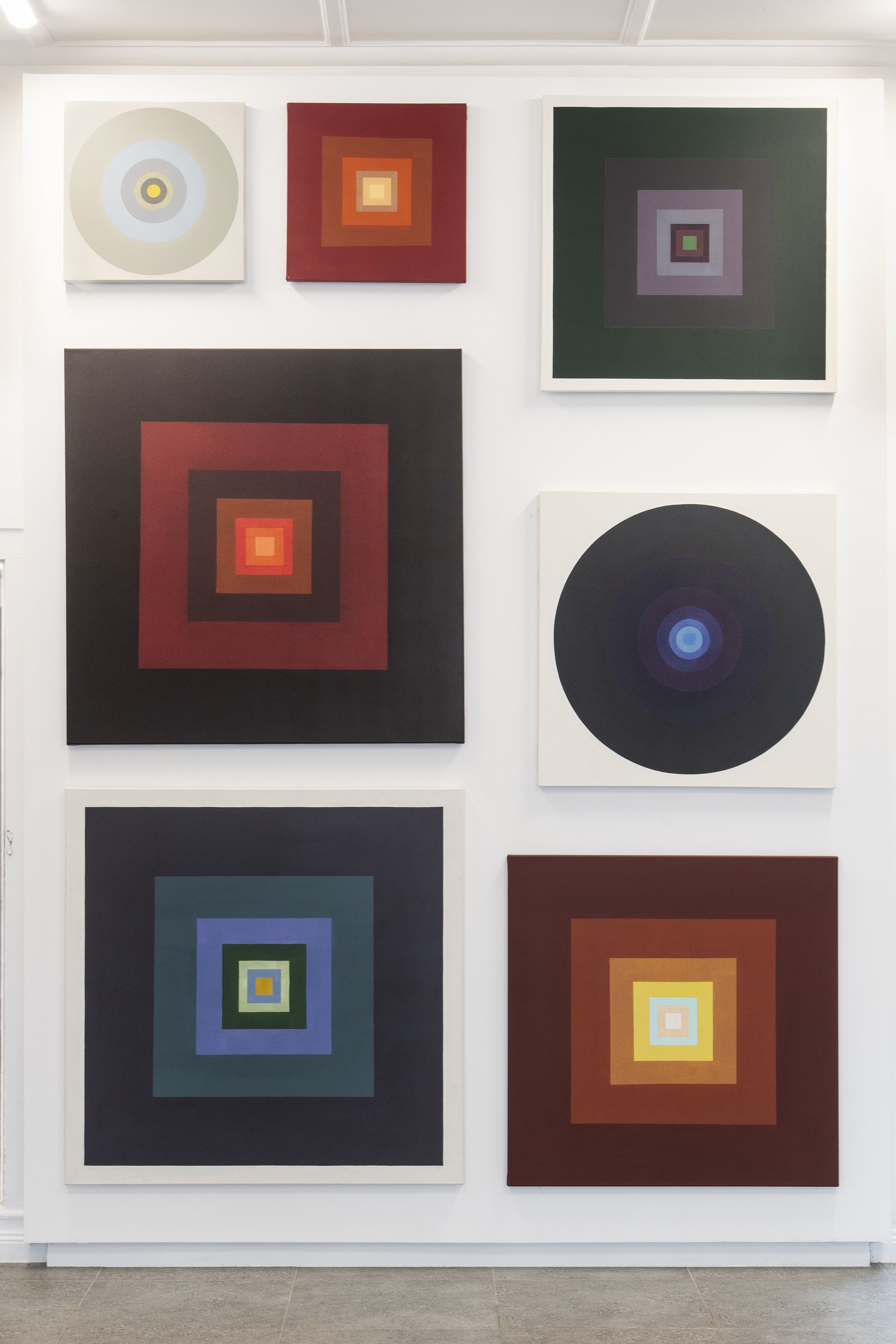
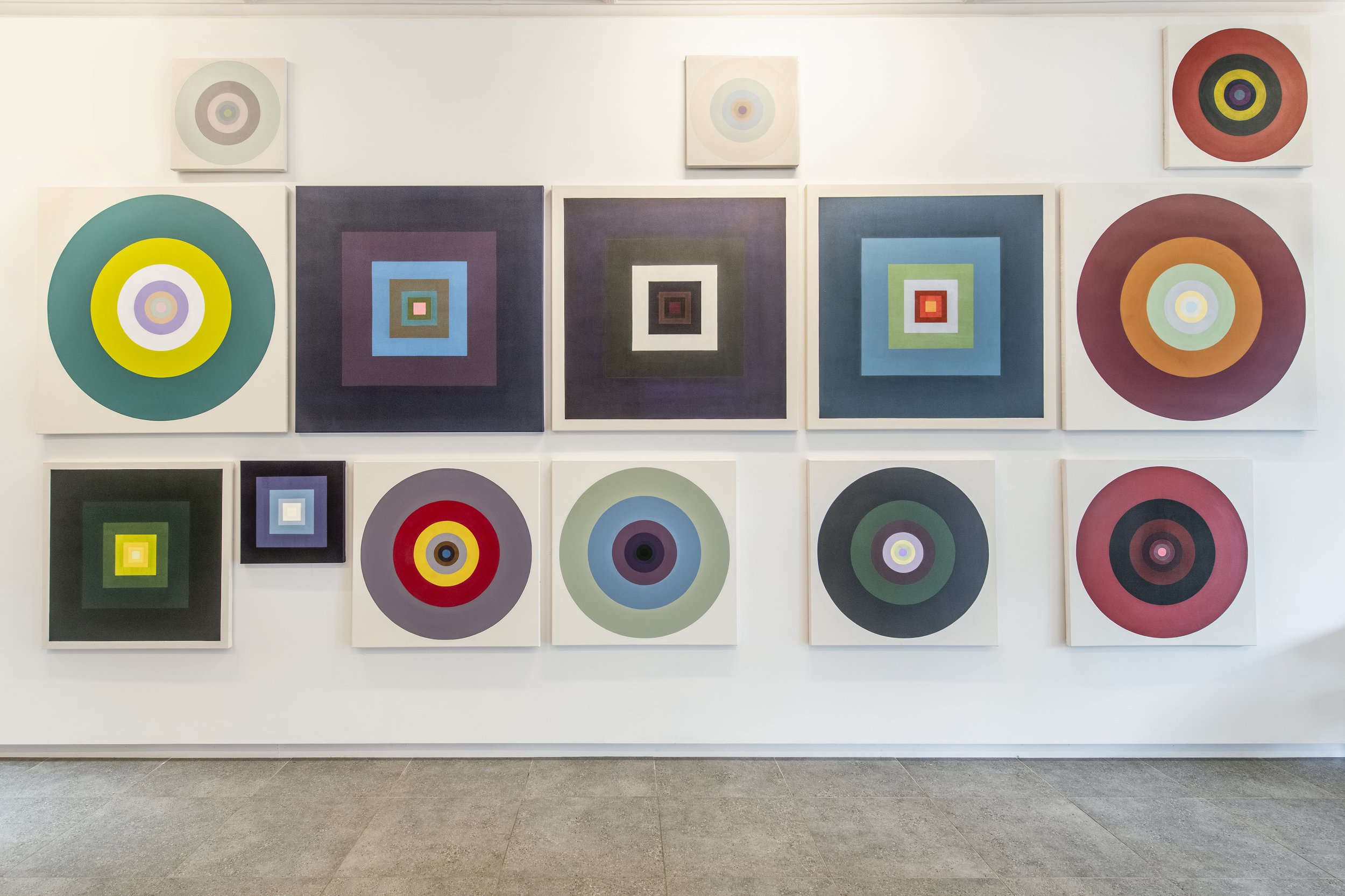
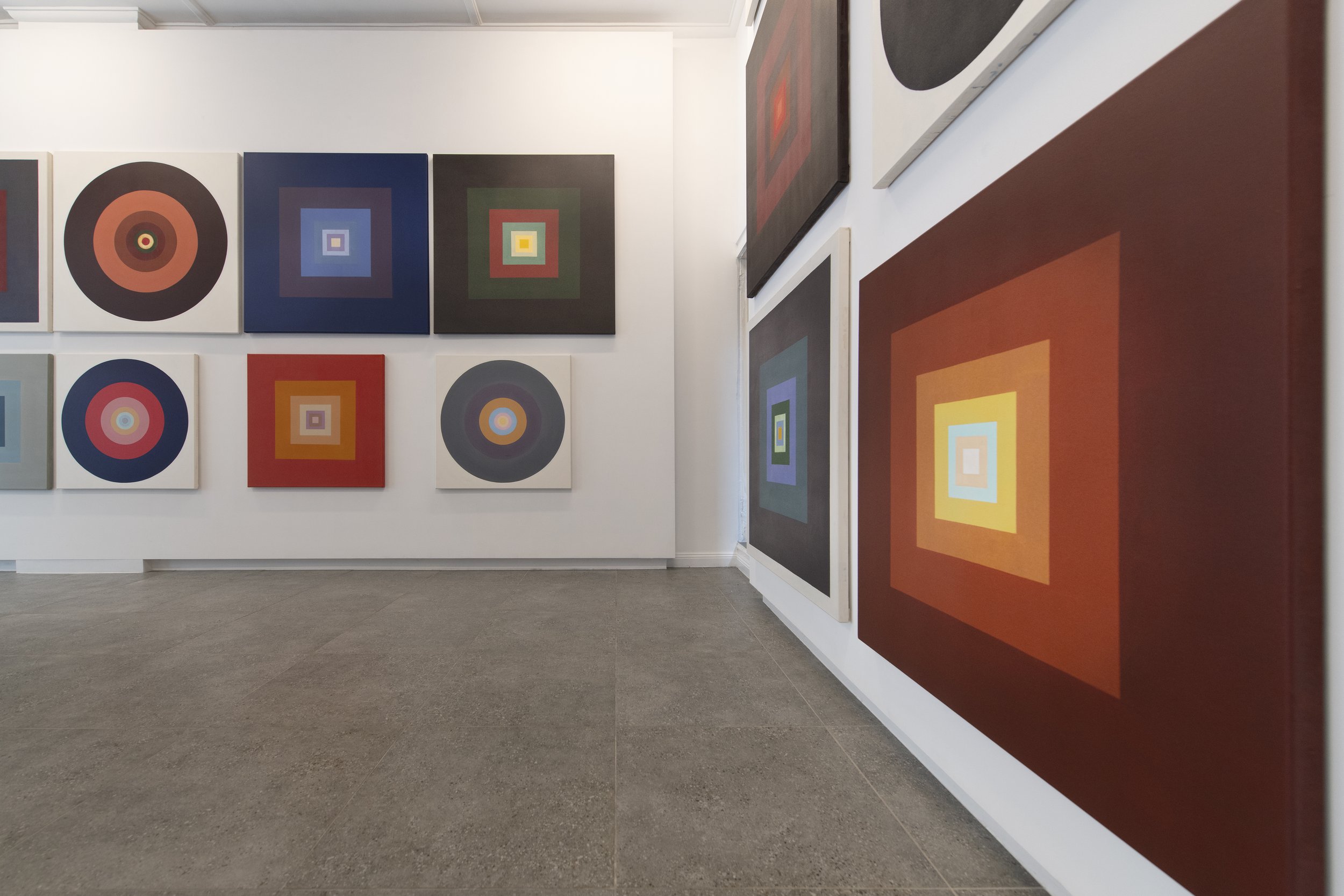
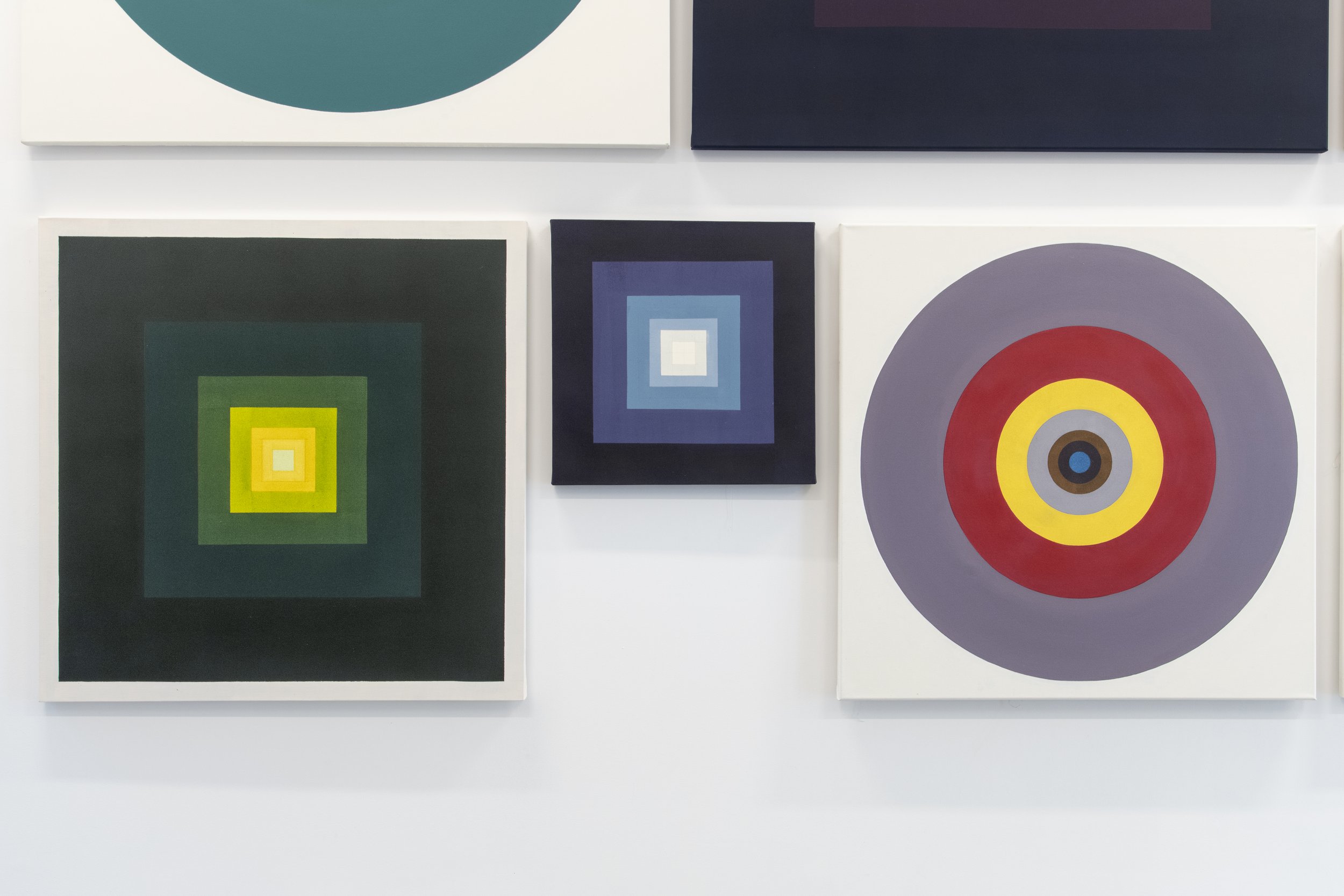
Installation Images
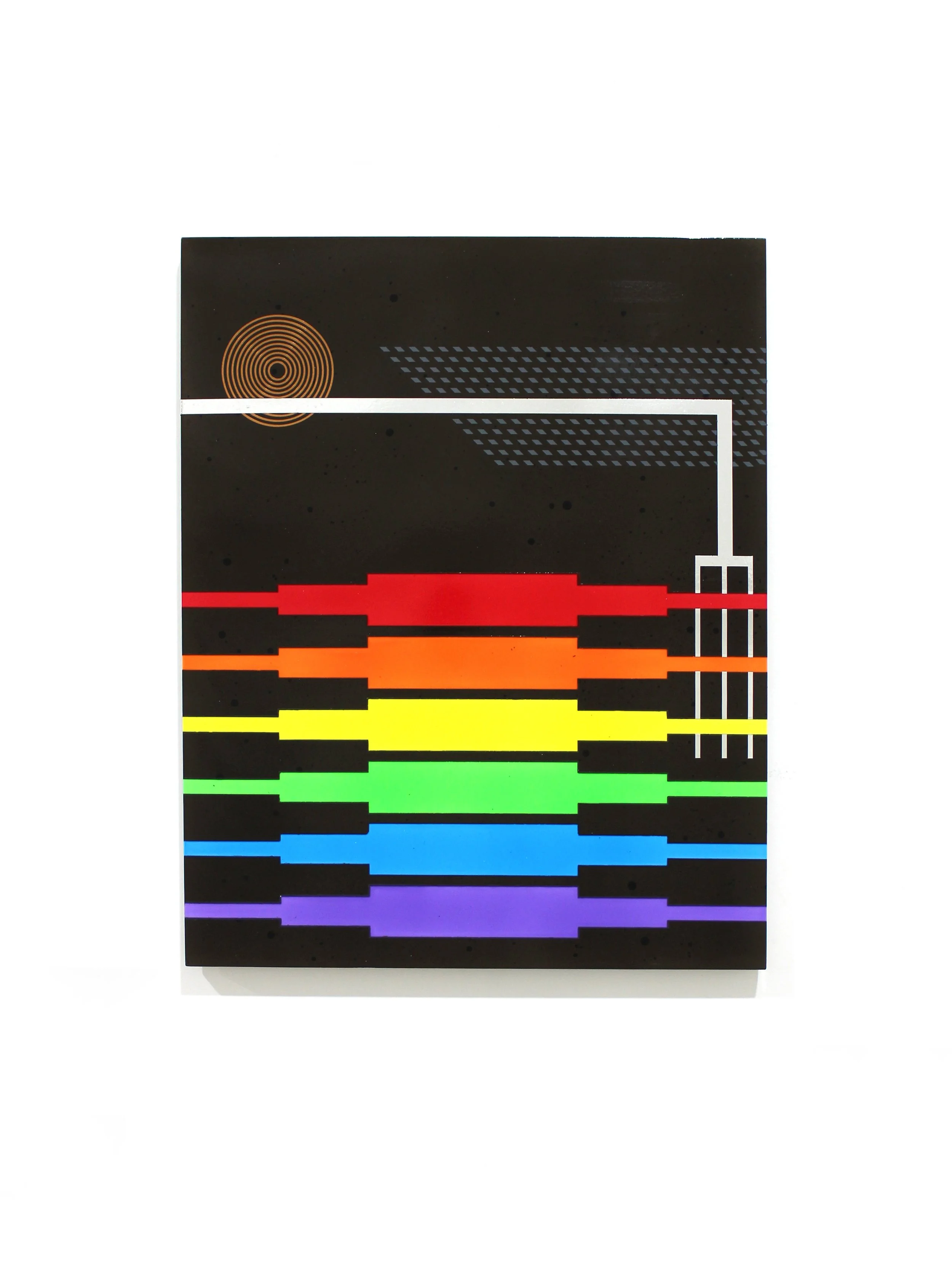
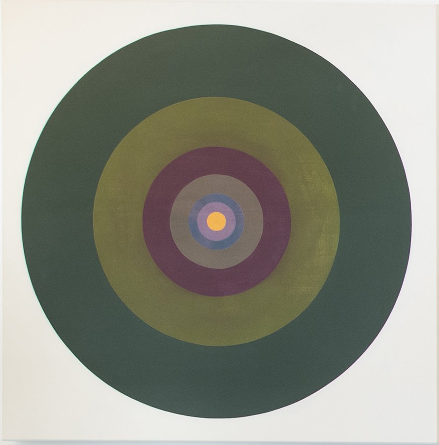
Of patience, penance, prayer WORLD-MOTHERING AIR, AIR WILD, WOUND WITH THEE, IN THEE ISLED, FOLD HOME, FAST FOLD THY CHILD
Gerard Manly Hopkins
…
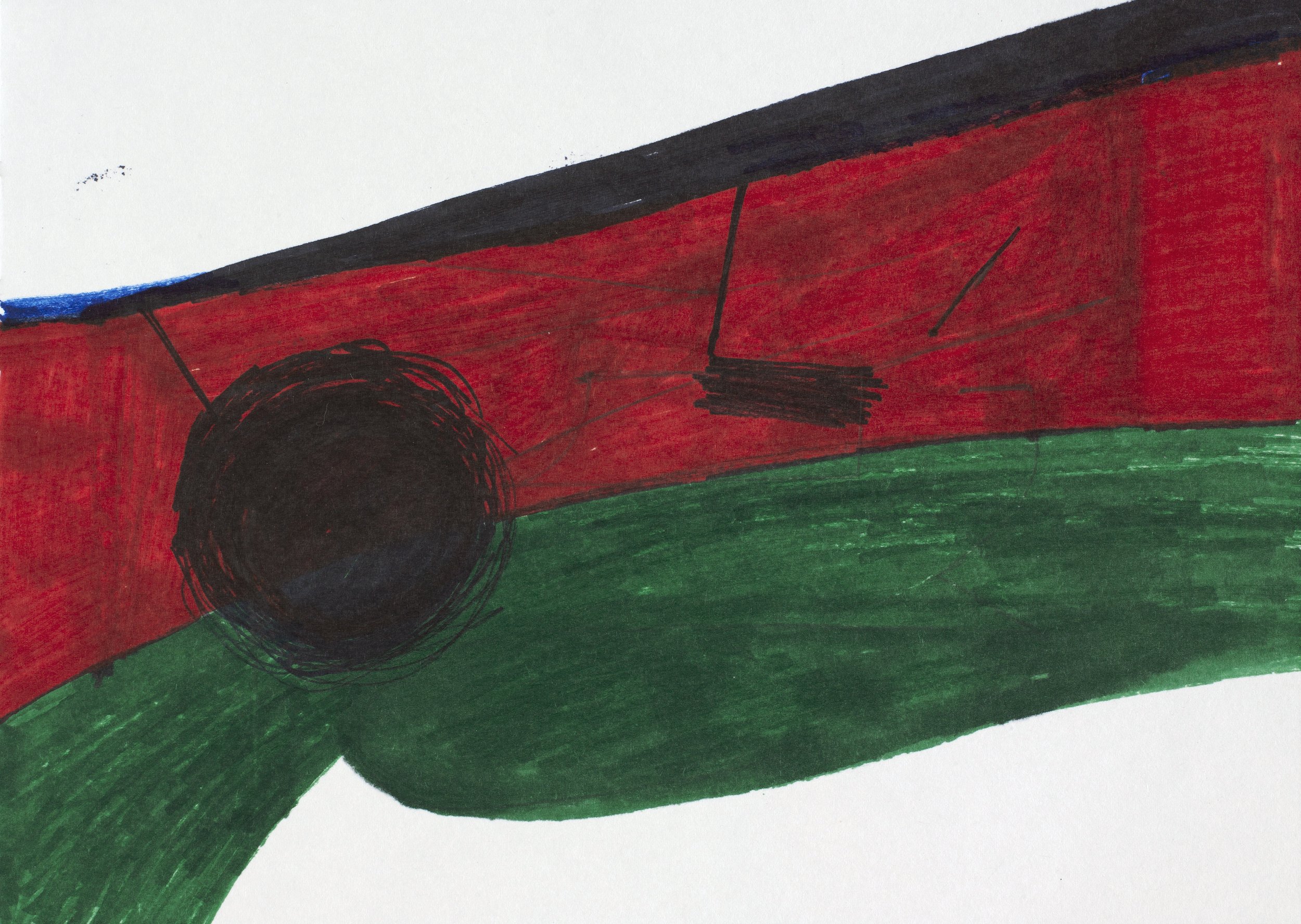
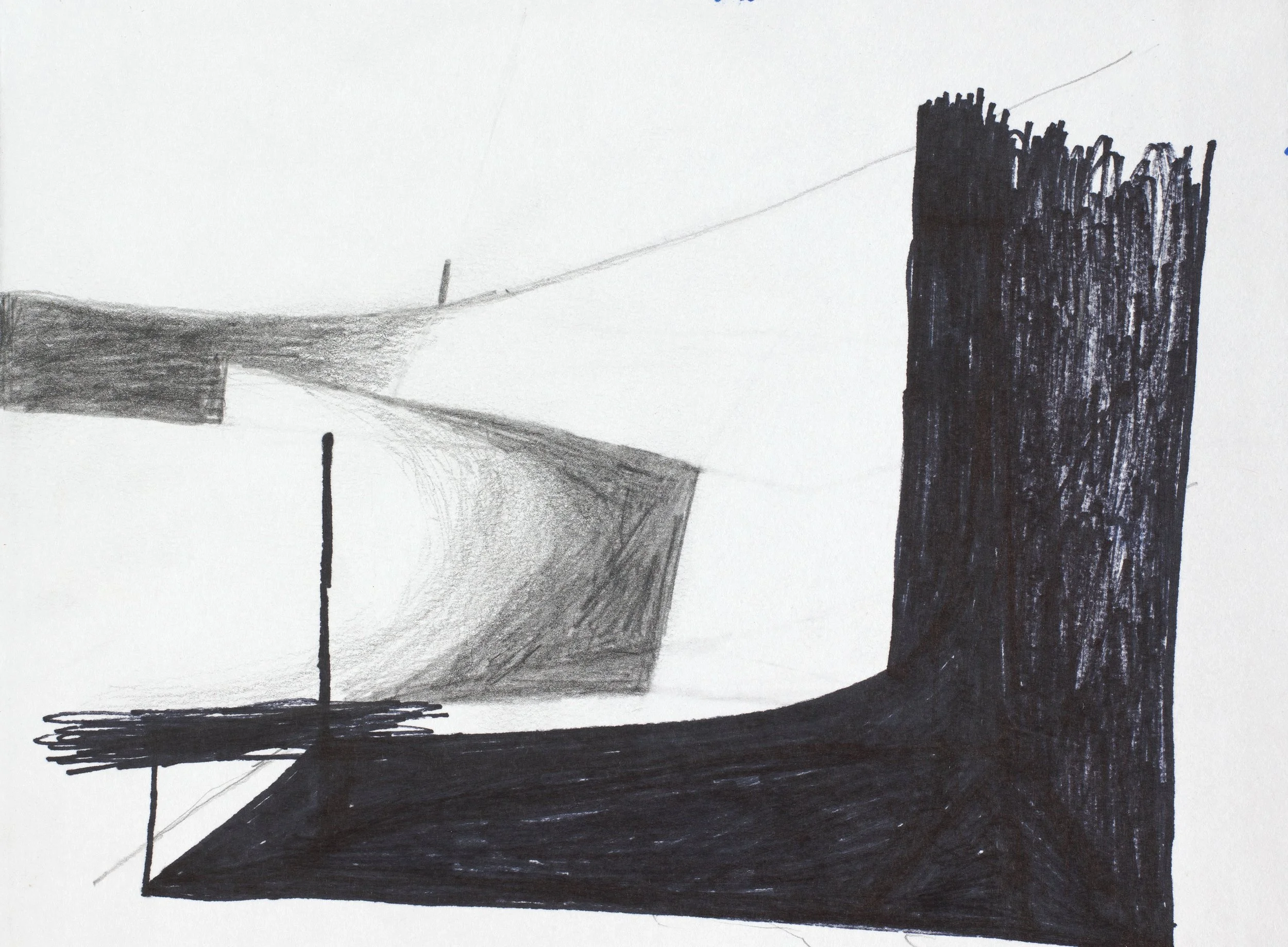
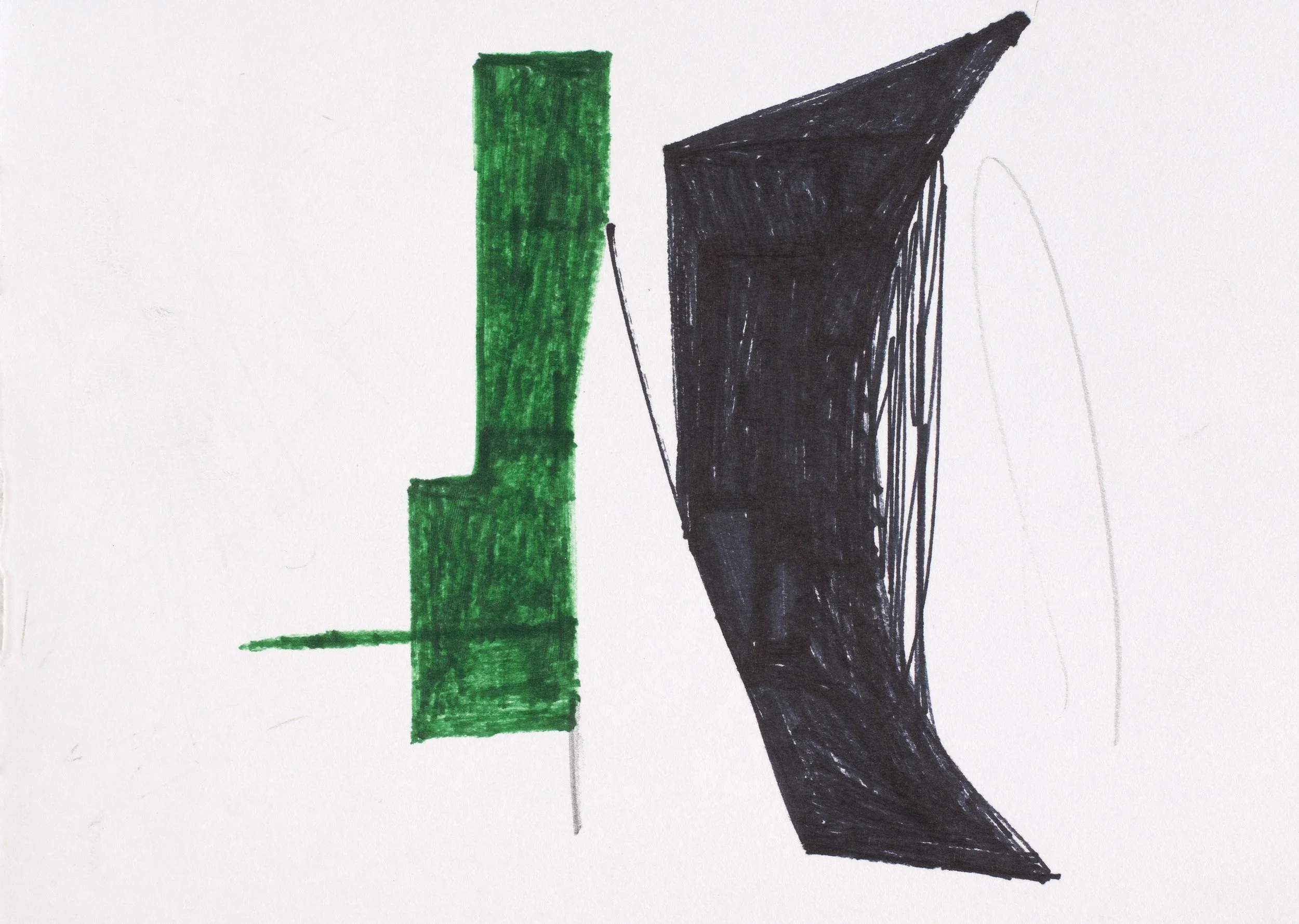
Last year while restoring some earlier works on paper l was drawn back into the unique poetry of Gerard Manly Hopkins, for l had taken certain words from his verse as titles for eight large paintings exhibited at Deutscher Brunswick St in 1990. The eleven studies were made in preparation for the larger works on canvas and can be found on the last pages herein.
The Breath Paintings came out of that contemplation. This document is to give some background for anyone that's interested in such stuff.
JAMES CLAYDEN
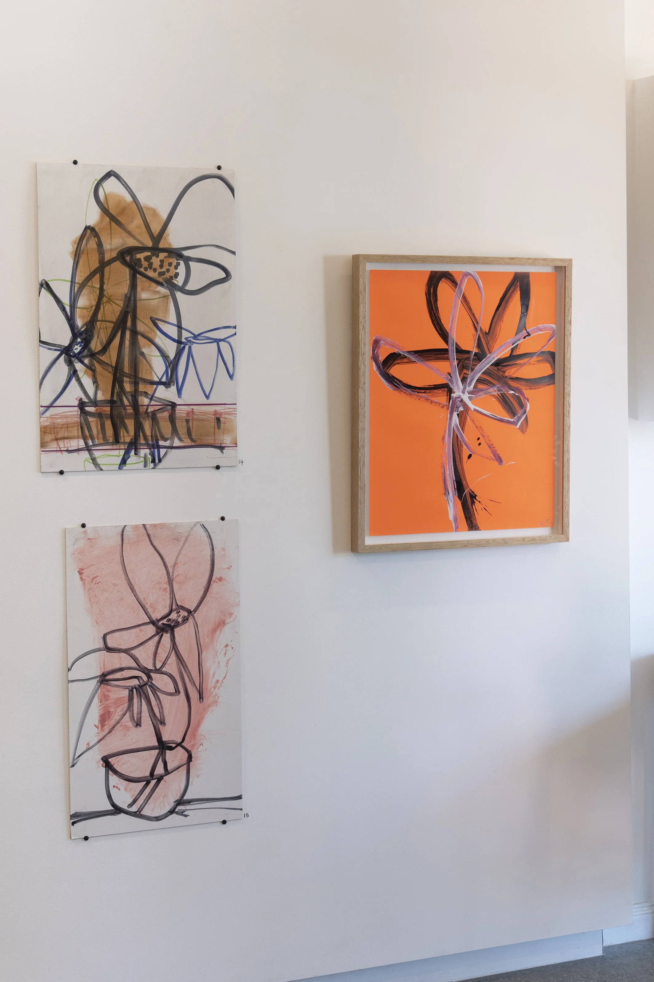
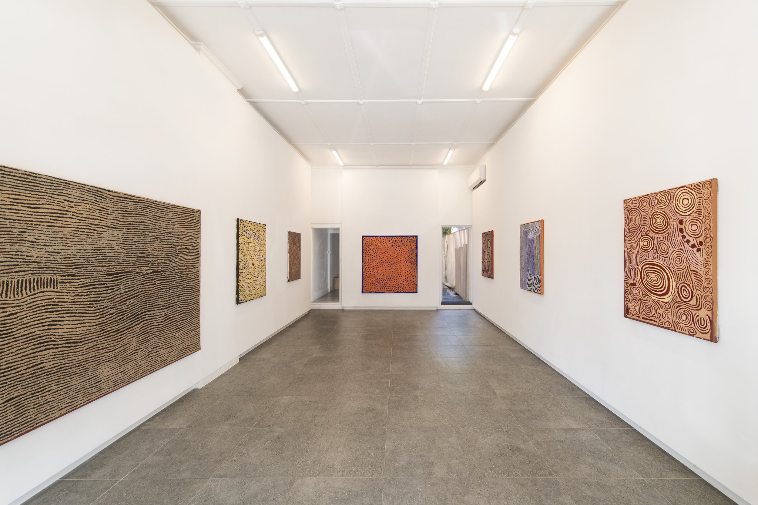
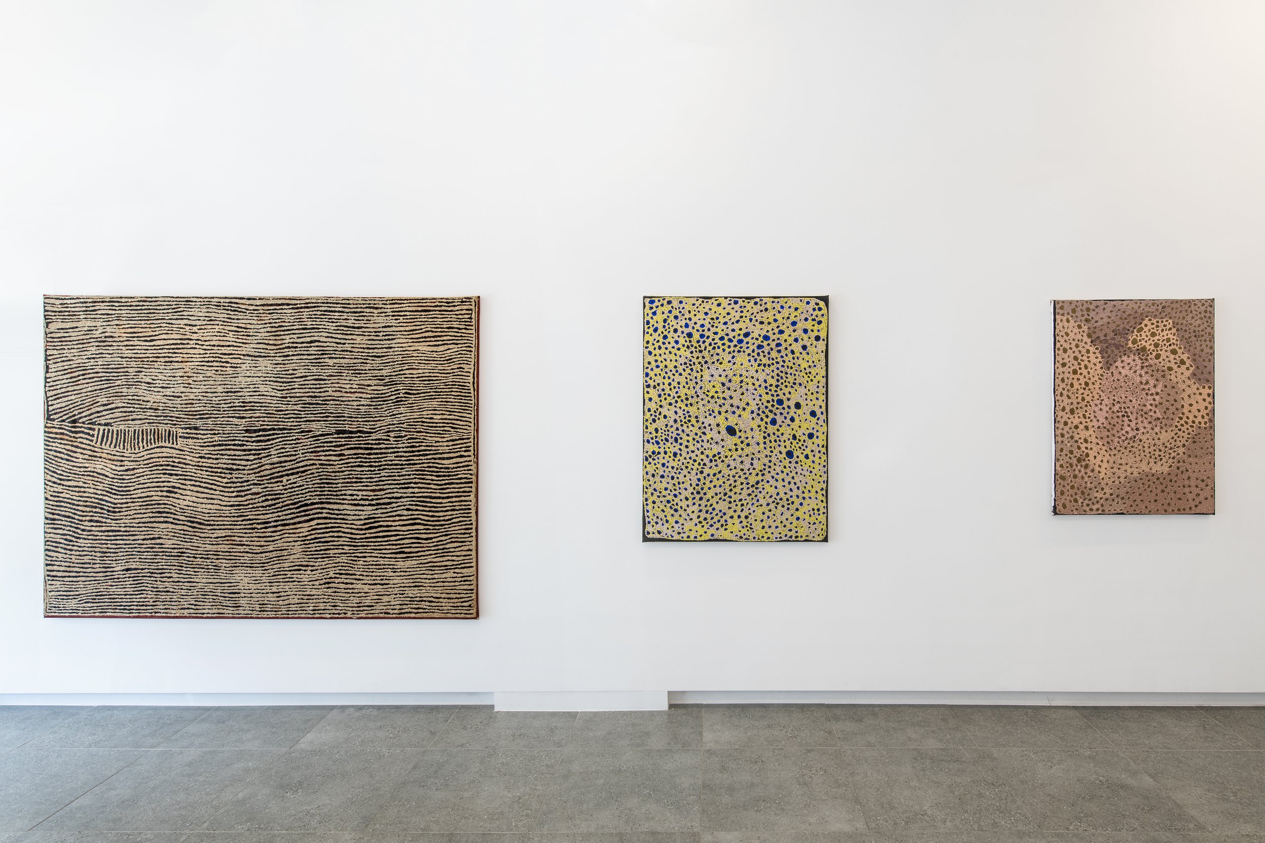
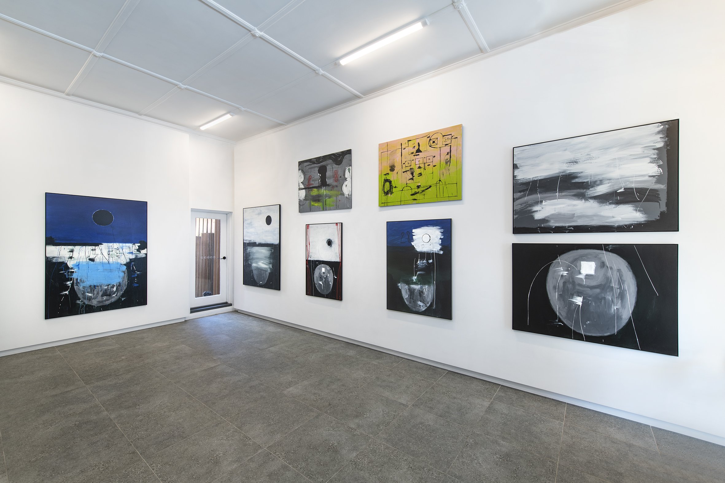
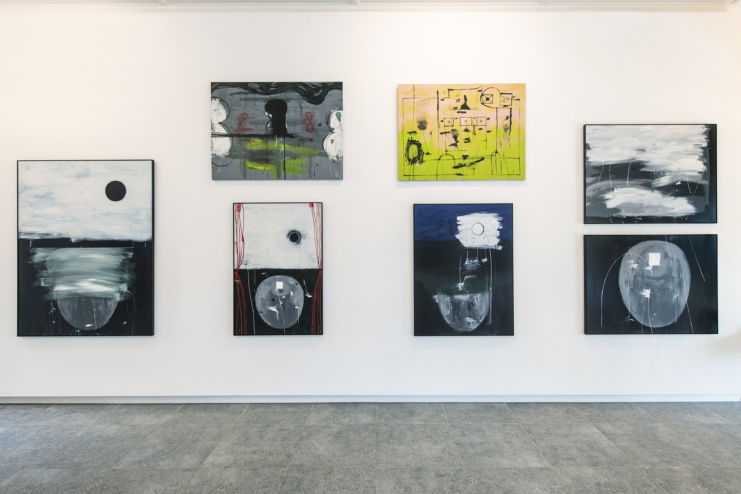
peter booth: works on paper
PETER BOOTH
Peter Booth Works on Paper
07.02.26 - 28.02.26
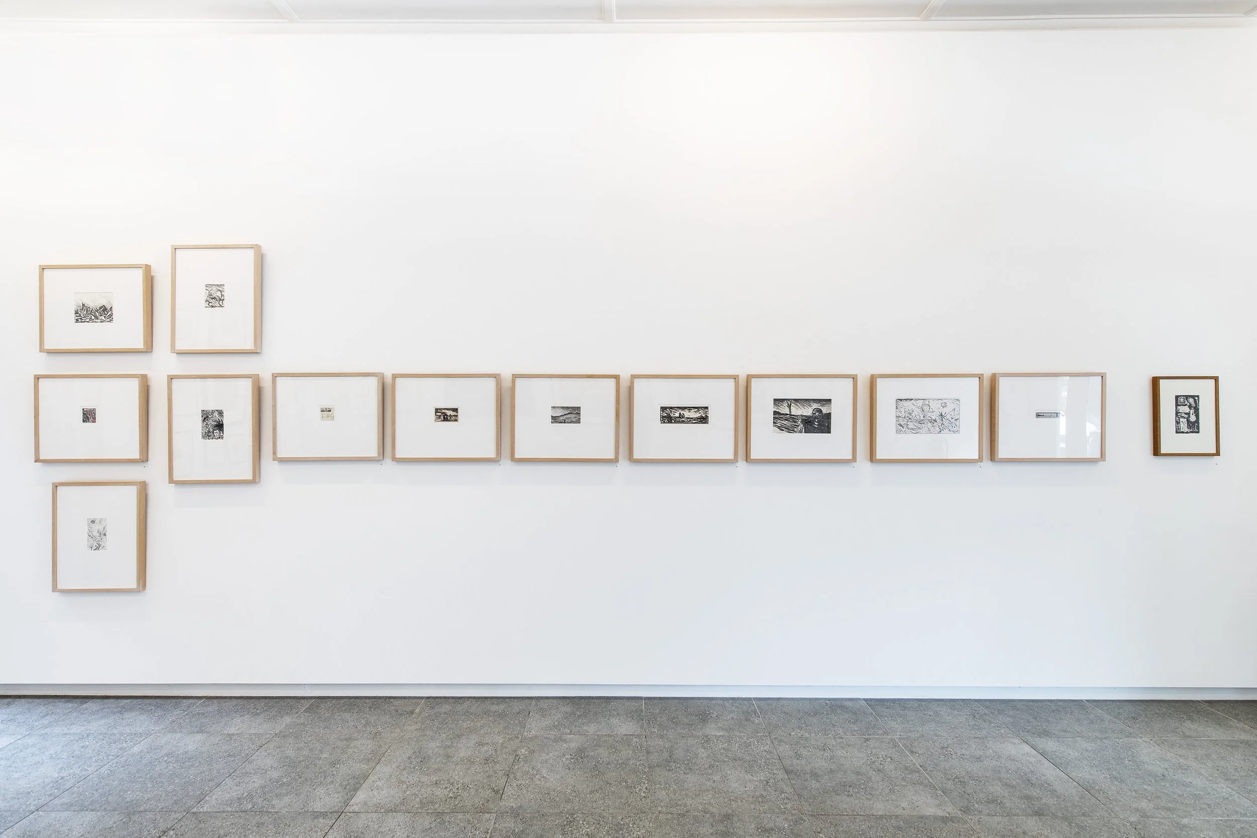
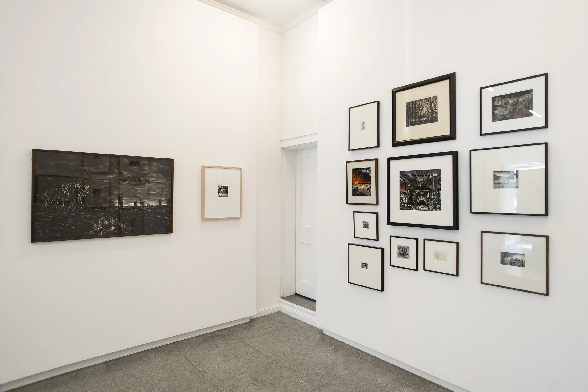
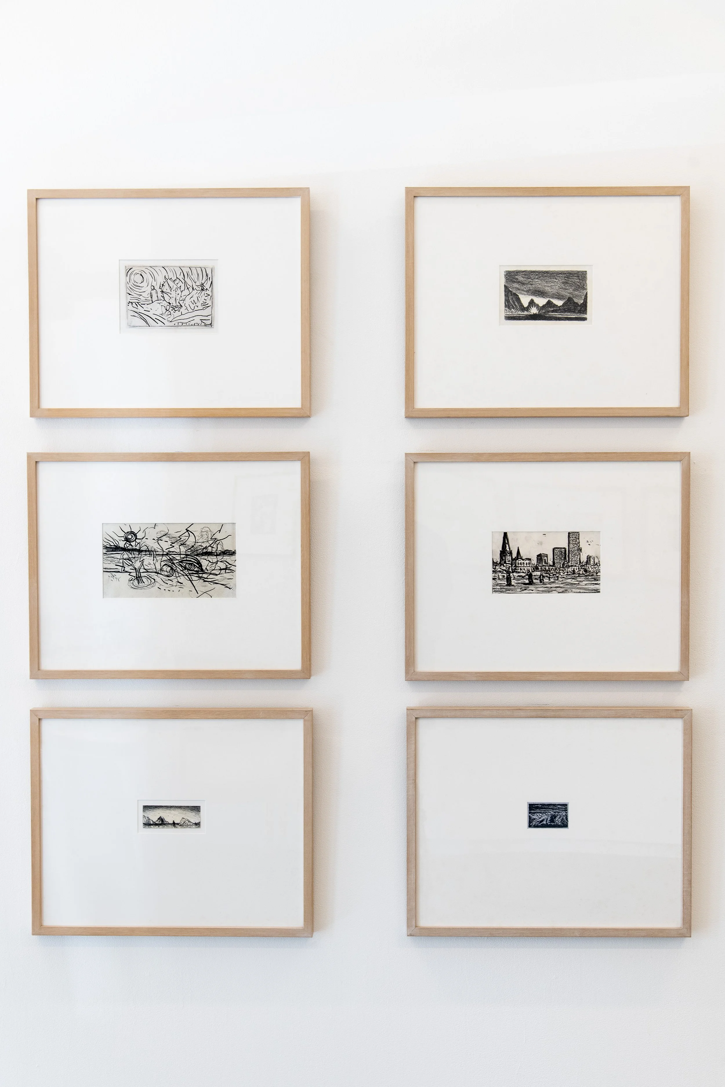
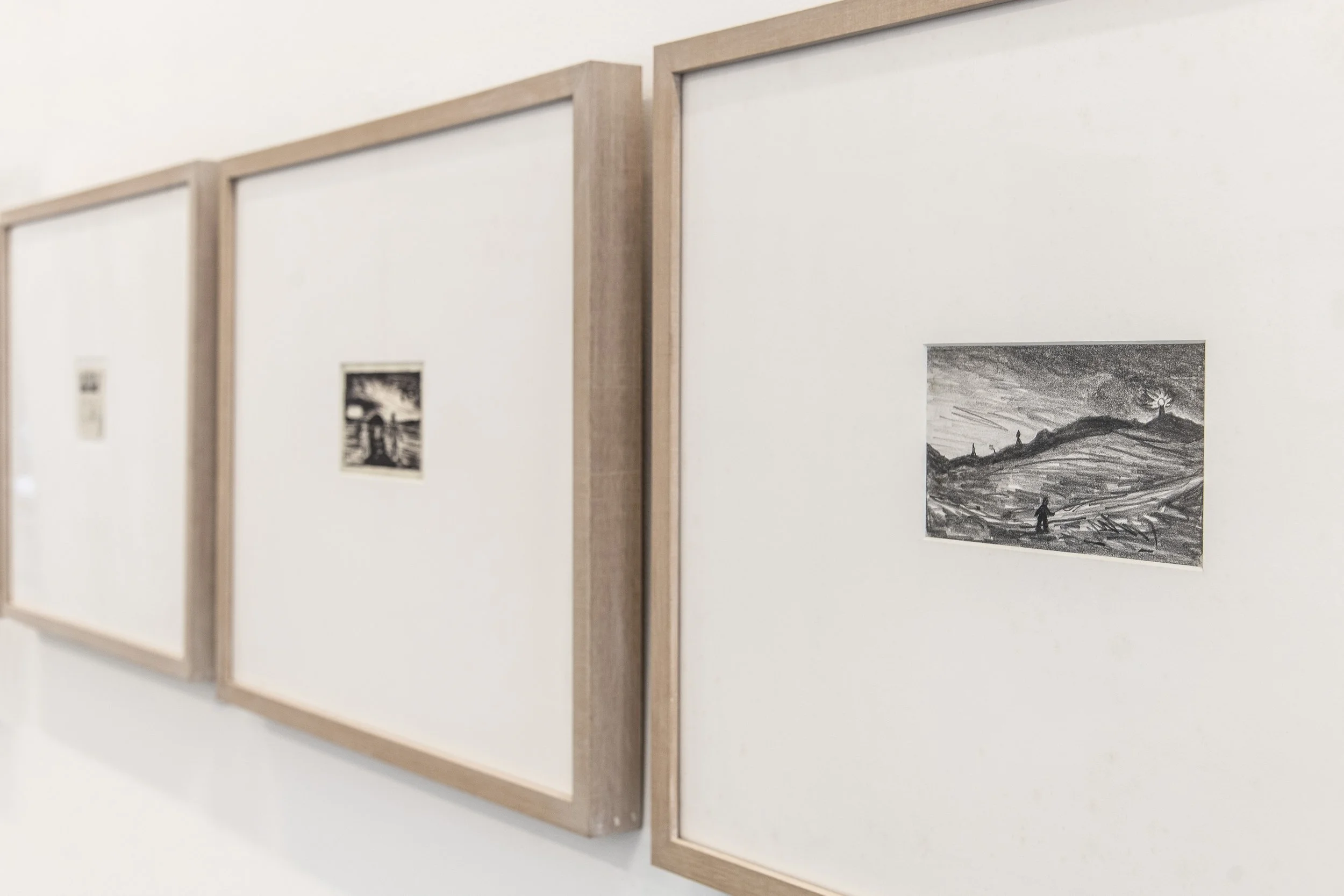
Installation Images
Peter Booth: WORKS ON PAPER
“What's ultimately so impressive is Booth's ability to imbue his smallest drawings or most lyrical landscapes with a sense of mystery, and often dread.”
McDonald J, ( March 7, 2003), Art Column, Peter Booth
…
The Return of the Uncanny
Flaming rivers, figures, sun, and cactus are the subject of a Peter Booth drawing, among many. The narrative of his drawings is unclear, yet his subjects are familiar. The look of things and our familiarity with it returns in Booth’s drawings as un-homely, febrile, what Freud termed unheimlich - the uncanny.
Large insects, crashed planes and burning trees are Booth’s world as they are ours but until we have them back, we have no idea how to constitute them, as images. Startling as they may be, to view these early Booth drawings is to lean into a set of complexes and considerations that the artist is at pains to make. The drawings are not a predication for the artist; they are not ipso-facto the basis of any one painting but the ongoing daily ritual of drawing - Booth’s letting go of images.
From the dark, where light is at the edges, where flatness and abstraction were once Booth’s domain, comes a rush of subjectivity, the world suddener and nearer. No longer is this Booth’s speculation, an art measured by colour and form, it’s now a whirl of imagery, a new figuration that sears the body and does little to comfort the soul.
The vision runs hot as it does cold, and without any given location, it is a message that settles in the mind and turns from quiet despair to salvation but with stops and inevitable byroads. The key to Booth’s art is humanness and our innate fallibility, what Saul Bellow has called ‘faulty humanity.’ It is everywhere in the Booth’s landscapes and no less in the predicament of his characters, skewered as they are by their own subjectivity and alienation.
The landscape, Booth’s stage, its foreground and deep space, serve to give the characters breath. They are part Commedia dell'arte - part Beckett. His characters walk alone, sometimes in lines; they stumble and often fall, disappear, and inevitably rise with bloody noses and a rictus grin. If the subject is a portrait head, then the game is upped because the predicament is there in the upper torso and face. Imagine the role call, the MO of these heads, the sweetness of a tragedy well told and a story for another time.
Speculate then as to these drawings as they tumble forward, and inevitably, as a hot day proceeds rain, the pathetic fallacy of nature and feeling goes out the window. There is no surety as to outcome in an uncertain world, and Booth’s outlook, his prophetic practice, will always be essential. The fates await us all, and no less the characters in Booth’s world, where pleasure comes but not without some pain.
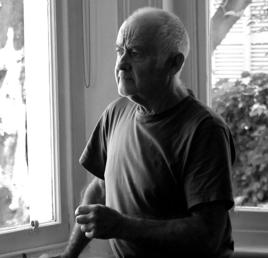
Brett Ballard
Brett Ballard is formerly Head of Art at Menzies Art Brands, Sydney. Prior to joining Menzies, Brett held the position of Senior Specialist, Art, at Sotheby’s Australia (Smith and Singer) for 10 years and was previously Gallery Manager at Rex Irwin Art Dealer in Sydney between 2003 and 2011. Brett works closely with clients, consulting on collection management and the buying and selling of art in the secondary market and at auction. He is an experienced curator who advises on all aspects of collecting both in Australia and abroad. Brett has published numerous articles and has written extensively on art for catalogues and exhibitions.
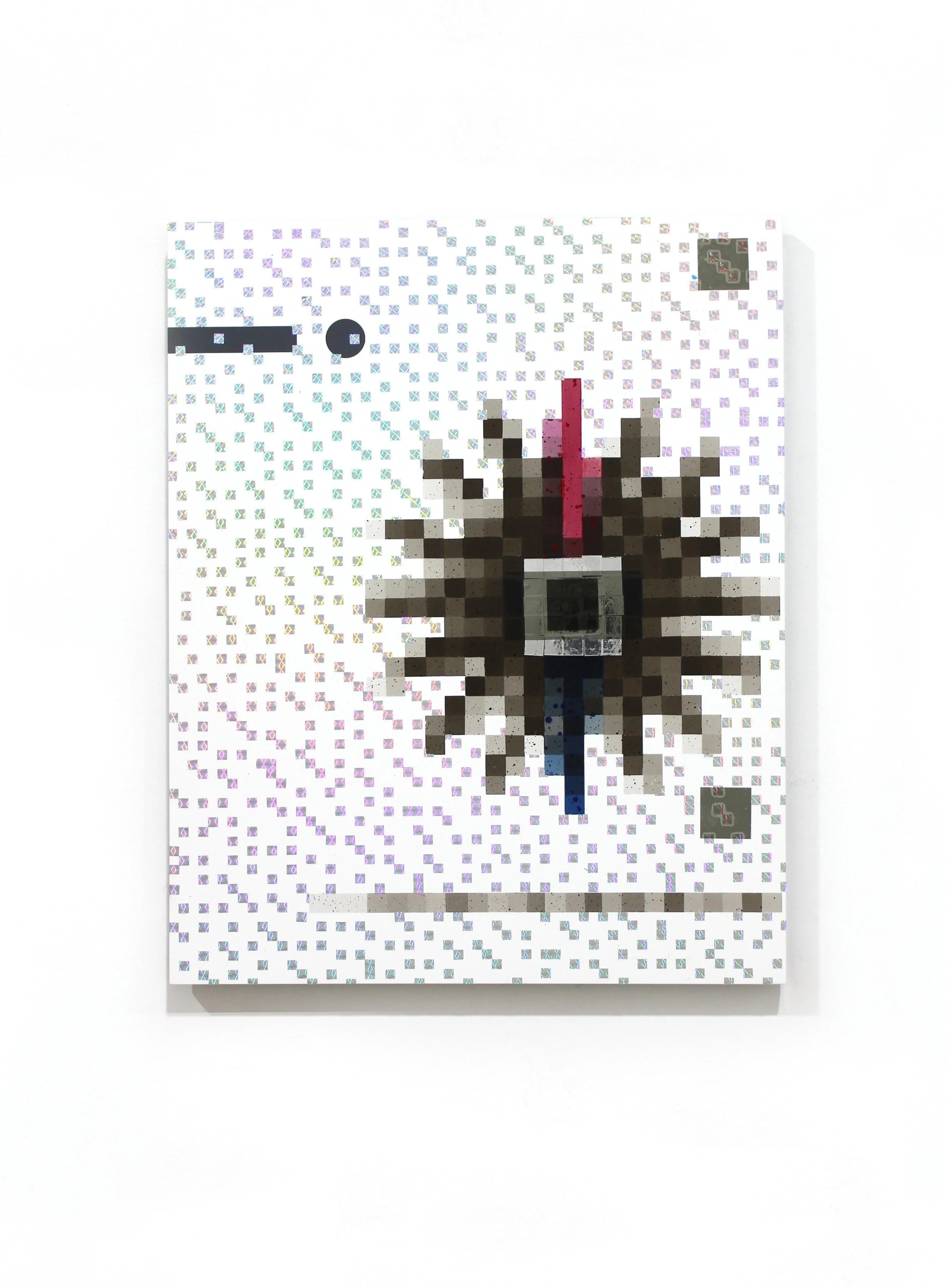
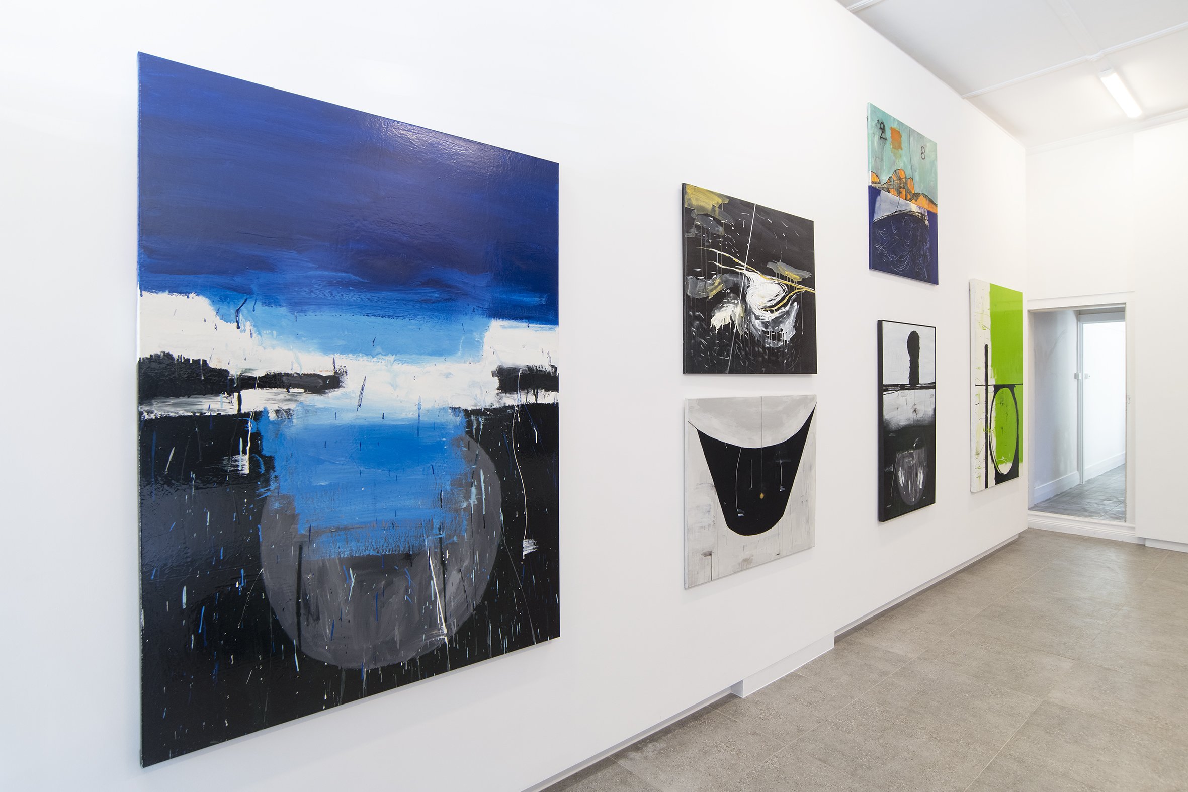
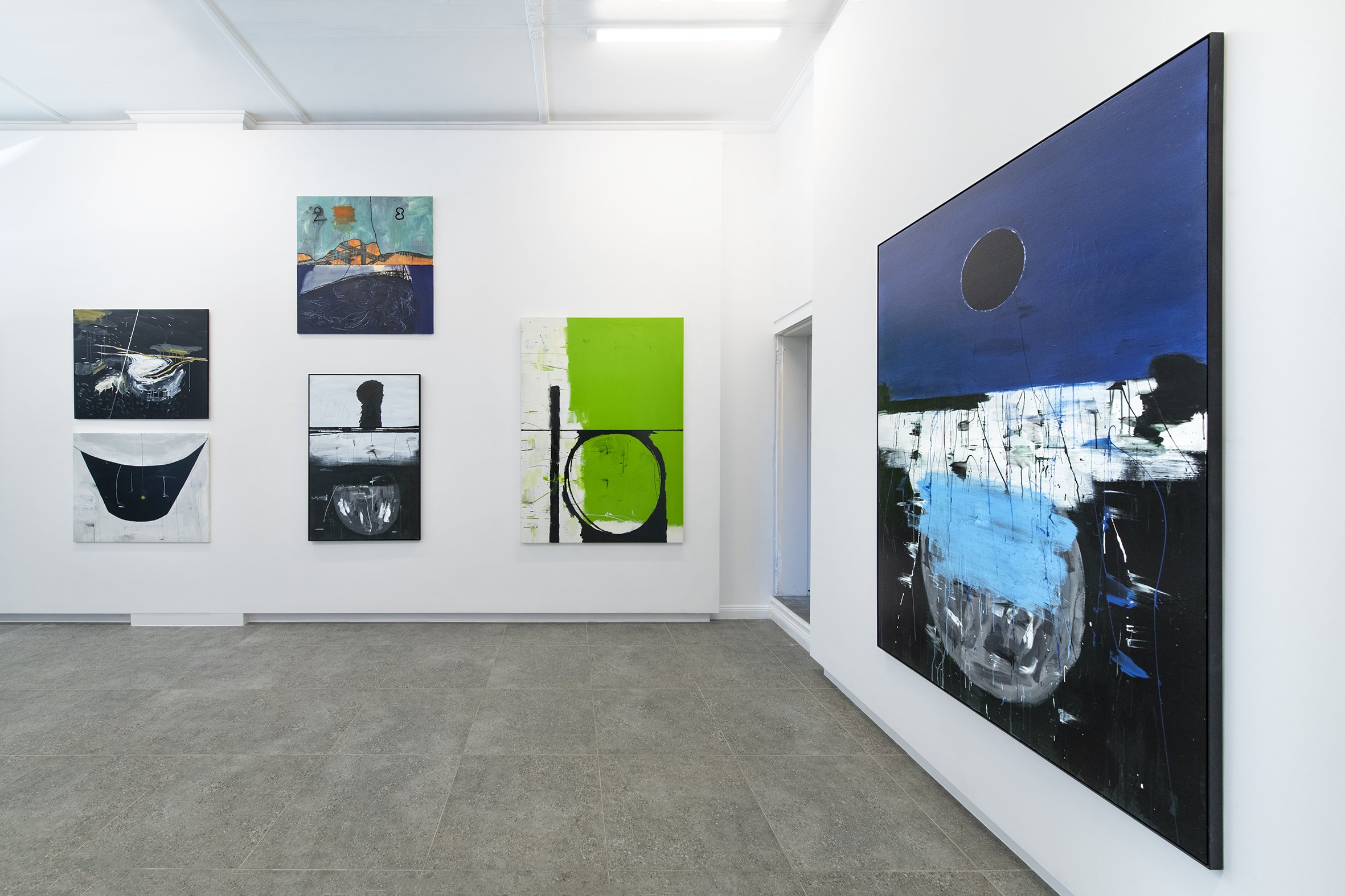
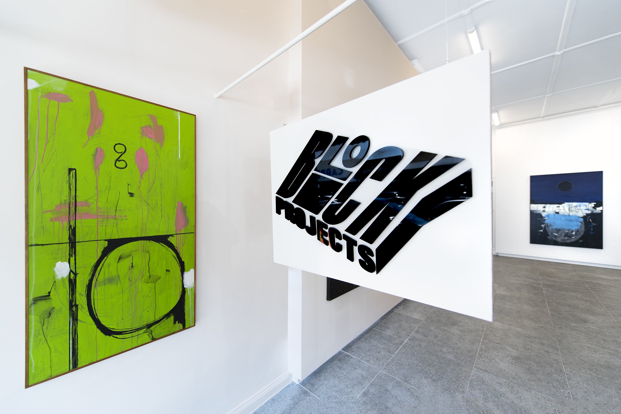
MERRIC BRETTLE: PSYCHOPOMP 2 : POETRY OF THE MECHANICS
MERRIC BRETTLE
26.11.25 - 20.12.25
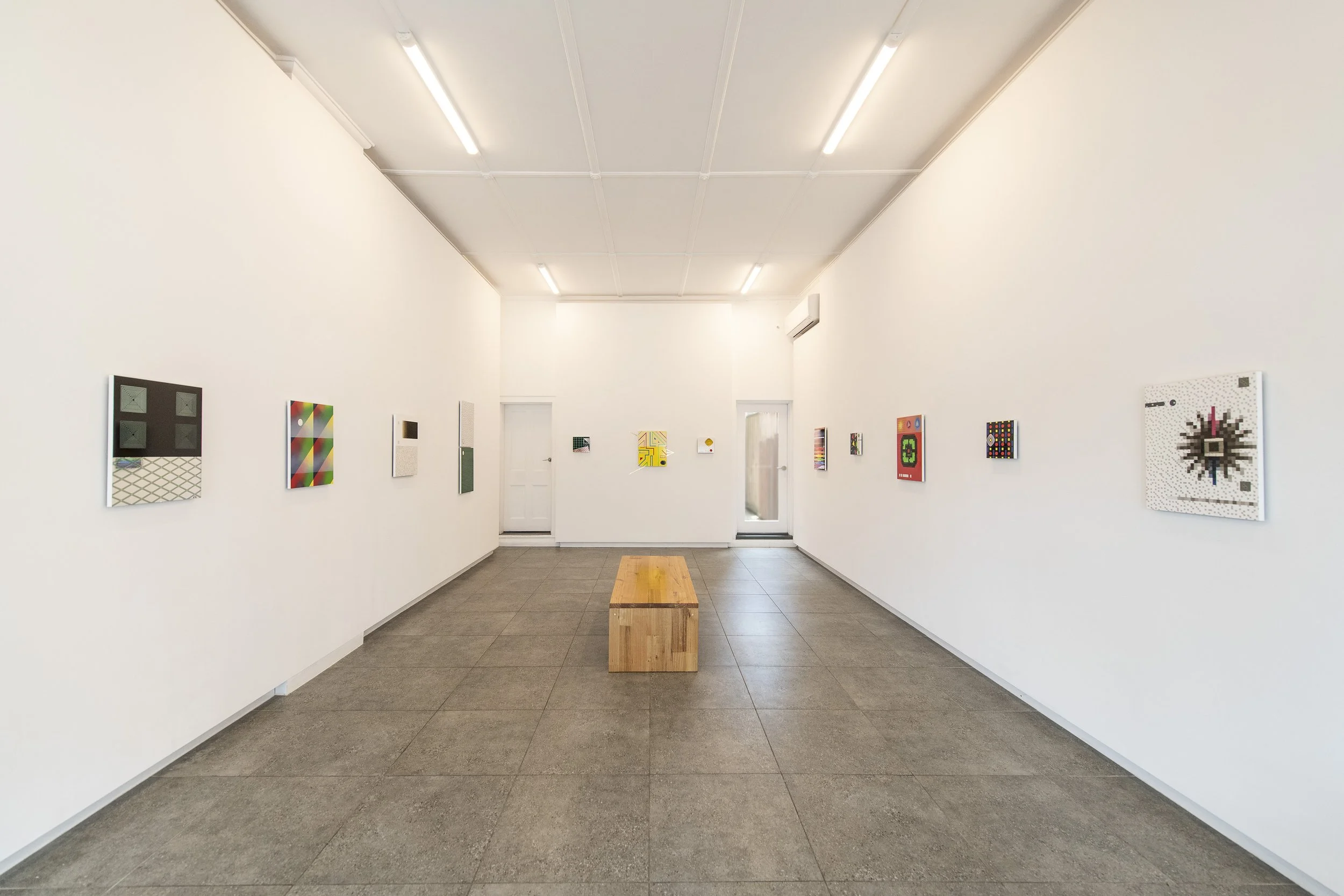
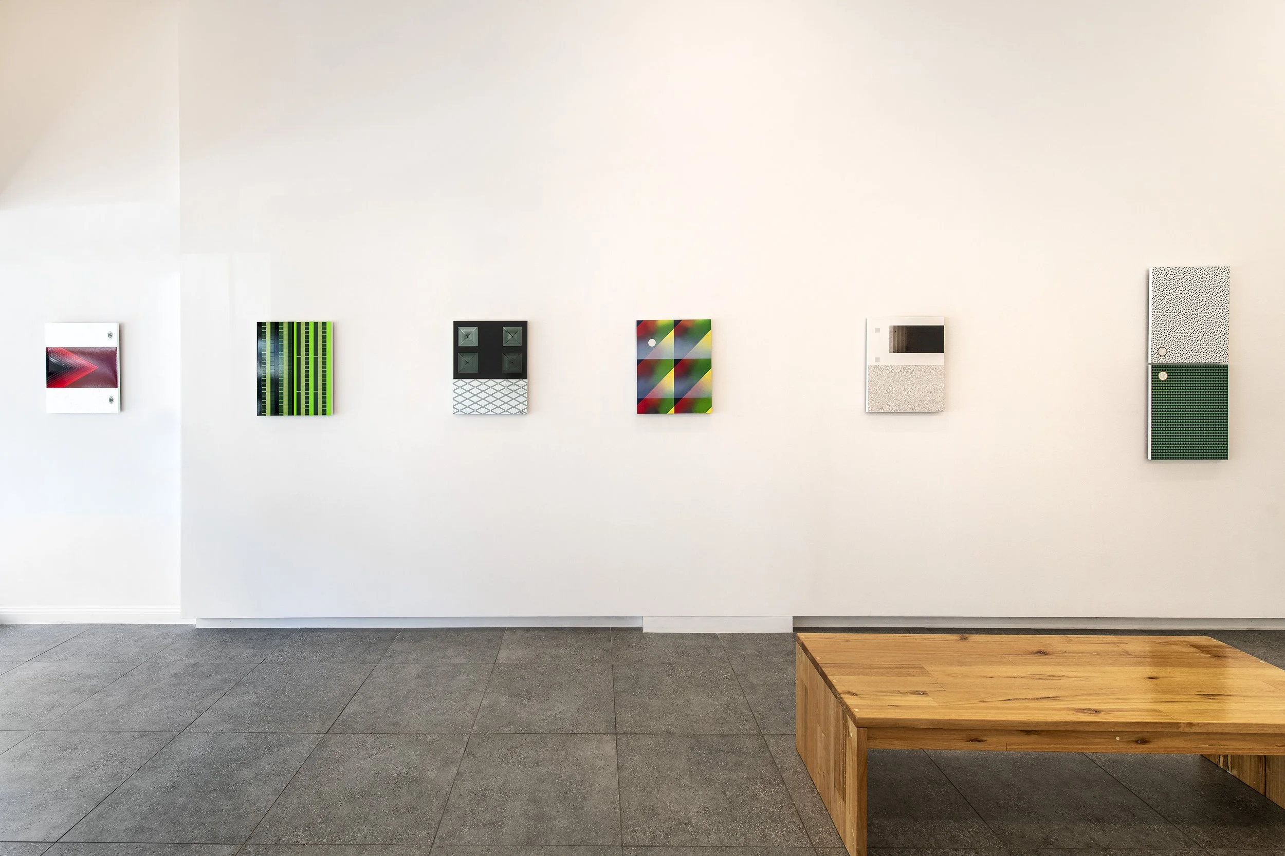
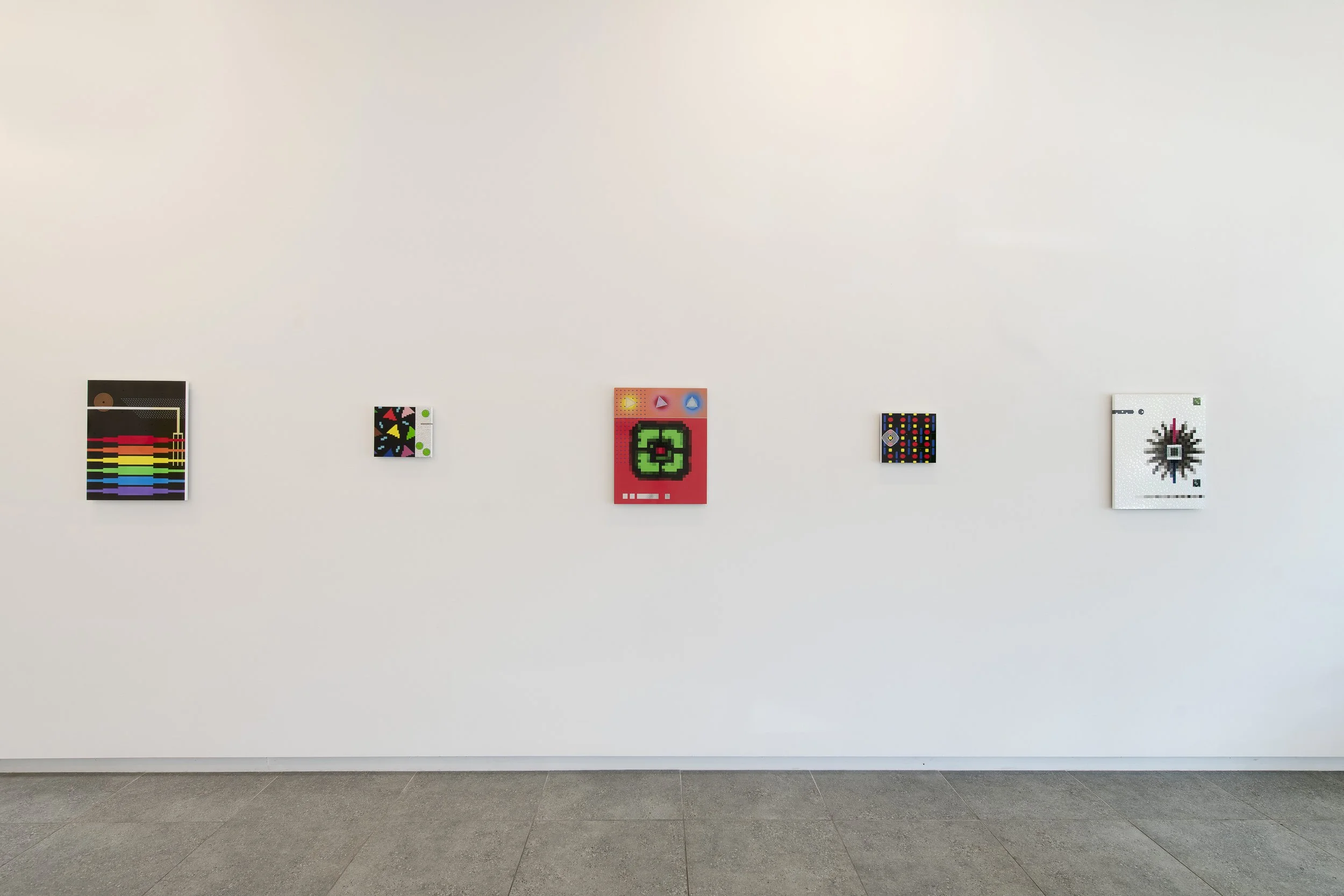
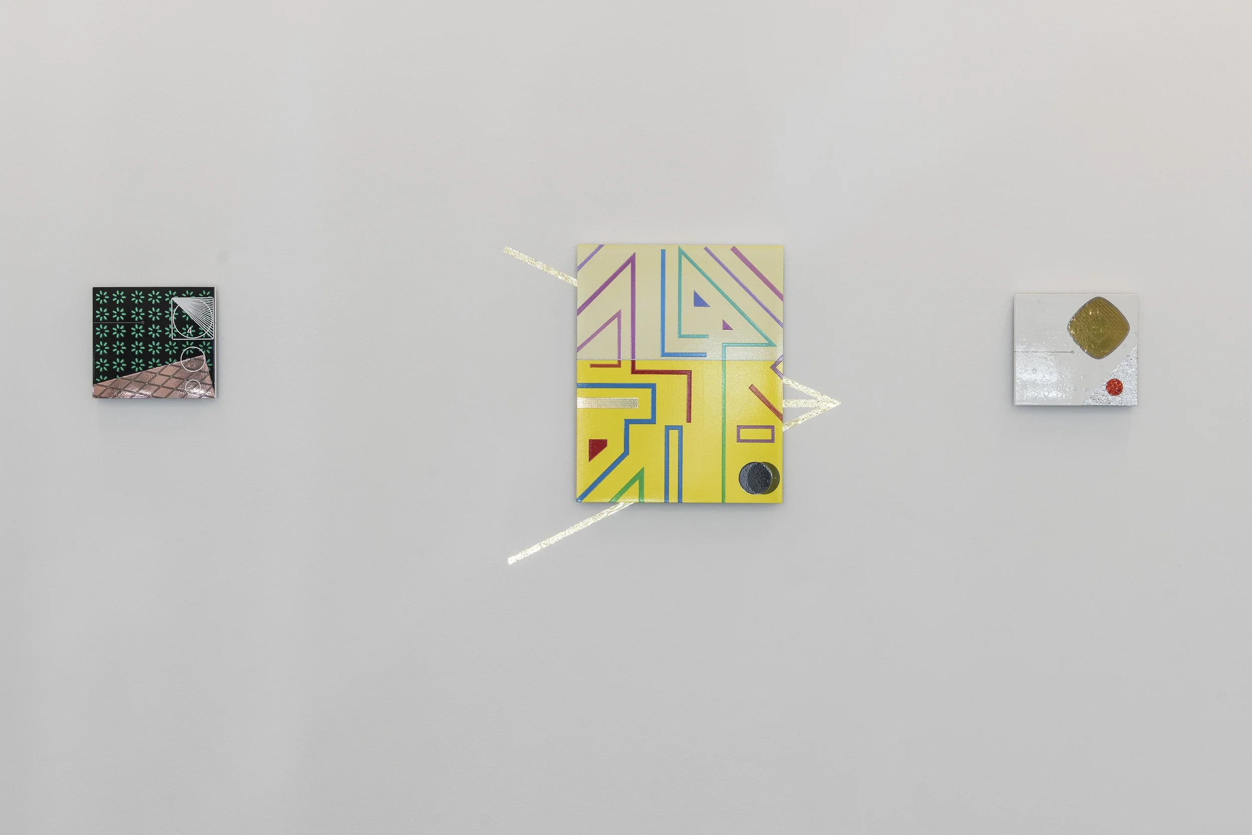
Installation images
Psychopomp 2 - The Poetry of Mechanics.
At the heart of my practice is an exploration of what it means to be an individual within our contemporary socio-cultural condition. With this in mind, I make two types of work. The first investigates what this condition ‘is’, and the second expresses my reflections on what it means to ‘be’ within it.
The first type of work therefore, investigates the social world we share, as I collect and remake bits of it that convey some ‘sense’ of it to me. These ‘bits’ are all images from the Internet, and the works I make from them are my Pattern Finding pieces. In these works I reverse engineer these sense/samples and explore how they ‘work’ on me.
It is by capturing the look of screen backlighting, for instance, that I come to understand our experiential relationship to a mechanised culture, and by making abstract pieces using colour pallets from advertising material, that I get an idea of a socio-cultural mood.
In these works, ‘I’ exist in their translation from sample image to object, and the ‘marks’ of my presence relate to ‘impression’ as opposed to ‘expression’.
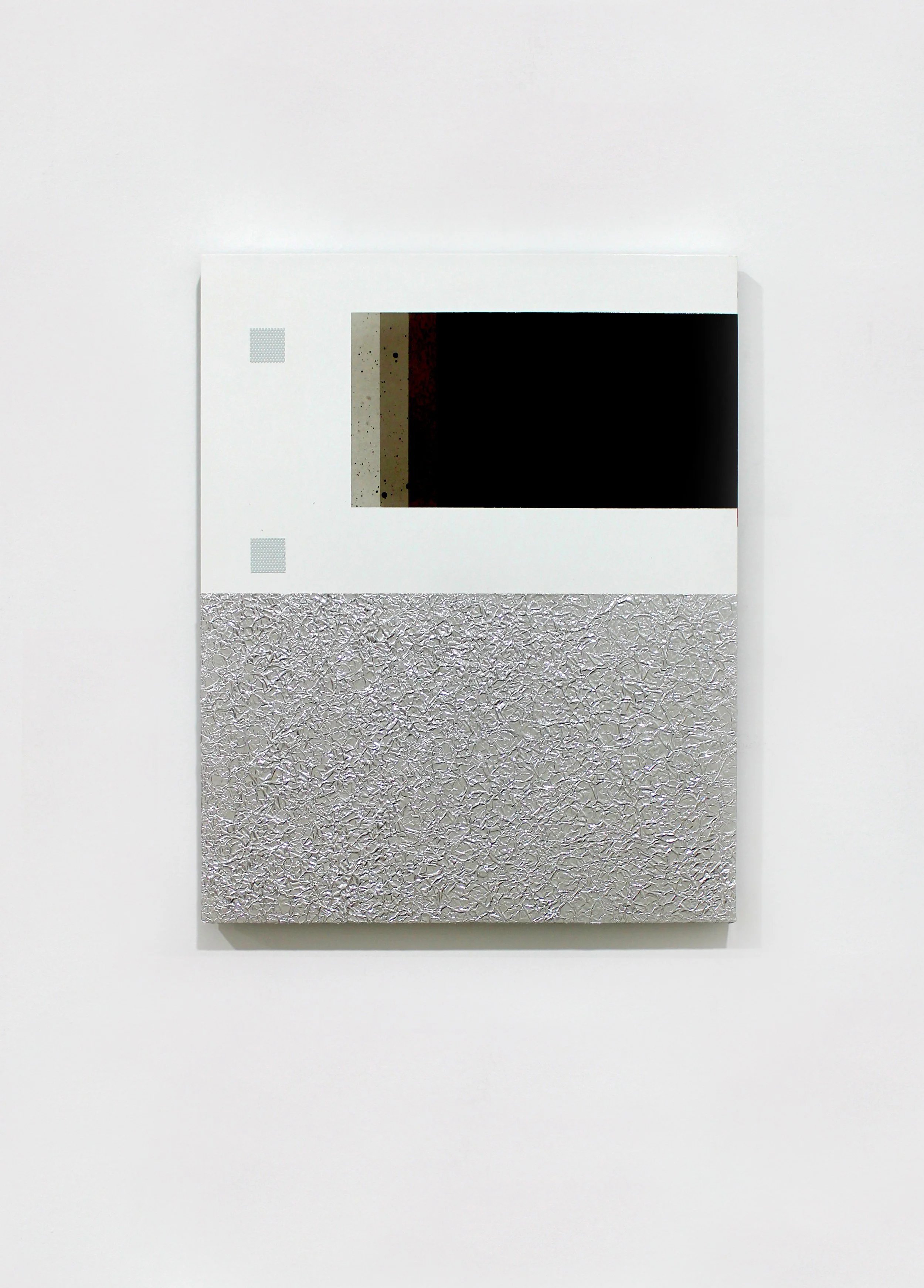
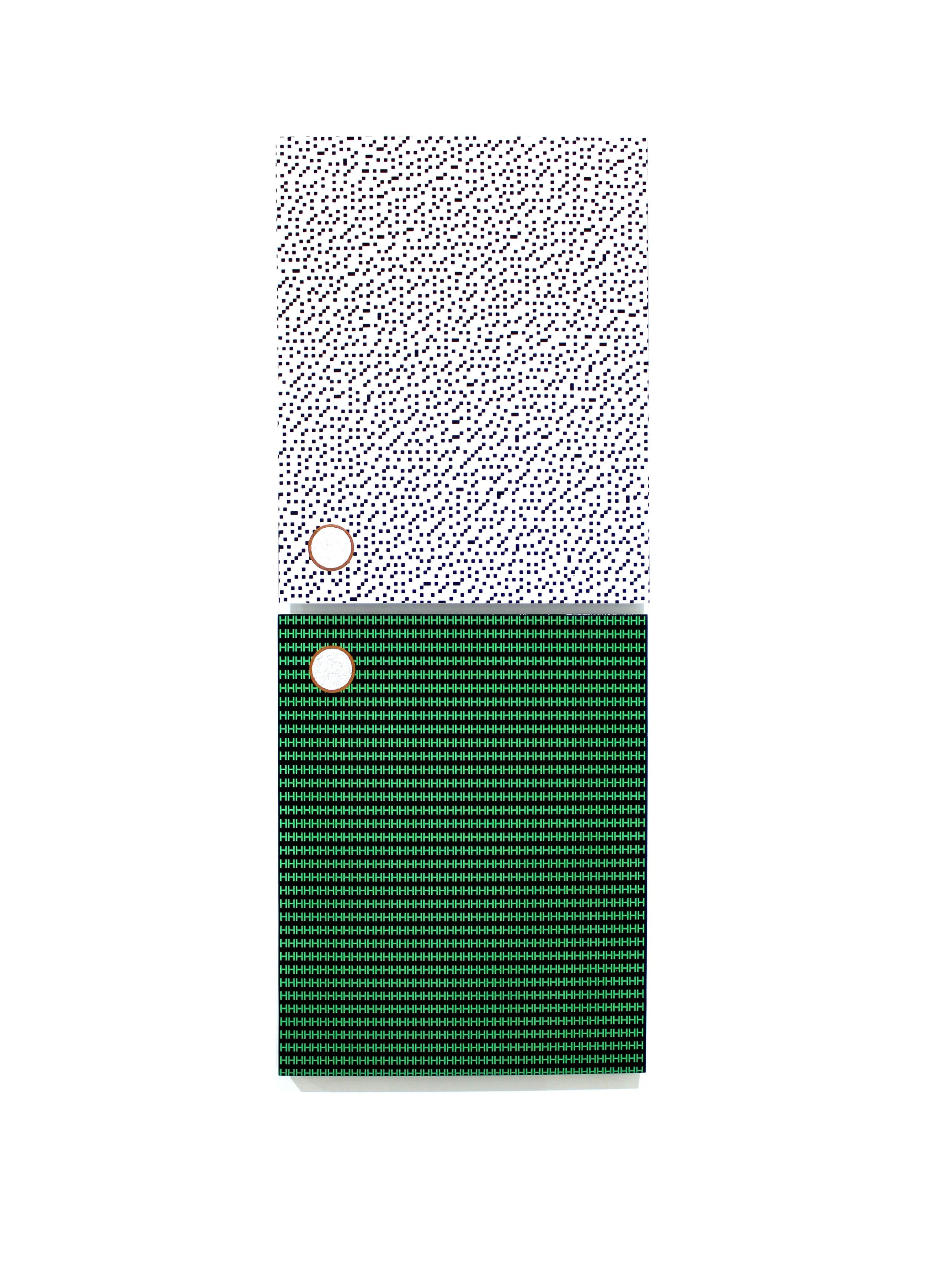
While constructing these works is an ongoing process, there is another type that I make paral-lel to them. These are my Reflection pieces, and they express ‘what’ I considered this condition to be, ‘the way’ that I saw it, and ‘how’ I understood being within it at different times. In them I employ an expanding number of systems of being creative, in series, to explore my ideas.
In some of these system/series, for example, I add to pattern finding pieces and overlay them with other materials to express the personal relationship I had with them when I ‘found’ them. In others I join two or more samples to explore a resonance that express’ something else. In yet others I explore the materials, methods and images I found in my pattern finding works, as a kind of language through which to express my ideas. These systems/series are represented in the Liminal Object, Ritual Process and Sense Data works shown here.
In these works ‘I’ exist in them as samples, yet also in the choices that my system/series afford. Consequently, within them, the ‘mark’ of my presence is multiple, exists in layers, and expresses both impression and expression.
Contemplating the works in this exhibition, they are all ‘visual poems’ and as such they are all emotional and experiential responses to ‘being in the world’. In saying this however, their poetry probably lies just as much in the mechanics of the systems I use as in the surface image I construct.
With this in mind, I hope that the viewer reads the works formally as they would allow for the poetry in these mechanics to be seen. Consequently, I would like them to consider the works as experiential metaphors of they way that I as one individual came to terms with our strange new digitized and globalised condition.
It is as an experiential metaphor thus, that I hope for them to explore the systems I employ to make work, as they reflect those that we all use to understand reality itself. That they consider the levels of choice that these systems generate in the works, as they create a ‘space’ between the viewer and object for them to explore. And that they understand the ‘senses’ that they receive from the work themselves, as they are a product of not just my agency, but also of the worlds on me.
Seen in this way the poetry of this ‘rude mechanical’ lies in understanding my works as personal ‘flights of being’. The mechanics of my poetry understood as the systems I devise to explore the possibilities of my own creativity. And the beauty of these mechanics, as to me, these poetics of creativity, express the limits and possibilities of ‘being’ itself.
Merric Brettle, 2025
ARTWORKS:
david freney-mills: continuum
DAVID FRENEY-MILLS
01.10.25 - 25.10.25


Installation images
Continuum
David Freney-Mills approaches abstraction as something alive, shifting and adapting like an organism. His paintings hold the traces of thought, cuts, layers, and gestures that build into constellations of presence. Language becomes his subject, not written or spoken, but sensed as an evolving system of signs, shapes, and rhythms.
In his first solo exhibition at Blockprojects, titled Continuum, Freney-Mills presents painting as a dynamic encounter rather than a static object. Central to the exhibition is the Hyperglyph series. These artworks start with ink applied to Korean hanji paper, which is then hand-painted, torn, and rearranged before being mounted on canvas. They convey a sense of movement and transformation. The overlapping and dissolving fragments resemble glyphs from a lost script, creating an atmospheric presence that evokes memory and the continuity of thought across time.
Freney-Mills moves easily between traditions. His work embodies the discipline of reductive abstraction while also drawing inspiration from East Asian aesthetics, including ink painting, calligraphy, textile dyeing, and woodblock printing. This dialogue produces paintings that are direct, sensorial, and quietly transformative.
The works carry the resonance of history while speaking in a voice that feels entirely of the present. They invite an experience that is both immediate and enduring, a language of presence and transformation that unfolds differently for each viewer.
ARTWORKS:


jarryd Cooper: juggernaut
Jarryd Cooper
Jarryd Cooper
03.09.25 - 27.09.25


Artworks
Jagganath
Philip Guston put down his brush and crushed his cigarette out in his palette. Ash pink dawn was breaking, and the cold light crept into his studio and cast an illuminating ray over his efforts, confirming what he had started to suspect. Completion.
What was it he saw there, in the countless strokes and scrapings? Some great steamroller. A chariot of dread proportion ploughing its way through all before it. From beneath the weight of the heavy roller, prickly legs issue forth in agony, crushed crimson and bulbous. Their shoes, horse shod, turned upwards to a bloodshot sun. He had always preferred Newton to Einstein. The gravity of it all!
He had been at it all night. He ate spaghetti and meatballs with Musa then made the short walk to the studio. When he squeezed out his first pustules of cadmium red, everybody was there. Friends, family, peers, critics. The whole bloody pantheon. But as he pondered and paced, and prodded and prised, one by one they all started to leave. Just like he always said they would. Was he going to leave too?
He took out his iphone and opened the camera. The clack of the shutter. A pale facsimile. Crooked and bowed, a deformed likeness if any. His thick and clumsy digits, so deft with the brush, plodded and fumbled numbly across the sleek paint smeared device, and eventually stumbled into Instagram.
He had never even wanted it. Bill de Kooning had persuaded him to get it. He had been late to Facebook too but had gradually succumbed. His last post read something along the lines of… “I do not give Facebook or any entities associated with Facebook permission to use my pictures.”
All his poet friends were on twitter, and he secretly wished he could join them. But Bill could be so persuasive. It’s freedom Phil! And that’s your true subject!
Ah well. Give it a go! What’s the worst that could happen?
*
The sun is starting to rise up over the trees. Crows perch on power lines and a cat knocks over a dustbin. But Philip can only stare in anxious wait at the greasy portend. Nothing. Why is it taking so long? Idiot. You fool, you should never have been so stupid. How could you let Bill talk you into this? To think that anyone could possibly appreciate what you’re doing. And what’s happened to you? In what sad pathetic world would anyone with a shred of integrity resort to… wait. A flash. A buzz. Like flies waking, and picking up their first scent, steadily they start to swarm. The dam busts open, and the deluge of approval washes in like a flood. He can’t fathom it. The adulation, the glory, all there in his paw.
No jibes and snide remarks. No accusations or mention of mandarins and stumblebums. Just positivity. Yes. Just nice words of affirmation. They like it. They actually like it. I’ve made something that people like. Fuck!
Thumbs up. OMG love this! The Pink is on point!
What do they mean by that, on point?
Now what, they’re making comparisons? Oh Jesus!
Love the Krazy Kat vibes. You should check out George Herriman. Hey @robertcrumbofficial get a load of this! Fuck yeah dude channelling some hungover De Chirico energy.
Oh, God stop! Stop! He tries to write back to these people. Tell them they’re wrong. Tell them the painting is a failure. An utter failure. But Bill didn’t teach him how to respond. Didn’t show him where it’s @
So, he shouts into the void. Can’t you all see this fraudulence? Can you not see you’ve been hoodwinked?
What have I done? They had all gone. They had finally left me alone, and then fool that I am, frail creature of vanity, I invited them all back in. I opened the box. I threw myself under the rampaging wheels of Jagganath. I am solely to blame. This and many more desperate utterances are spat into the chasm, unaware that with indifference, the algorithm had ploughed on, swallowing his words like a street sweeper, churning them up, perhaps to one day cast them adrift, to wash up on a desolate foreign shore.
Haggard and bereft, his day ruined, he lights a cigarette and takes a deep contemplative drag. Nothing to do now but paint. He takes his titanium white and empties it onto his palette. With his biggest brush, he begins to erase and undo. But he struggles against the weight of that mighty chariot. All that red and black, still wet, still living. History is written by victors and Guston wasn’t winning. But gradually things settle, and he relaxes into the process. Slowly though, he starts to sense something. A sound. What is that? Some kind of tone. Tinnitus? No, far worse. A high pitch note, constant, without break. It’s near. It’s inside the building. He steps out of his studio into the hallway, and follows the sound to a room he never even knew was there. No Entry. DANGER. Cellular site. TELSTRA. What is Telstra doing in Upstate New York? Subsidising his studio? Paying his rent? Funding his entire existence? Have they been listening this whole time? Would you believe it? The door isn’t locked.
Inside, everyone is there. Bill, Morty, even Jackson. John is performing four minutes and thirty-three seconds of silence. In this version, two split systems rage against the heat of a giant computer running hot, and that same ear-piercing tone, strikes its blistering knell. Lights flash green, but one is red, bloodshot even, and it doesn’t flash. It sits static, radiating like it were painted. It hums along to the silence. A socket beneath it plays host to a snaking cord. He’s down to one line now. With Mickey Mouse gloves, he grips it. The line goes taut and Guston, sweating under his hood, tastes salt on his lips. Well, he says to himself. What’s the worst that could happen?
Written by Harry Hay.
Hay is a painter and writer based in Melbourne.
ARTWORKS:


darren munce: snakes & ladders
Darren Munce
06.08.25 - 30.08.25


Installation Images
SNAKES & LADDERS
Dear Darren,
You told me over the phone you felt to always be saying the same thing about paintings. I know the feeling, but once the call ended I got thinking about why that might be such a bad thing. Or what the compulsion even to say new things is or where it comes from or why it might be least useful, especially, and most of all, when dealing with something as mysterious and obvious as a painting.
Have you ever seen the Paul Klee painting The Snake on the Ladder? I love the title more than the work. If the snake is on the ladder we can neither climb upward nor slide down. Which is a way of saying that action organises grammar or grammar organises action. Either way, the snake and the ladder entwine and our reading of both must change.
I’m writing this from a plane and the coastal low has scalloped the air up here. We shoogle like gravel in a gold pan. Crazed waves break in all directions below us, sea looks roughed with sandpaper. The sun hits the wing and I’m blinded. I wish I understood the weather like I wish I understood engines. It exists to me mostly as a vague, unruly and persistent claim the world makes unto itself, a kind of petulance we accommodate with a set of instruments that tell us where not to be and when. Flight routes are altered, towns evacuated with warning or with sudden fire or water.
But this isn’t a climate letter. Though perhaps it is a things turning up in ways we don’t expect letter. Like a snake on a ladder. Or the scuzzy flecks of an underpainting skulking below the final layer.
Which I was reminded of recently when a doctor scooped a benign lump from my forearm. I watched him insert and tighten stitches, arrange narrow tabs over the wound, dab it with minerals, align and smooth a dressing over the lot and finally waterproof it with a strange sticky plastic. At which point the whole configuration seemed to shimmer and I felt to be seeing through the gauze itself and looking upon the tabs and minerals and stitches which had been covered only a moment ago, and then through them into the cavity which they were put there to seal, and then through even that, through time, through every other surgery my doctor has ever conducted, through his medical training, through each and every overdetermined current buoying him into his profession and me atop his operating table. I thought of you, of our friends, bent over their various labours––paintings and poems and songs––delicately applying, shifting and removing things in an unruly and persistent submission to claims the world makes unto itself.
Which is to say, Darren, the weather is the weather. How we proceed––in those labours or in travel––is a matter of how we read it. Let’s see if the snakes uncoil.
Love,
Gabriel
Text by Gabriel Curtin
ARTWORKS:


Stephen eastaugh: fluffy geography
Stephen Eastaugh
14.05.25 - 07.06.25


FLUFFY GEOGRAPHY
In Fluffy Geography, Australian artist Stephen Eastaugh offers a tactile, poetic meditation on movement, place, and the fluid geographies shaped by memory and imagination. Developed across Taiwan, Fiji, and Australia, the exhibition brings together 37 small-scale works that blur the boundaries between map and memory, language and landscape. Made from salvaged wood, thread, fabric, and gouged text, each piece functions like a signpost—yet rather than pointing toward fixed destinations, these works invite drift, reflection, and intuitive navigation.
For more than four decades, Eastaugh has embedded travel into the core of his practice. Having worked in over 80 countries—including multiple long residencies in Antarctica—he creates from the perspective of the perennial outsider, one who engages place not as a backdrop, but as a collaborator. Yet Fluffy Geography is not about documenting travel. These are not souvenirs. Instead, they are markers of inner topographies—visual and linguistic fragments shaped by movement and material.
Each work resembles a directional sign, but what it directs is uncertain. Abstracted panoramas sit alongside single-word inscriptions gouged into the wood—symbols and scenes that hover between clarity and suggestion. The stitched elements and worn surfaces hint at landscapes that may be remembered, imagined, or entirely invented. The use of text does not explain but deepens the mystery. Words here feel like found thoughts, partially buried or weathered over time, inviting interpretation rather than instruction.
The title, “Fluffy Geography,” encapsulates the conceptual tension at the heart of the show. “Fluffy” evokes softness, atmosphere, and a sense of ambiguity. “Geography,” by contrast, implies order, measurement, and control. Eastaugh brings these opposing forces into conversation, allowing them to coexist in each piece. What results is a kind of emotional cartography—artworks that don’t chart space so much as they suggest how it might feel to move through it.
Rather than offering a linear narrative, Fluffy Geography unfolds as a dispersed landscape of thought. Each work is a waypoint, not in the navigational sense, but as a moment of pause—an invitation to stop, consider, and reorient. These are artworks made to be read slowly, felt physically, and understood over time.
Stephen Eastaugh’s ongoing commitment to working with found materials—wood scarred with age, fabric frayed by use, thread as both line and suture—adds to the sense of lived history embedded in the work. In his hands, the act of stitching becomes an act of mapping; the gouging of words, a form of excavation. Together, these gestures form a language that resists certainty and celebrates ambiguity.
Fluffy Geography offers no destination and no clear route. Instead, it proposes a different kind of journey—one shaped by intuition, memory, and openness to the unknown. Eastaugh reminds us that place is never just where we stand, but how we feel, remember, and imagine. In this world of soft signs and shifting symbols, the viewer is invited not to arrive, but simply to wander.
Q&A
BP: What conditions or contexts gave rise to the Beautiful Borders series?
SE: This series was developed during my second residency in Taipei, at the Treasure Hill Artist Village—a compact, characterful space nestled within a layered urban ecosystem. I spent six intensive weeks there: exhibiting, walking mountain trails, reflecting on Taiwan’s precarious geopolitical position, and engaging with the local art community. The looming, unresolved threat from mainland China lingered in the background, sharpening my awareness of visible and invisible divisions. From that atmosphere emerged this suite of 16 mixed-media works.
BP: How does materiality function in this body of work?
SE: Each work—20 by 35 centimetres—combines acrylic, cotton thread, fake grass, metallic paint, watercolour, felt, and Belgian linen. I deliberately chose a tactile, sometimes contradictory palette. Softness alongside synthetic, stitched lines crossing open fields. These materials behave like borders themselves: shifting between containment and permeability, comfort and friction.
BP: Borders are central to the series—what draws you to them, conceptually?
SE: Borders occupy a liminal terrain that is both real and symbolic. I’m drawn to their contradictions—how they can simultaneously separate and connect. They operate like emotional seismographs: sites of joy and sorrow, confrontation and reconciliation. I see them as see-saws—tipping between states, never still. They’re where abstraction and representation meet, where politics collides with personal experience.
BP: How do you articulate the shifting nature of frontiers through your imagery?
SE: I stitched barbed, red thread and scattered grid-like formations across ambiguous islands—gestures that suggest mapping, but resist legibility. These visual interventions aren’t literal—they’re speculative. They mirror the unstable, often contradictory character of borders: places where strangers encounter one another, for better or worse. The ambiguity is intentional.
BP: Do you imagine a future for borders beyond their current function?
SE: That’s the hope buried in the title. Borders can be violent, bureaucratic, cold—but they can also transform. Frontiers become walls, then trenches, then maybe bridges. Landscape, of course, doesn’t care about our divisions. The idea of beautiful borders isn’t naïve optimism—it’s a provocation. A hope that these charged zones can evolve into places of genuine, humane encounter.
REQUEST MORE INFORMATION ABOUT THE EXHIBITION ENQUIRE
ARTWORKS:


enquire.
david walLage: free falling
David Wallge
09.04.25 - 10.05.25


David Wallage: Free failing
David Wallage's latest exhibition, Free Falling, explores the essential elements of painting and sculpture. Wallage approaches his work with a commitment to abstraction, seeking to understand the most essential components of art—form, colour, and material. His approach echoes the modernist tradition of non-representational art, influenced by ground-breaking figures such as Joseph Albers, Imi Knoebel and Agnes Martin.
Wallage's process is driven by a desire to eliminate excess, distilling his work to its most basic and essential aspects. Albers famously stated, “Simultaneous contrast is not just a curious optical phenomenon—it is the very heart of the painting,” emphasising the critical role of colour relationships. For Wallage, this idea serves as a foundation for his creative process, where the interaction of colours and materials is central to the artwork's meaning and impact.
For Wallage, each painting becomes an opportunity for experimentation, working serially and continuously refining his exploration of essential forms. His use of materials remains straightforward, focusing on the tactile relationship between the surface and the viewer. Wallage remains committed to a rigorous, abstract practice that does not simply create art but instead attempts to unearth the fundamental relationships that define our interaction with the visual world.
ARTWORKS:


enquire.
JAMES CLAYDEN: 100 DRAWINGS 2020 - 2022
James Clayden
12.03.25 - 05.04.25


James Clayden: 100 Drawings
"These drawings were made between 2020 and 2022 when for no reason l kept them roughly the same size. They weren’t done with paintings in mind, but purely as intimate drawings for themselves alone. When l looked back over them l thought they could possibly go together in a small landscape format book. I had them photographed and slowly l began arranging them into the order they are in this book. There seemed to be a good feeling to the idea of there being 100 drawings, so l made a selection from all l had done in that time and here they are."
James Clayden, a visionary painter, filmmaker, and musician, presents 100 Drawings 2020-2022, a collection that offers an intimate, raw exploration of his creative process during the global pandemic. Through these drawings, Clayden distils his ongoing fascination with abstraction, form, and the delicate interplay of space—unveiling a personal and visceral narrative of artistic evolution.
Spanning two years, 100 Drawings captures a moment of transformation, allowing us to witness the artist’s journey as it unfolds across each piece. This exhibition reveals not only the development of Clayden’s distinctive language but also his deep engagement with the rhythms of time, space, and perception.
Accompanying the exhibition, Blockprojects is proud to release a comprehensive publication showcasing the full series of 100 drawings, offering a deeper insight into Clayden's world and the evolution of his art during these pivotal years.
ARTWORKS:


enquire.
marc freeman: all things being equal
Marc Freeman
12.02.25 - 08.03.25


Marc Freeman: All things being equal
In an age when the digital and the physical intermingle with increasing ease, Marc Freeman’s latest exhibition, All Things Being Equal, examines the delicate dance between historical iconography and contemporary visual culture. The show dissolves rigid artistic boundaries, offering a space where classical painterly traditions and the aesthetics of algorithmic design meet, forging a landscape in which past and present exist in constant dialogue.
Freeman’s latest body of work treats painting as both an act of excavation and reinvention. He retrieves, dissects, and reconstructs historical references through a distinctly contemporary lens. These compositions shift seamlessly between the digital and the handmade, challenging established hierarchies and collapsing the divide between medium and time. Elements of pixelation, glitch aesthetics, and machine-generated forms intertwine with expressive brushstrokes and careful composition, blurring the line between fleeting digital imagery and the permanence of paint on canvas.
A key reference point here is Frank Stella’s late-career embrace of digital technologies—his evolution from strict minimalism to computationally generated three-dimensional structures serving as an important precedent. Freeman follows a similar trajectory, disrupting linear art-historical narratives by merging abstraction and tradition. His inclusion in Thames & Hudson’s 100 Painters of Tomorrow, as well as his exhibitions in New York and Beijing, position him within a contemporary conversation on materiality and technological mediation. His receipt of the Marten Bequest Traveling Scholarship speaks to the expansiveness of his practice, both in terms of geography and conceptual ambition.
All Things Being Equal resists the temptation to frame tradition and innovation as opposing forces. Instead, it proposes a continuum—one where artistic methodologies evolve and hybridise. In Freeman’s work, painting is neither a nostalgic return nor a futuristic leap; it is an ongoing negotiation with time itself, investigating how images endure, adapt, and assert their presence in an ever-shifting visual world.
ARTWORKS:


enquire.
peter graham: diviner
Peter Graham
20.11.24 - 20.12.24


peter Graham : Diviner
‘Diviner’ is a project comprised of figurative studies, that depict an artist as a kind of primal, magical entity inhabiting a workshop within the mind. Sometimes long hours are spent in the studio staring dumbly at blank surfaces so that eventually a lack of inspiration becomes subject for the work itself.
At these times I have made observations of my own artistic practice as if it were some (absurd) ritual, undertaken in order to transcend its own limitations. I have often depicted my surrounding workshop like the interior of a giant head-space, a vault with indication of openings into the external world that exists beyond.
The figurative forms operating in this underworld are like bodily manifestations of an artist’s imaginative intent. I wonder how consciousness might extend its reach beyond the internal regions of a body, as if our physical-self was a slave to the spirit that motivates its actions. That an exhausted artist is like a golem to their inner creative drive: we are thaumaturgic beings, spellbound to motivate beyond the despondency and despair of an imagination in decay.
The paintbrush is like a wand, or antennae- a dark spark, or spore; as well as a hairy stick that seems to stop short of everything. I imagine a type of magical activity beyond its sad failed reach as if it were a lamp illuminating interior spaces on the other side of a picture plane. There the artist ventures like an archaeologist, attempting to steal the shine reflecting off a deeply kept secret located in the bunker of the mind.
ARTWORKS:


enquire.
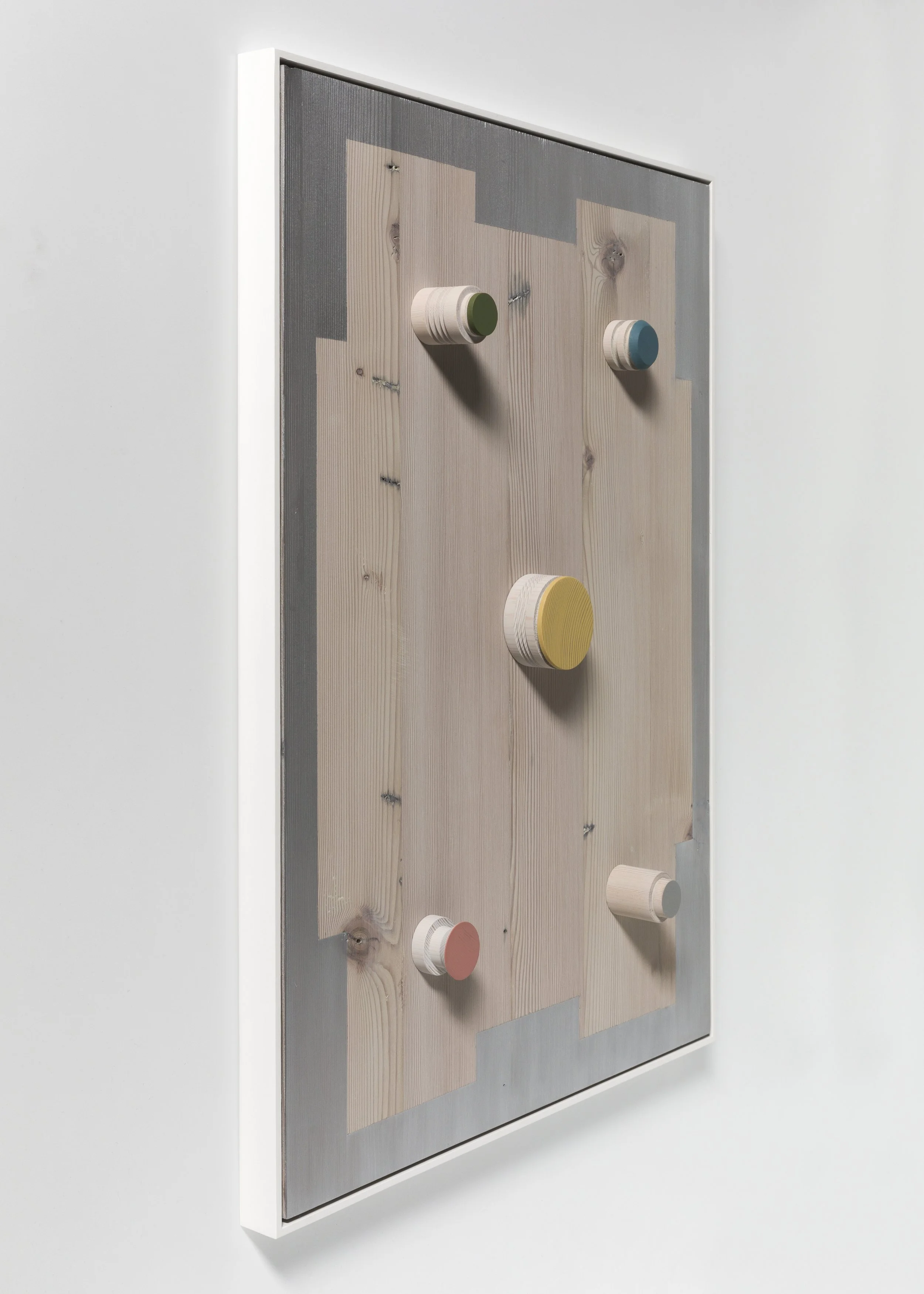
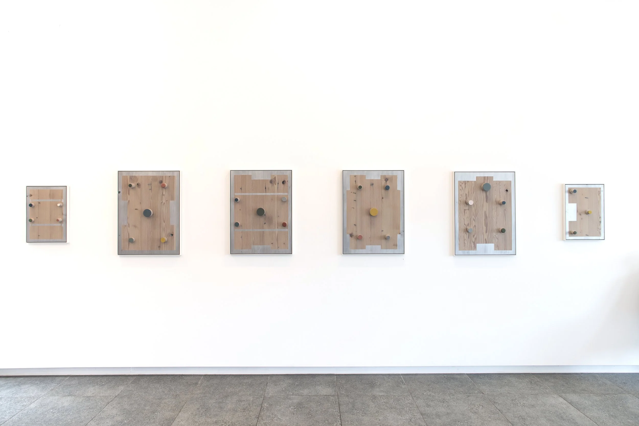
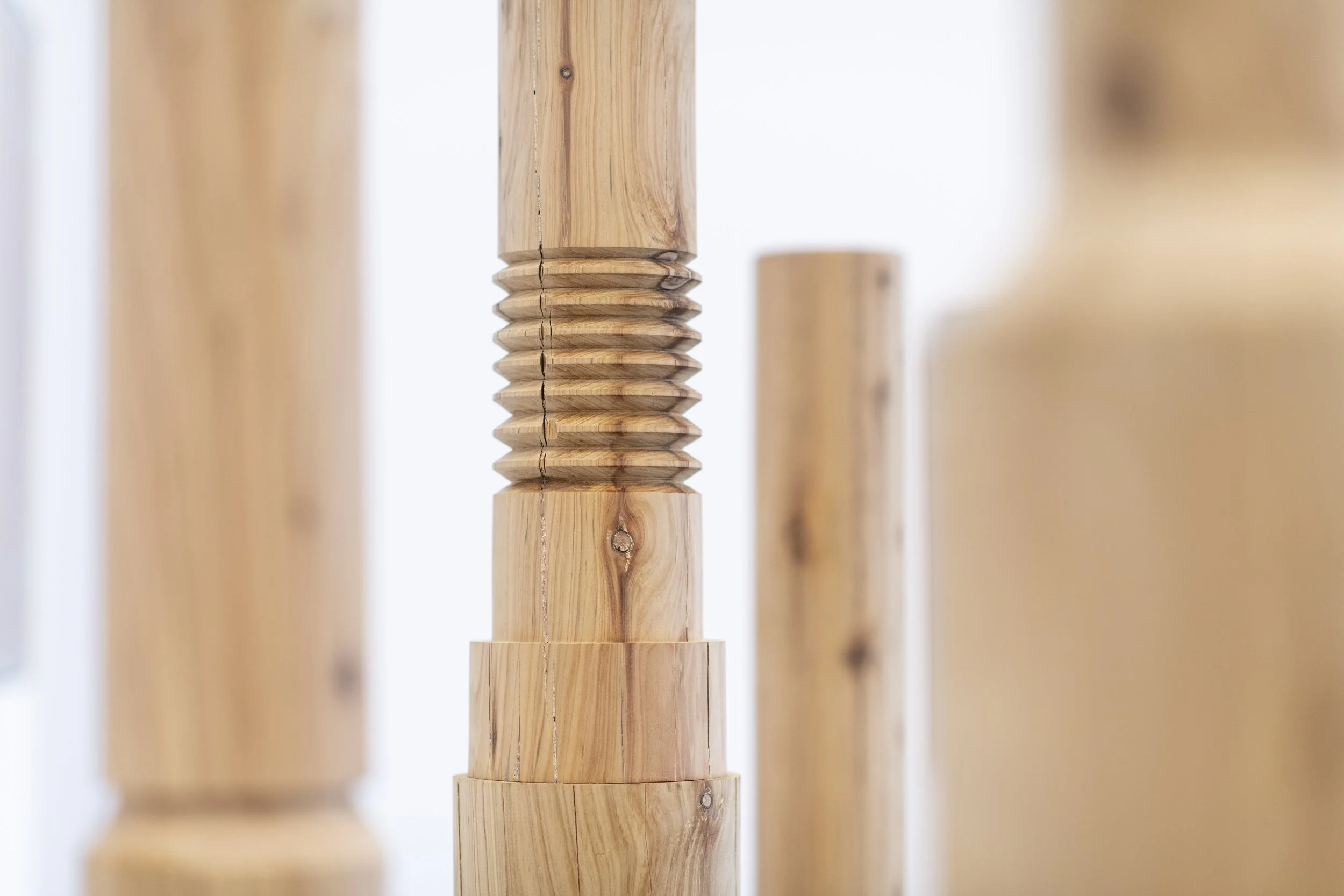
jo wilson: wood/line/pins
Jo Wilson
16.10.24 - 16.11.24


Jo Wilson: wood/line/pins
While nature and industry are not immediately obvious counterparts, they are the primary and consistent themes that characterise Jo Wilson’s recent art practice. Her work is distinctive both in its use of natural materials – typically reclaimed timber which is selected for the beauty of its grain, texture and colour, as well as its history – and in terms of the ongoing and wide-ranging influence of the plastic injection moulding factory that was established and operated by her father. Wilson’s studio is based at the factory and the varied elements of this familiar industrial setting provide a rich repertoire of source material that has inspired her work over many years. While others may not see beauty here, for Wilson, who is acutely aware of her environment and sensitive to its details, it is a site of artistic potential and constant creative renewal.
The woodLINE totems in this exhibition are based on steel tooling components stacked in imaginary assemblages which have been turned on a lathe into a series of single towering forms. Shape and line are perfectly calibrated in these works, but the precision of their design is interrupted by the natural features of the cypress – the irregular patterns of its grain, variations in colour and random knots in the timber – establishing a compelling interplay between the manmade and the organic. The same dynamic operates in the Channels and Pin/Point series where details from the factory are replicated in metallic paint and playfully coloured miniature pins (also turned on a lathe) on panels of richly figured cypress and oregon. The silver painted sections in these works follow the linear format of channels in plastic palettes which Wilson has sketched and photographed in the factory and while they recall the sheen of industrial machinery, sometimes appearing solid and dense, in certain lights the paint is also translucent, deliberately chosen so that the grain of the timber remains visible.
Wilson feels a strong connection with her medium – she loves its tactile material qualities, its patterning and tonal variation, even its scent. She is excited by the prospect of transforming discarded raw material into something beautiful and giving it new life. Beyond this, she is also conscious of the timber she uses as having an energy that connects it directly to the natural world. She observes the finely-set grain lines of one panel which indicate years of growth, for example, with fascinated awe. The slow, often hand-worked and labour intensive nature of the techniques that Wilson uses allows her to focus on these qualities, showing respect for the medium at the same time as stilling her own thoughts in a therapeutic form of making as meditation.
KIRSTY GRANT
Kirsty Grant is a curator and writer specialising in Australian art. She previously served as the Director of Heide Museum of Modern Art and was the Senior Curator of Australian Art at the National Gallery of Victoria (NGV).
ARTWORKS:


enquire.
julia powles: all these galaxies inside us
JULIA POWLES
18.09.24 - 12.10.24


Julia Powles: all these galaxies inside us
In her most recent solo exhibition Julia Powles maps out a trajectory of human feeling. A large series of black and white drawings titled A brief history of crying, runs along one wall of the gallery. In this work we find numerous tear shapes - a common motif for Powles - drawn in white pencil and chalk onto ink; erased and re-drawn in a manner reminiscent of a blackboard, the site where lessons are learned. With so many tears washing down the wall, we are reminded that weeping is also a collective action, and that through compassion and empathy we can find unity. Made using her engineer father’s drafting equipment – compasses, rulers and French curves – Powles employed tools that were once used to design the built environment, as a means for expressing inner emotions.
Similarly, a Venn diagram of overlapping circles has been painted onto a blanket that belonged to the artist’s mother. The schematic blanket painting operates as a kind of family portrait with members overlapping in significance, casting shadows and creating absences. So much happens, Powles says, in bed: sex, love, birth, death, illness, crying and dreaming, while the blankets, kept for years in her mother’s linen closest, bear witness to those events. In reusing her mother and father’s possessions to make art she can not only redeploy functional materials but embed the lived experience of others into her working methodology.
The paintings and drawings in this exhibition span a four-year period during which Powles sought to represent ideas relating to time and experiences. Sound waves, thoughts that resurface, stories told and retold, memories (actual and repressed) are manifest in paint through echoes, reverberations and ghosts – lines and colours repeat in more and more corrupted manners, shapes are erased, one form is buried beneath another, spatial structures emerge and collapse. A small relief sculpture completes the exhibition, appearing as a series of loops it is in fact a sentence: All these galaxies inside us. Made from a single coil of clay and gilded with silver leaf, the barely legible nature of the text is, like so much of our confusing, complex emotional lexicon, obvious once we can see it.
ARTWORKS:


enquire.
vivian cooper smith: patterns of the eclipse
VIVIAN COOPER SMITH
14.08.24 - 15.09.24

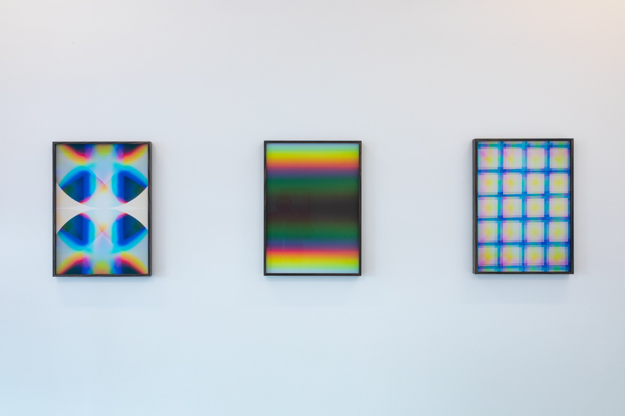


vivian cooper smith: patterns of the eclipse
In his new exhibition ‘Patterns of the eclipse’ Vivian Cooper Smith draws inspiration from minimalism, science fiction, and new age aesthetics to challenge photography’s conventional boundaries. His work invites viewers to discover meaning not just in the subject matter, but in the haptic process of creation itself.
Central to Smith’s work is the model of an eclipse—a cosmic alignment that both obscures and reveals, casting shadows on Earth and creating spectacles for its inhabitants. Smith recreates this phenomenon within his studio, positioning the camera as the situated earthbound observer. Before the lens, an arrangement of geometric objects and paper cutouts intersect and obstruct one another in a fluid, ever-shifting composition. Light passes through this scene and encounters a diffraction grating on the camera lens where it proceeds to unravel and reform into an array of patterns and colors.
This studio-based methodology embodies ideas derived from the writing of Karen Barad, who proposes (among other things) that new ideas emerge not from opposing differences, but by working through and with them. Smith’s approach thus becomes a visual manifestation of Barad’s philosophy. Each object in his studio setup exists not in isolation but in relation to others. The resulting photographs stand as visual testaments to this worldview, where obstruction and intersection don’t hinder creation but become essential to it.
In essence, Smith’s work is a meditation on the generative power of difference and obstruction. It challenges us to see beyond binary oppositions and instead explore the rich patterns and insights that emerge when we allow diverse elements to interact with and inform one another.
Artist statement:
This exhibition has been one of the most challenging to create for various reasons. Time for studio experimentation has been limited, and my creativity has been challenged by a mind and body committed to and distracted by competing priorities. There have been many times when I have felt eclipsed. However, while it may be a disservice to Karen Barad’s work to suggest this, it remains no less true that obstruction and disruption can indeed create space for surprises and joyful outcomes. These photographs are the result of working with and through the challenges my art practice has faced in recent years.
ARTWORKS:


enquire.
David Thomas: the passing of days and nights
DAVID THOMAS
09.07.24 - 10.08.24


david thomas: the passing of days and nights
Simply put the exhibition is diverse/complex and requires slow viewing. I see it as a journey through various aspects of life, celebrating the intimate and the grand.
THE PASSING OF DAYS AND NIGHTS has a contemplative function.
THE PASSING OF DAYS AND NIGHTS is a COMPOSITE exhibition of abstract paintings, photopaintings, titles, photography, and structures.
THE PASSING OF DAYS AND NIGHTS presents new works that explore the perception of time, space, complexity, impermanence, memory, and feeling.
My PAINTINGS are mainly from the ongoing “Gently Painted Series”.
They are complex in a simple sort of way. They manifest the factual reality of the painting’s materiality, temporality and form. Colour evokes a sense of boundless time/space/ energy. They reveal the sensibility /sensation of human touch in time via surface/facture and celebrate the INTERIOR non-material world of feeling/spirit / thought.
My PHOTOGRAPHY reveals its own material realities (physical, digital, mechanistic). It records the specific, the details of the EXTERNAL everyday world. it activates memory, sentiment, at times reflecting the absurd, the sometimes beautiful, and the sometimes bitter-sweet world of PAST EVENTS.
My use of TITLES is POETIC creating entry points into the work. The titles can be literal, conceptual, humorous, ironic, paradoxical, deeply felt. They act as triggers for recovering content.
The JUXTAPOSITION of the various elements/durations in the exhibition creates COMPOSITE RELATIONSHIPS (at times surprising) between language, form, media, and content… at times simple, at times complex like the world itself.
David Thomas
David Thomas Biography:
David Thomas was born in Belfast N. Ireland. He studied at Melbourne, Monash, and RMIT Universities. He lives and works in Melbourne/Naarm, Australia. His work explores the contemplative function painting, photopainting, and installation, in particular, how new iterations of the monochrome tradition and the composite can explore the perception of time, space, complexity and impermanence. He holds a PhD from RMIT University where he is an Emeritus Professor in the School of Art. He occasionally curates and writes on contemporary Eastern and Western art.
His work is held in numerous private and public collections in Australia and overseas including: National Gallery of Victoria, Melbourne. Australia. Australian National Gallery, Canberra, Australia. Heide Museum of Modern Art. Melbourne, Australia. RMIT University, Melbourne. Australia. Cripp’s Collection, Australia and UK., Gippsland Art Gallery, Victoria, Australia. Ballarat Art Gallery Victoria, Australia. Chartwell Collection, NZ Auckland Art Gallery, New Zealand/Aotearoa. Lowenstein Collection, Melbourne, Australia. Canterbury University, Christchurch, NZ /Aotearoa. Lim Lip Museum, Gong Ju, South Korea.Theodor F. Leifeld Stiftung, Kunstmuseum Ahlen, Germany. Kunstmuseum Bonn, Germany, The Frederick Collection, Germany, Justin Art House Museum, Melbourne.
He is represented by: Block Projects Melbourne, Australia, Minus Space, New York, USA and raum 2810, Bonn, Germany.
ARTWORKS:


enquire.
robert doble: the glasshouse
ROBERT DOBLE
26.06.24 - 06.07.24


ROBERT DOBLE: THE GLASSHOUSE
ARTWORKS:


enquire.
peter westwood: the new way to live
PETER WESTWOOD
14.05.24 - 08.06.24


Peter Westwood: The new way to live
Peter Westwood is an artist, curator, arts writer and academic. His work is focused on ideas of unsettled and uncertain times. Peter has worked in various media however his practice is primarily formed through a long-standing preoccupation and interest in painting.
In the title of Peter Westwood’s latest exhibition, we find a clue. The new way to live suggests that an alteration or schism in the way we approach the world has occurred. The old ways have receded, a fresh way to live is required, but how do we recognise it? How do we grasp its form? In an era of uncertainty – a heating planet, wars, economic displacement, rising global intolerances – in a world, we increasingly experience as fleeting and fragmentary, Westwood proposes a survival strategy of radical momentariness, where each fragment, each encounter can be experienced as a totalising instance. Something inexplicable glistens on a flat blue background, two miniature arched rainbows hover in tandem, a nighttime garden has plants with branches and roots that cross over each other with lines sharp as knives, abstract patterns tumble down from ceilings, and shapes we feel we should be able to recognise recede into multi-coloured backgrounds.
The new way to live puts forward the idea that to be in the contemporary world is to experience life as an accumulation of fragmentary moments, both ubiquitous and peculiar. Rather than seeking a structure within this tumult we could, Westwood’s painting suggests, accept the chaotic moments as a sequence of equivalences where what matters is not a rationale, but an immersion.
Westwood has been included in group and individual exhibitions in public and commercial galleries in Australia and overseas. He has also curated exhibition projects for the past 30 years in Australia, and periodically overseas, and is represented by Blockprojects Gallery in Narrm/Melbourne, Australia, and Boutwell Schabrowsky Gallery in Munich, Germany.
in conversation: Peter Westwood & BLockprojects
Tell us about yourself.
I was born in Sydney (on the lands of the Gadigal people) eventually moving to country Victoria (to the lands of the Wadawurrung people), and finally then to Melbourne/Narrm in the early 1980s to study at the School of Art at RMIT University.
From a very young age, I had thought that I would become an artist as I was captivated by drawing and painting. This was partly due to having had an artist in my family, an uncle who was relatively successful during the 1960s and 70s. But my childhood in the country was also marked by instability, and I guess that this was another reason that I became an artist. As a child, drawing and painting seemed to be a way of making sense of a confusing adult world and an unpredictable household. Creativity not only formed a space of solitude and interiority for me, but in retreating to my bedroom to draw, I was able to make sense of, and intuitively express feelings about the world I lived in.
Making art has remained a primary way for me of understanding and clarifying the eccentricities of our human condition. In the main, my artworks are formed entirely through experiences where I channel my feelings and thoughts around what I consider to be a complex and ambiguous, but deeply engaging world.
I have taught in various art schools, and in my teaching, my principal method has been to encourage students to make contact with their feelings and to employ conscious and unconscious workings as a primary method of creative production. Of course, a capacity for skills, analysis, understanding, and knowledge are also primary factors for young artists to develop.
But what I discovered early in my life is that the thing about painting is that it has the capacity to bring ‘the world’ into an intimate space. In painting ‘the world’ artists can represent life as a sensual experience, freed from the manoeuvrings of our day-to-day interpretations and understanding.
I’ve also encouraged our three children, by some means, to trust their intuition because sometimes we feel things within our bodies before we are even aware of what it is that we are thinking. In working with these art forms I’m often surprised by my bodily response to colour and the materiality of a medium, even prior to ideas eventually revealing themselves, unfolding as thoughts about ‘the world’.
What process/method are you exploring /experimenting with at the moment?
No matter what the medium (painting, printmaking, drawing, video), I approach every new work as a unique experience, and in essence, I discover the content of a work by making it.
My processes and methods have always involved working from a random photograph that I’ve taken, towards a painting, print or drawing. The final artworks bear very little resemblance to the original source material.
Having finished a series of large- and small-scale paintings, I am currently working on a series of 7 screen prints (each as an edition of 6, and an artist proof). The prints range from three to eight colours, forming imageries that capture something of the atmosphere of our current times.
The prints will be presented initially at Blockprojects before being sent to Munich, Germany. In Munich, they will form part of a two-person exhibition with Julia Powles in June 2024. The exhibition is titled ‘What we feel and what we know’ and the work will be shown at Verein für Original-Radierung. The prints will also be exhibited with drawings at Boutwell Schabrowsky Gallery in Munich.
How do these processes/methods inspire your themes, concepts & ideas?
Returning to screen-printing after many years has been an enjoyable reacquaintance. Screen printing was invented around 1900 for the advertising industry, and in the mid to late 20C, it was adopted by many British and American Pop artists.
Therefore, as a medium, it leans naturally into more graphic imagery, and it’s this aspect that has been fun to work with. As my work builds via an interpretation of a photograph (a snapshot) it feels curious for me to work with a type of visual artefact that comes from the world (the photograph) while reworking the image as an unconscious response to my associations and feelings about the image. Its highly graphic, but the result is very intuitive.
In making screen prints, I’ve felt that this notion of devising imageries that evoke something that we know or feel that we recognise but also don’t really know comes very much to the forefront.
ARTWORKS:


enquire.
paul newcombe: opus
PAUL NEWCOMBE
09.04.24 - 11.05.24
paul newcombe: opus
The Melbourne painter Paul Newcombe has conceived a new exhibition for Block Projects in Hawthorn. Newcombe’s Opus is a group of paintings centred on visuality and a sensuous grasp of colour. It is not colour that screams brightness or speaks its surface but is the experience of something seen and fashioned into linear form.
This large opus of paintings is presented as a complete work. The paintings are all square and are in four sizes. Newcombe likes a system, and the circle and the square are his mantra and the necessary means of production. System painting suggests repetition but what is evident in Newcombe’s painting is a willingness to admit the like-for-like form of his paintings in favour of differences that are to be found in colour.
There is an analogy here which has a voice in this series. A single colour can have the like-value of an individual. Individuals are both singular and part of a group. It is what the artist Josef Albers described as ‘independence and interdependence,’ a polarity that speaks of relationships – in harmony or discord - that arise when individuals or colours are grouped together.
What further unifies the paintings of Opus are the colour bands of the compositions. They are multitudinous in hue: green – Phthalo and moss, pale blue to lighter grey, and into red, brick and brown. The certainty is here, and with it, the controlled application of synthetic polymer paint. On balance, Newcombe’s palette does not appear particularly Australian nor is it the colour of post-war American abstraction, but looks English, and would suggest painters of the 50s such as Terry Frost and Adrian Heath.
Abstract painting is tasked with remaining visible in a world that is ever more complex. We may think abstractly but we see things in figurative terms. The challenge for a painter such as Paul Newcombe and this series of paintings is to convert the moving world into abstract form. But more critically, it is the allusion, the keeping alive of lived experience, that the paintings of Opus so successfully sustain.
Brett Ballard
ARTWORKS:


enquire.
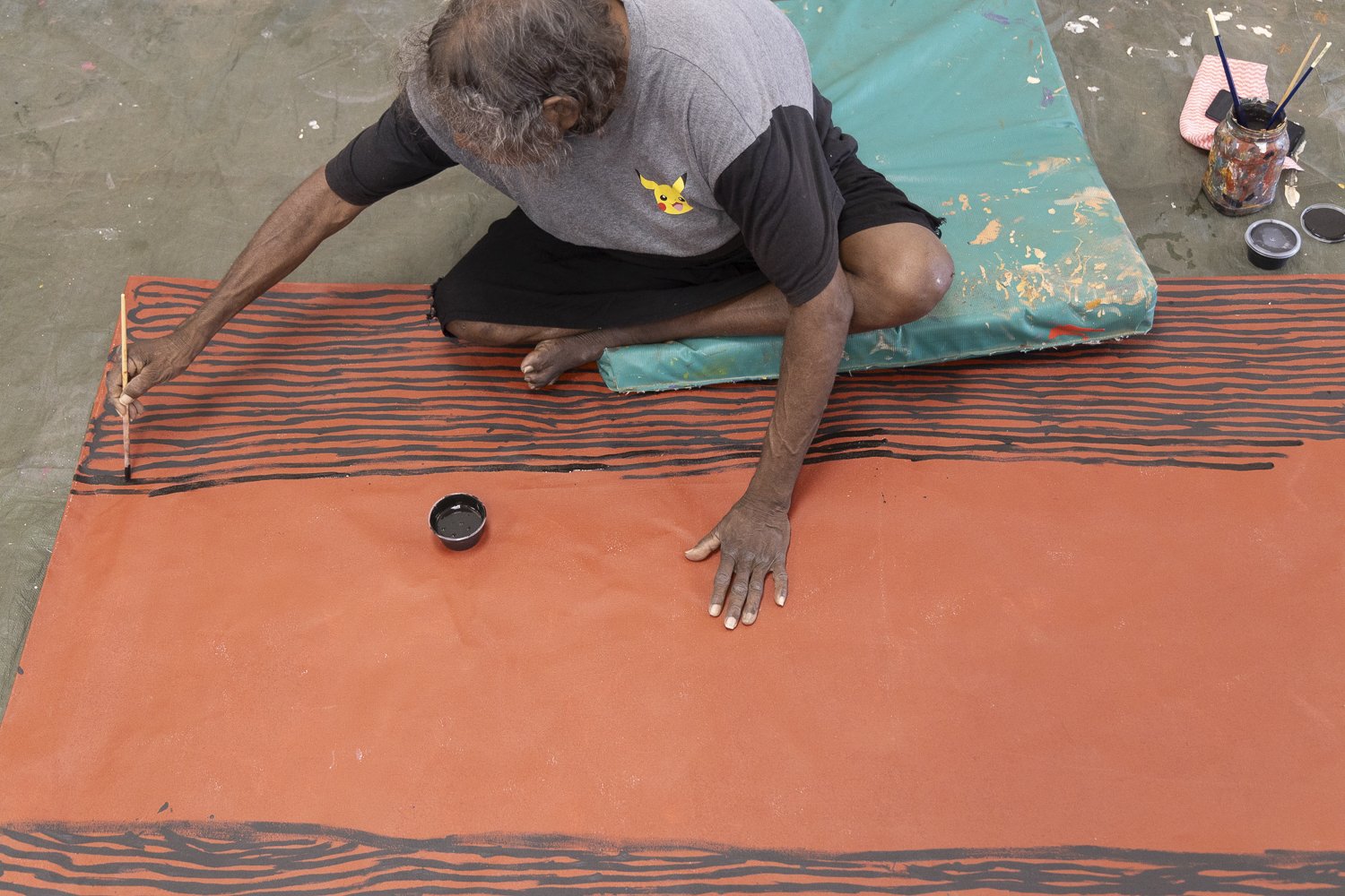
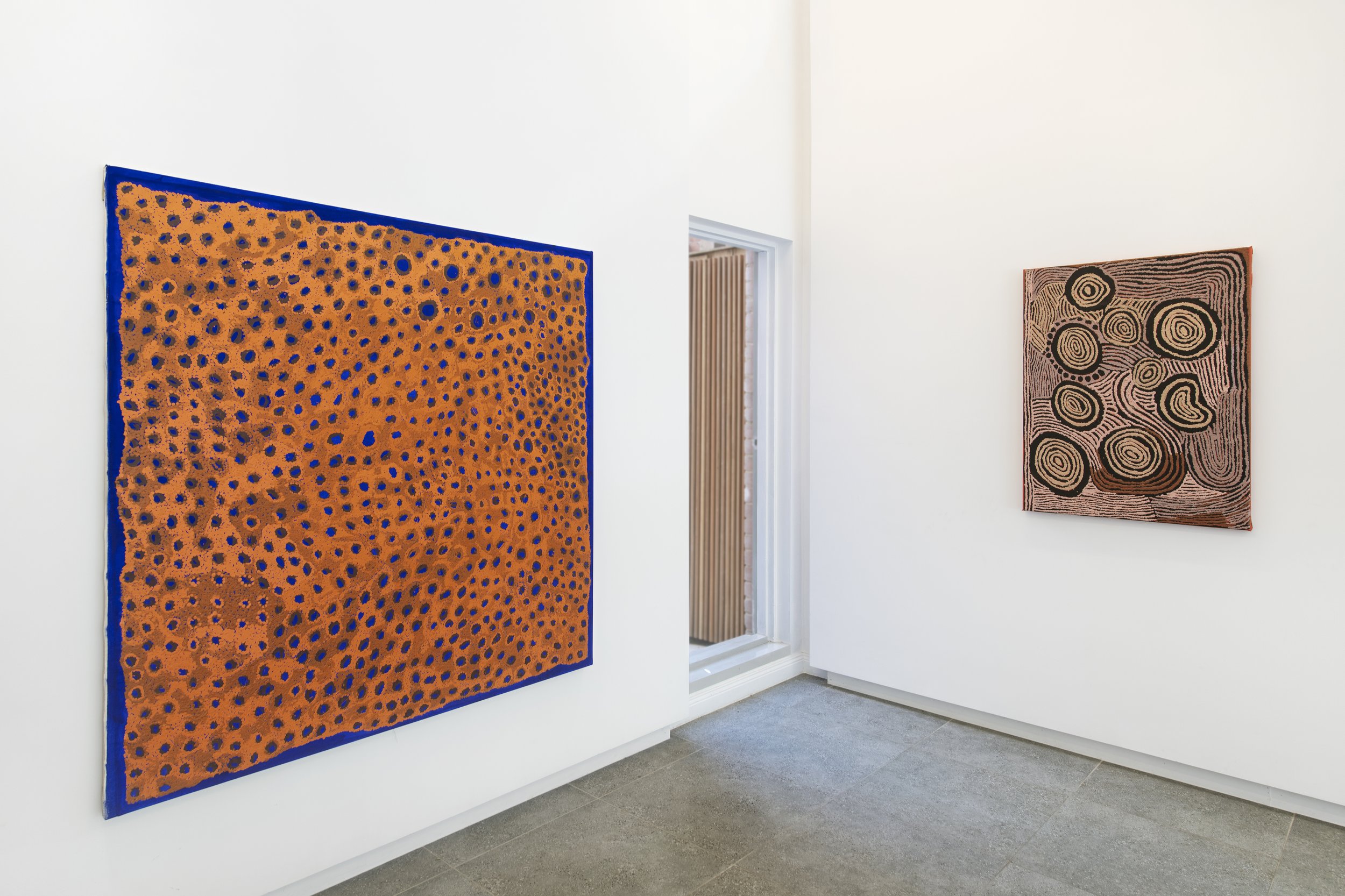
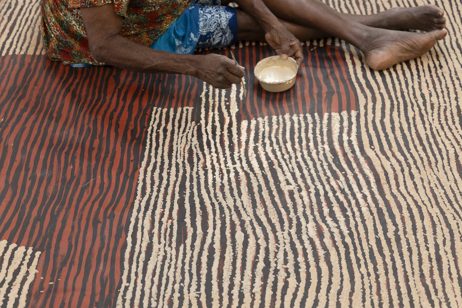
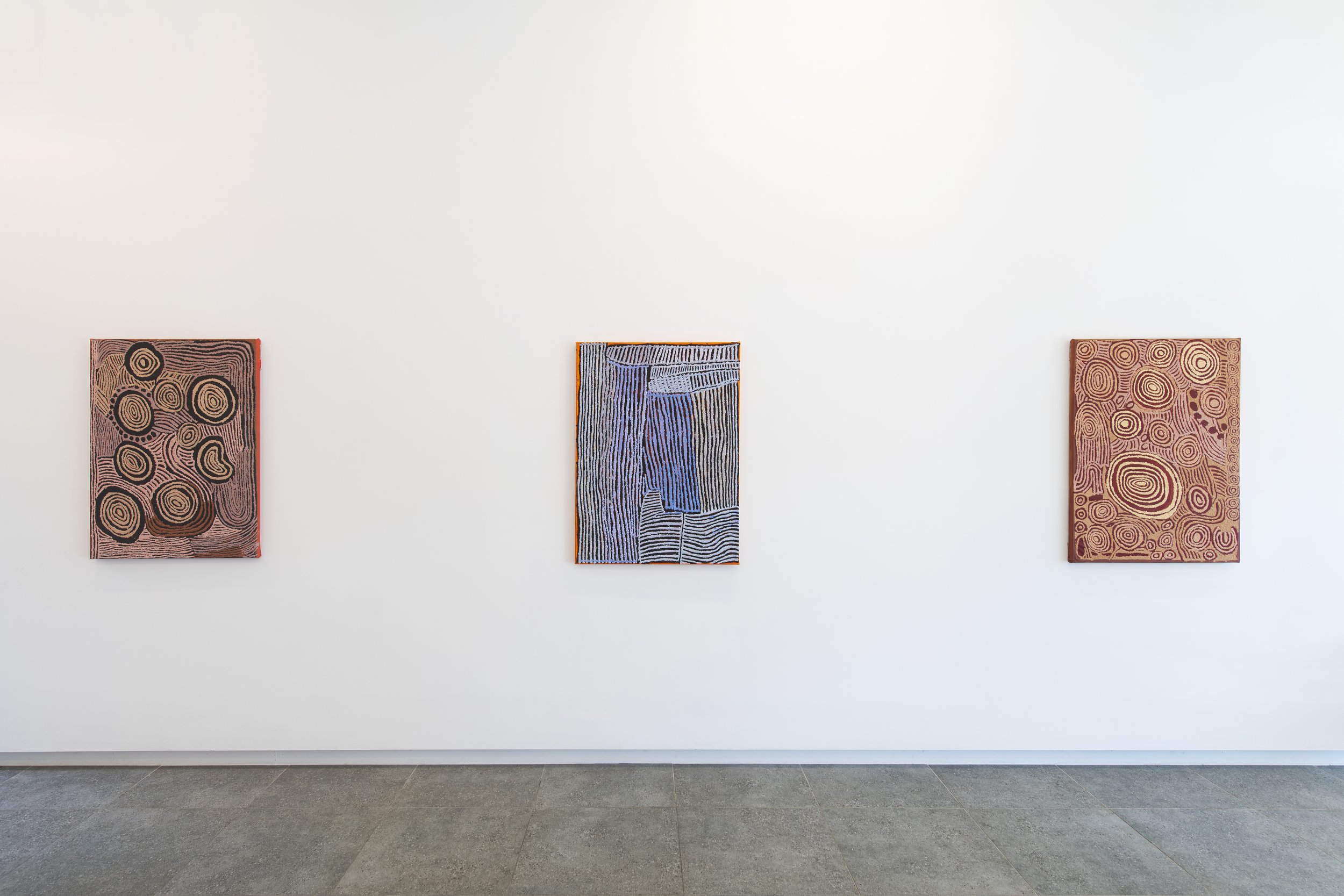
dorcas tinamayi bennett: mother’s story
Dorcas Tinamayi Bennett
12.03.24 - 06.04.24
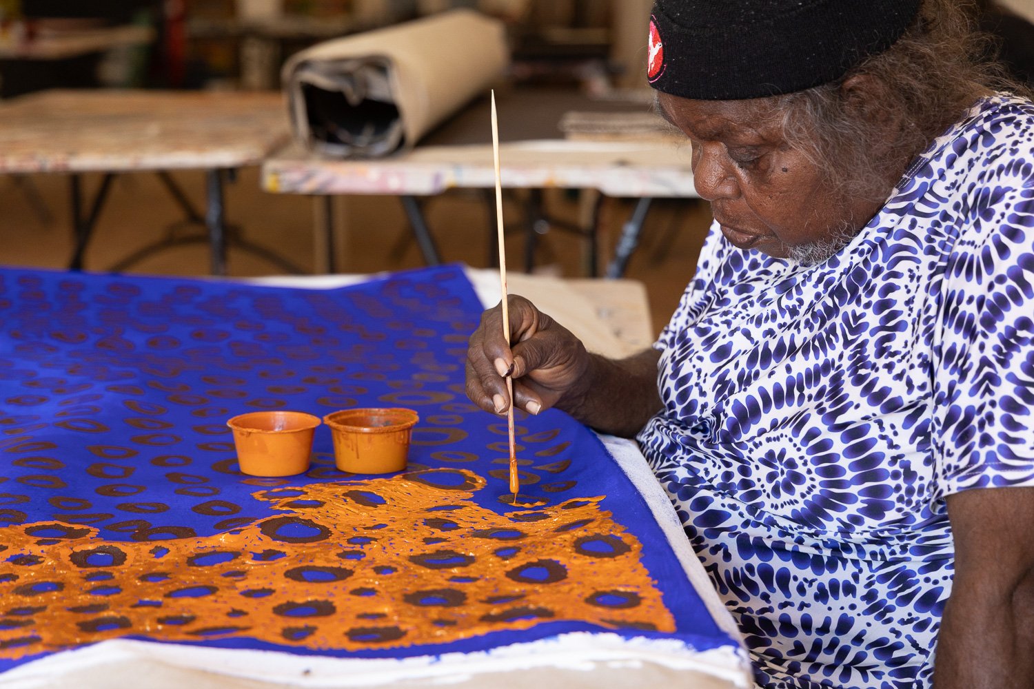
Dorcas Tinamayi Biography:
“I was born in the bush at Wurturu rock hole near Kaltukatjarra (Docker River)”. After her birth, her mother and father walked with her to Warburton Mission where she was given her English name by the missionary Mr. Will Wade.
Her parents returned, walking with Dorcas to the Warakurna - Tjukurla area. Although soon after they had to leave due to the radiation exposure from the atomic testing in Maralinga “the funny smell made a lot of people sick”. Her family met Mr. Bob McAuley and traveled with him in the renowned yellow Native Patrol Officer’s truck to the Amata settlement. They then travelled by camel to Areyonga where Dorcas began to attend school.
Dorcas and her family returned to the Warakurna homeland when it was established in the mid-1970s. “In 2005 we started painting on paper then on canvas, the old shop turned into an art centre, that’s where we all started doing painting” Dorcas is the current Chairperson for Warakurna Artists. Dorcas Bennett is the daughter of Nyurupayia Nampitjinpa (Mrs Bennett) a senior artist for Papunya Tula Artists. Dorcas’s paintings are prefigured by her mother’s Tjukurrpa (dream time), encompassing the country between Tjukurla and Warakurna.
As the final heir to these ancestral stories, it is crucial for Dorcas to reenergizes them. She does so with a lot of gusto, creating vibrant connections between the dotted Tali (sand hills), the circler Kapi Warnanpa (water holes), and various designs linked to the journey of a group of women to the rockhole site of Yumarra.
ARTWORKS:


enquire.
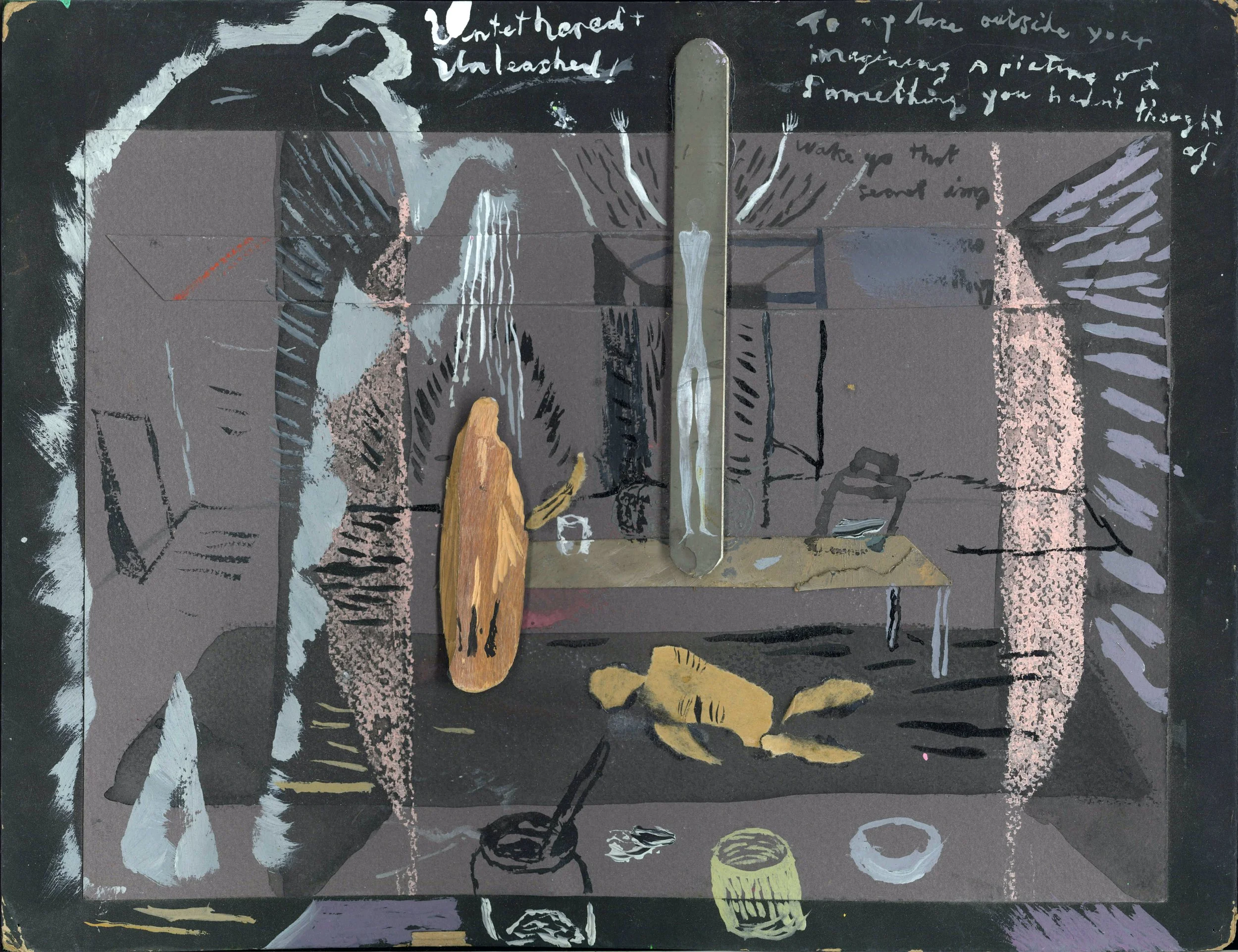
JAMES CLAYDEN : THOUGHT / MEMORY PAINTINGS
James Clayden
30.01.23 - 02.03.24
Jame clayden: artist statement
Early in 2023 after rewatching Peter Weir’s fantastic film The Last Wave I found myself once again disappointed with the way the film ended and thought to try and paint an ending for myself. The thought kept going around in my head and began merging with the memory of being in the Lisbon Aqueducts that were built on ancient Roman structures during the 18th century; this seemed together with the feeling left by the ending of the film, of being underground beneath the city but at the same time in some deep space far beyond, where past and present pulsed like some atavistic memory of longing amidst water and sky like spheres as one. Out of this, I remembered Michael Snow’s haunting 1967 short experimental film Wavelength and after watching it again it seemed something worthwhile was going on around me, without me, and this together with the mystery of painting itself is more or less how and why I began work on this series of Thought/Memory Paintings.


